


BLOG
We go all in!

The Art & Science of Logo Design
In today’s visual world, your brand’s logo design can be all the difference between success and struggle of your brand. A logo is the face of your brand, if I ask you to imagine Nike what is the first thing that came to your mind? Their shoe? No, I’m sure for most of us, it's their iconic swoosh.
Such is the power of a logo!
Picture this. You are driving on a busy street and a series of cafés on either sides of the road are trying to steal your attention. How do you decide which one would you try? In addition to the logo, the larger brand identity - including facade design, café ambience, colours, use of materials, textures, lighting etc. - all should be narrating a unified story. You can make your choice in an instant, and wonder what drew you inside that café. Such is the power of branding. Logo is the face of the brand. But, it needs to be tied
to Brand’s Purpose and DNA. All of it needs to narrate a strong message about your brand.
A logo is not only a graphical exercise.
There’s a lot of thought and research that goes into creating a logo for your brand with the right colour and your brand story. A logo needs to be simple yet elegant. It could be as small as a favicon or seen in half - it should be memorable and identifiable.
Did you know, in just 400 milliseconds, a logo can trigger emotional & behavioural responses? Neuroscience tells us that logos and brands behind them can activate parts of your brain in a much deeper manner that you may think.
A study conducted by researchers at the Amsterdam University found that logos start playing with your subconscious mind at a very early stage of life, they found that children of 2-3 years of age could easily recall a logo and the product it represents in 67% of cases.
Have you heard of the golden ratio? The golden ratio is 1:1.16 derived by mathematical principles that is found in nature elements, space matter, and even sound waves. It has a pleasing nature and is used in art, paintings, music, architecture, and design for over thousands of years. Studies have shown that anything that contains the Golden ratio is perceived as beautiful, perfect and harmonious, even if we are unaware of it.
Not all logos need to be designed as per “Golden Ratio”, but the logos that are, remain timeless and classic. Logo Design process is not as simple as having a team of graphic designers making some sketches or illustrating ideas. It needs to have a meaning, behind every stroke, every pixel, every curve. Meaningful brand identities can inspire trust and association. Let’s do it methodically.
Get help from a professional Branding Agency for your logo design.
Read more about Types of Logos & their uses here.
Article contributed by:
Riya Wadhwa, Brand Artisan - Marketing

How Packaging Design Influences Buying Behaviour
A few days back, I visited a supermarket and was looking for my favourite brand of crisps. I walked around the dedicated aisle twice but couldn’t find them so I requested an assistant to help me with it…
How often does it happen that you are looking for a particular product at the supermarket and you go around the aisle a number of times only failing to find that product?
A few days back, I visited a supermarket and was looking for my favourite brand of crisps. I walked around the dedicated aisle twice but couldn’t find them so I requested an assistant to help me with it. When we started walking towards the dedicated shelf of crisps and cookies, I wondered how these hundreds of products on the shelves fight with each other for our attention and what actually persuades us to choose one brand over the other. In that brief moment, I thought about the different elements of packaging - colour, typography, visuals and format that affect our buying habits and coming back to reality only to find out that the assistant was nowhere to be seen. Assuming he never found the crisps, I disappointedly started looking for a similar flavour and surprisingly, found my favourite pack of crisps at the corner of the shelf and thought how difficult it was to find something I actually wanted.
Today, we face an ever increasing number of options available to choose from. A regular supermarket has over 30,000 products, all competing with each other for our attention. In most cases, a brand gets roughly 30 – 45 minutes of a shopping session to attract, excite, and sell their products, proving to the fact that product packaging is considered to be the decisive point of communication in any retail environment.
It has been estimated that around 60-70% of buying decisions are made in the store. Packaging is considered as the final opportunity for marketers to communicate their brand’s message. Packaging plays a crucial role as it has been proven that 1/3rd of our decision making is based on how the product finally looks. It has a direct impact on how your consumer perceives the product.
Most of the times a consumer leaves home with a definite purpose in mind, but no loyalty towards a brand. The final choice depends on variety of factors. Some consumers go for household brands, some do an extensive research, while the rest of them (which forms the majority) buy on impulse. These decisions are often influenced by knowledge and reputation of a brand, consumer personality, but most importantly having a good and attractive package design that would intrigue and encourage the consumer to try the product.
We are all still guilty of instantly judging a book by its cover but still there’s no way around it.
A product only appeals to us when it looks attractive.
Such is the power of Packaging!
Read more here: 5 Golden Rules of Packaging Design
Article contributed by:
Riya Wadhwa, Brand Artisan - Marketing

4 Important Elements of Packaging Design
Packaging is known to be the identity of a product. Packaging plays an important role educating the customer about the product; it’s also like having a direct interaction with the brand. The four main elements of packaging are…
Packaging is known to be the identity of a product. It is extremely important for your product to get noticed amongst the hundreds of other products available on the shelf. Packaging is an integral part of any Branding Strategy to glamorise a product in a way that would not only catch the consumer’s attention, but also would be a great source of advertising. Packaging plays an important role educating the customer about the product; it’s also like having a direct interaction with the brand. As said by Martin Neumier “A retail package is the last and best chance to make a sale.”
The four main elements of packaging are Colours, Visuals, Typography and Format. These elements help the consumers to relate to the brand easily and tend to have a high recall.
Colours have great psychological impact and can draw attention to your product. In order to stand out, brands often choose colours that do not belong to their brand colour palette. This disruptive behaviour is good, but may not always work in favour of the brands. Colours are known to be the most important part of packaging because they subconsciously reflect the personality of a brand; also it is the first thing to be noticed and can be visible at a distance as well.
Visuals & Mascots help in associating with the brand and create high recall value. Visuals are graphical representations of the product inside, where one can easily understand what the product is without having to read.Mascots on the other hand are an additional element that may in some cases strengthen the identity of the brand. A mascot is easily relatable by every age group. Brands like Amul still extensively use’s their mascot named Amul girl for all their communication and branding. This over the years has become a part of their identity and is now very relatable by the consumers. Another Indian brand using a mascot is Air India using their mascot named Maharaja, for their communications.
Typography is another powerful part of Brand Identity. Just like colours have meaning; typography represents the values of your brand. Every typeface has a different set of connotations and hence will create a unique representation of who you are and what you stand for, as a brand. Brands often use bold fonts and serifs to catch attention, as they’re clean, simple, and easily readable. As mentioned, fonts also have a different meaning. The font used for the IBM logo demonstrates power, while Coco-cola and Disney cue fun.
The format of Packaging is designed in such a way that it attracts the attention of the consumer and can be easily spotted on the shelf. Format of packages largely depend on the products, keeping in mind the requirements and convenience of a consumer. For instance, products like shampoos, oils, ketchup, etc come in various sizes as well as in sachets which encourage the consumer to try them.
Read more here: 5 Golden Rules of Packaging Design
Article contributed by:
Riya Wadhwa, Brand Artisan - Marketing

Difference between Logo & Brand Identity
People often use Logo and Brand Identity loosely and interchangeably. Logo is not the same as Brand Identity, although they are very closely linked. Let us first understand what do these terms mean.
People often use Logo and Brand Identity loosely and interchangeably. Logo is not the same as Brand Identity, although they are very closely linked.
Let us first understand what do these terms mean:
LOGO
A trademark-able symbol, graphic, visual representation of an organisation that reflects beliefs and values of the organisation whilst enabling public recognition.
BRAND IDENTITY
Key identifiers of a brand that includes Word, Sign, Symbol, Colours, and Design Style that makes a rand recognisable. Logo is a subset of Brand Identity.
Building a Brand Identity is an exciting process. It’s a collection of tangibles like a logo, Brand Colours, Typography, Tone of Voice and Communication system. The more specific, distinct and cohesive these elements are, higher would be the likelihood of Brand Recall and Brand Association. And this would allow your customers to distinctly remember your brand differently from the crowd. A consumer is only able to do so when a brand is able to consistently communicate this through its service, packaging, use of media and quality of products.
Brand Identity is divided into Visual and Verbal identity. Visual elements make your brand stronger and have a positive recall. While elements like Tagline, Tone of Voice and the use of media form a brand’s Verbal Identity. For any brand to have an effective and robust Brand Identity, it is mandatory that both, Visual and Verbal Identity of the brand are in sync.
On the other hand, Logo is one of the key elements of Brand Identity. A logo is known to be the face of the brand, the first impression of your brand. A Logo creates a visual impact and consumers instantly connect with the brand with the sight of a Logo. For a brand to be successful it is essential to have a well designed, unique, memorable and aesthetically pleasing logo.
Logos can be classified in three types: Typographic logos, Symbolic logos and the Combination of the two. Typographic logos are stylised text of the Brand Name or its initials. For instance, brands like Google, Subway, Sony, Disney use it. Symbolic logos have a symbol representing their brand for instance Audi, Mercedes, Apple, Twitter, Instagram, etc. Most of the brands use a mix of both as their logo like Adidas, Pepsi, Doritos, Burger King. Read more about the types of logos here.
To conclude, a Strong Logo is the key to an effective Brand Identity. Though they are overlapping concepts and both are equally important for the success of a brand.
Article contributed by:
Riya Wadhwa, Brand Artisan - Marketing

Evolution of Colours and their role in Brand Identity
Colours are known to have effects on a person’s psychological, physiological and sociological behaviour. Thus, colour is an important aspect while considering the brand identity system.
It is believed artists invented pigments using a combination of soil, animal fat, burnt charcoal, and chalk as long as 40,000 years ago. Initially, artists only invented a basic palette that consisted of red, yellow, brown, black, and white. Later, through scientific progress and advancement, colours like blue, green and violet were invented. Since then, there have been numerous discoveries of new and colours simply by mixing and experimenting.
Today, colours are present all around us and are associated with every aspect of our lives. They influence the way we think, cause actions and reactions. They can irritate or soothe your eyes. Some colours are calm and give us a feeling of serenity while some can cause anxiety. Every colour has its unique meaning and associations. In today’s society, colours have become a very powerful form of communication and are irreplaceable. The study of human behaviour towards colours is known as ‘Colour Psychology’ and this is a widely used concept in Marketing and Branding. Here, we will see how our mind perceives certain colours:
Red: Red is known to be a very strong, noticeable and an emotionally intense colour. Red is most associated with energy, youth, courage, strength, warmth, desire, passion and excitement. While on the other hand, it is also associated with war, danger and aggression. Red has the ability to enhance metabolism, raise blood pressure and increase our respiration rate. Red colour also makes objects appear much closer than they actually are and thus, grabs more attention this is why danger signs, traffic signals are in red.
Yellow: Being the colour of sunshine, yellow puts a smile on the dial. The most visible colour from a distance, it communicates cheerfulness, friendliness, energy, reflects joy, optimism, confidence, happiness and creativity. However, at the same time, yellow is the colour of caution and associates with fear, depression and anxiety. Yellow also arouses hunger and hence most of the fast food and ready to eat products are packed in yellow.
Brown: Brown is seen as a serious and very down to earth, warm, with properties like stability, structure, support and sophistication. It is among the oldest colours and is associated with wholesome, natural and organic produce and anything related to the great outdoors, agriculture and farming. Hence, most organic products use brown in their packaging.
Black: The colour black relates to hidden, secretive, unknown, and as a result it creates an air of mystery. It is associated with elegance, glamour, luxury, power, exclusivity. Black is bold, classic and to be taken seriously. Black on the other hand also has a negative side to it like evil, oppression, grief, and insecurity.
White: White represents purity, simplicity, hygiene, innocence, clarity, transparency. It is known to be the colour of perfection. If we had to identify one brand that has uses white to convey its brand message to perfection it would have to be Apple, white represents the simplicity of the products in both their form and function. White can also be associated with emptiness, coldness, unfriendliness, isolation and emptiness. The colour white also depicts peace, cleanliness and calmness; thus hospitals are generally painted in white.
Blue: Blue is a universally preferred colour, having versatile qualities. Blue is widely used and appreciated for its calmness and serenity. Brands using the colour blue in logos give a sense of reliability, trustworthiness and authority. Thus brands like Dell, Intel, Facebook, Twitter, Samsung have their logos in blue. However, being associated with feelings, also expresses sadness or depression.
Green: Green has two very common meanings - one being nature and environment, and the other being finance and wealth. It signifies harmony, balance, freshness, awareness, growth, restoration, and stability. Though, it can also be significant to boredom, blandness. Green representing nature is also considered to be beneficial for Mind and Body and is also said to have amazing healing powers.
Violet: In ancient times, violet was termed as ‘the colour of atmosphere’. It is known to be a soft colour with calming effects that convey creativity and wisdom. Violet is also associated with spiritual awareness, vision, luxury, truth, and quality. Violet also has negative associations like introversion, suppression, and inferiority.
Colours and Brand Identity:
Colours are known to have effects on a person’s psychological, physiological and sociological behaviour. Thus, colour is an important aspect while considering the Brand Identity System. As every colour has a unique identity, it is important for brands to select the right colour. Using colours that go with your brand personality and consistently using brand colours, has been proven advantages and create a stronger Brand Identity and has higher brand recall. Few examples are Coca-Cola is known for its bright red labelling on bottles; Dairy milk uses their patent violet for all its chocolates, Christian Louboutin is known or its red bottom pumps and Barbie uses the typical pink for all its packaging. Colours are thus an important element in a brand’s visual identity and needs to be based on logic, meaning and purpose.
Article contributed by:
Riya Wadhwa, Brand Artisan - Marketing
Why is it important to determine your Brand Values?
Brand values are the foundation of any business. They give your brand a purpose and a direction to be followed. Without Brand Values, your brand is like any other business operating with only one goal - to maximize profits. Brand Values are reflected in your employees and in your work culture.
“Marketing is about values. It’s a complicated and noisy world, and we’re not going to get a chance to get people to remember much about us. No company is. So we have to be really clear about what we want them to know about us.”
– Steve Jobs
In this quote, Steve Jobs is trying to convey that for any brand to be successful, it is very important to define the brand values. People often get confused between Brand Value and the Brand Values. While Brand Value is the monetary worth of a brand, Brand Values are the moral principles a brand follows. These moral principles support the Brand Promise and are expressed through the Brand Identity.
Determining Brand Values
Brand values are the foundation of any business. They give your brand a purpose and a direction to be followed. Without Brand Values, your brand is like any other business operating with only one goal - to maximize profits. Brand Values are reflected in your employees and in your work culture. Unlike Vision or Mission, they are not mere statements hanging down the walls of your offices. They are a defined set of standards which represent your brand’s DNA and communicated through actions & employee behaviour. An authoritative brand looks and speaks differently compared to a fun brand. Just like the verbal tone and visual style of IBM is different from that of Disney’s. It is important to clearly determine who you brand is speaking to. And what values do they represent as a group. Customers flock to the brand that reflect their values.
How do you define your Brand Values?
Well firstly, you don’t define the Brand Values, you identify them. They are already part of your company. Brand Values are identified through branding exercises where you and the key employees of your organization take part and help in identifying the Values of your brand. Brand Values are expressed visually and verbally across touch points that customers can identify with. Identifying your brand values and expressing them clearly greatly enhances the ROI on your marketing spends, ultimately making your business more profitable.
Article contributed by Mansi Panchamia, Marketing Team, Yellow Fishes
Types of Emotional Benefits
Let’s start with an experiment. Melt a Toblerone and mould it into a slab. Ask a friend to taste it and observe their reaction. Most probably your friend will throw it at you and will be disgusted for having such a terrible taste in chocolate. And you would agree with him after you taste it yourself. That pops a question in my mind.

Let’s start with an experiment. Melt a Toblerone and mould it into a slab. Ask a friend to taste it and observe their reaction. Most probably your friend will throw it at you and will be disgusted for having such a terrible taste in chocolate. And you would agree with him after you taste it yourself. That pops a question in my mind.
How Toblerone makes its sales and how did they make it so big?
Answer - Emotional Benefits
It is the Emotional Connection that draws a customer to the Brand. Every decision in our lives is influenced partly by Functional and partly by Emotional Benefits.
Let’s identify the myriad of Emotional Benefits that we receive from other Brands.
1. Recognition – Our lives revolve around it. Right from childhood, you start forming an Identity that you want to be seen as. Some Brands intentionally own a space in our minds, that inspire a feeling of ‘being recognized’.
Mercedes: I own Prestige.
Chanel: I am Expensive (only a handful can afford me).
2. Belongingness – We have our own trust circles. Our choices often reflect the school of thoughts we belong to. So do brands.
Apple: I belong to people who are cool and look beyond convention.
BMW: I belong to people who enjoy driving
3. Confidence – A definitive element of our personalities. It is about how we feel about ourselves, rather than how others feel about us.
Victoria’s Secret: My body ‘feels’ desirable.
Abercrombie & Fitch: I ‘feel’ sexy.
4. Individualism – In the Millennial age, it is not uncommon for individuals to be bold enough to express or explore. There are a few brands that harness these heroic emotions.
Louis Vuitton: I am indispensable.
Old Monk: I am not afraid to show who I am.
5. Nostalgia – Our memories are very precious to us. Few Brands reflect that through their Brand Identity.
Paper Boat: Indian packaged drink brands that play around childhood memories
Nintendo: Do you think Pokémon Go Smartphone Game would have been as successful without the nostalgic memory of Pokémon game we played decades ago?
Every brand needs an Emotional Benefit. It is the Emotion (limbic system) that commands the Rational Brain. While we may think of making Rational choices, we always need Emotional Connection with the Brands we choose. So what made you buy that Toblerone?
Article contributed by Himali Jangam, Marketing Team, Yellow Fishes
The 5 Golden Rules of Packaging Design
Packaging Design, also known as Package Design is very important element in your Brand Identity. A good Packaging can easily inspire trust and enable you to command premium for your products. Whether you're looking at creating a new Packaging Design or refreshing an existing one, here are 5 Golden Rules you should take into consideration.

Packaging Design, also known as Package Design is very important element in your Brand Identity. A good Packaging can easily inspire trust and enable you to command premium for your products. Whether you're looking at creating a new Packaging Design or refreshing an existing one, here are 5 Golden Rules you should take into consideration.
Rule No. 1: Your Packaging Design should be true reflection of your brand/product
Neither over-promise, nor under-deliver. Packaging should be mirror image of your Brand/Product. It is quite human to form expectations looking at the package. Your Brand should not disappoint customers, or trick them into something they don't expect. Use the Front of Pack (customer facing side) to clearly express what the Brand stands for. Use both Visual + Verbal methods to do so.
Rule No. 2: Your Packaging Design should be consistent
Your product may have multiple variants, Packaging formats, or may be sold in varied sizes. It is important to have all of them look consistent. Own a Visual and Verbal style and know that your customers will recognise you with it. Consistency always inspires trust.
Rule No. 3: Your Packaging Design should be clear and precise
Use your Packaging as vehicle of your advertisement. You can communicate a lot on your Packaging if you use the real estate smartly. Include the reasons to believe in your Brand.
Rule No. 4: Your Packaging Design should be different and own-able
A unique Packaging pops out on the shelf. Differentiate your Packaging by means of format, shape or colour palette. Today, we have great ease in recognising Tide with orange colour, or Cadbury’s Dairy Milk with purple. We instantly know it, without even reading brand names. Pringles box and coke bottle does the same magic. That's the power of differentiation.
Rule No. 5: Your Packaging Design should be functional
Think about the environmental footprint of your Packaging. In international transits, cost of transportation is by cubic metres of space occupied, so keep the package moderately small. Deliberate over Packaging materials and shelf life of your products. Make it recyclable, if possible. And of course, adhere to all legal compliances.
_
Bonus:
Try to raise the bar. Break at least one norm in the category you operate in. And delight your customers.
Check out the following case studies of packaging design:
Classic Branding Mistakes to Avoid
Here are 5 most common mistakes to avoid, when creating a new brand or rejuvenating an existing one

Choosing your brand name the wrong way
A lot of new businesses are naming their companies based on the availability of domain names. No. No. No. You can’t choose your business name based on a .com domain. Select the best, most appropriate name for your business. One that reflects Value System & Personality of the company. Having a nice domain name is sure important, but you can always do permutation-combination there.
Starting with marketing, ignoring the need for branding
Very often people jump onto Marketing Execution as they want to get started with business. So, they begin with a clumsy Logo, a cheesy tagline, default system fonts and a basic Colour Palette. Seldom do they understand that at every touchpoint, their business is creating Brand Image. A sharp and relevant Brand Identity, done with the help of Branding Agency, will get more customer conversions per dollar spent on Marketing. Defining your Brand Strategy and Brand Identity will also help you determine key messages for the Brand.
Underestimating the power of branding
Branding is not beautiful Brochures or stellar Websites. It is neither pretty fonts nor an intriguing Logo. It is sum total of all these elements, whose look and feel is defined by what your Brand stands for. Define your Brand first.
Not being consistent
One of the most important attribute of Branding is consistency. Consistency commands trust. Learn to control your whims and fancies if you want to build a strong Brand. Once the Brand Personality and design style is defined, continue with it. The benefits you reap by staying consistent is very rewarding.
Going to an advertising agency for development of your brand
An Advertising Agency, in most cases have a limited view of Consumers and Competition. Almost all Ad Agencies operate with a general belief that a Brand has to do unique stuff to stand out. It is not always true and not needed at that stage. Moreover, the objective while building Brands is not disruption, but definition. Branding Agencies don’t think campaigns. They think long term, sustainable Brand Promise.
Resisting change
Very often businesses get complacent with their current numbers. Don’t stick with your Branding if it isn’t working. There is no thumb-rule here. You may need to Rebrand your business over and over until you get it right. Learn to judge your Branding with an open mind. Go out and ask your customers. Step into their shoes. See what can be bettered. Include those things in your brief.
Typography: Classification & Uses
Typography is the study of typefaces, and the manner in which the type is laid out, to best achieve the desired visual effect and to convey the meaning most effectively. Typography is a lot more than selecting a few fonts and using them in design. It is important to understand the meaning behind each category of typeface and which typeface is right for the brand. Think of a famous logo. Okay, ready?...

Typography is the study of typefaces, and the manner in which the type is laid out, to best achieve the desired visual effect and to convey the meaning most effectively. Typography is a lot more than selecting a few fonts and using them in Design. It is important to understand the meaning behind each category of typeface and which typeface is right for the Brand. Think of a famous Logo. Okay, ready? Try and visualise that Logo in a different typeface. It will elicit completely different feelings. Thus, typography plays a very important role in developing strong Brand Identity.
Using Bold, Italic and Underline formatting tools are great to communicate effectively. But, they should be used selectively. Bold is used to highlight a word / point, all CAPITAL letters to convey domination or authority, and italics to give background information. These are basic and minuscule points, but very important for good typography.
Right typeface can convey intended Emotions, as it makes the Brand appear Authoritative, Serious or Fun - in line with the Brand Personality. An essential part of understanding typography is to start with type categories.
Typefaces can be classified in 5 Broad Categories –
1) Serif 2) Slab Serif 3) Sans Serif 4) Script & 5) Novelty

1) Serif: Serif typefaces are those that have distinctive “Accent / feet”. They are identified as serifs because of small terminals that protrude out from the edges of letters. Serifs are very easy to read and book publishers love this category of typeface. They create a subtle visual connection between the letters and have excellent readability even in small sizes. They are great for long paragraphs. Key Characteristics: Authoritative & prestige. Famous fonts in this category: Times New Roman, Bodoni & Baskerville.

2) Slab Serif: Slab serif are a sub-set of serif typeface. They are identified by thick, block-style feet that jut out from the letters. Because of their bold rendition, this category of typeface is most commonly used in headlines but are rarely used in body copy. Key Characteristics: Strength & Boldness. Famous fonts in this category: Rockwell, Courier & Museo Slab.
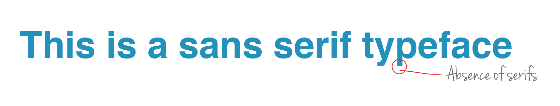
3) Sans Serif: Sans Serif can be easily identified as Sans-Serif by the conspicuous absence of the feet (sans means without). Sans Serifs are clean, well-spaced out and geometric, making them easy to read in large or small sizes. Sans serifs are very popular for headlines, bold statements and body copy. Key Characteristics: Approachable & to the point. Famous fonts in this category: Helvetica, Myriad Pro & Futura.

4) Script: Script typefaces resemble handwriting. They look amazing for logos & small headlines. The finesse and style reflected by this category of typefaces make the Brand appear elegant, while also connoting handmade or hand crafted nature of the Brand. Key Characteristics: Pally, personalised & casual. Famous fonts in this category: Zapfino, Brush Script & Pacifico.

5) Novelty: Novelty fonts are every other typeface whose characteristics do not fit into any of the categories above. They are used mainly for decorative purposes and create a definitive mood based on the look of characters. Avoid using novelty typefaces for large paragraphs of text. Key Characteristics: Fun & non-serious. Famous fonts in this category: Heartbreaker, Grinched & Ice Age.
Design needs Attention to Detail
The other day we stepped out for office lunch and went to our favourite pizza restaurant nearby. While devouring our pizzas and coke, we started casual conversation about this interesting wall backdrop (pictured above). We were completely baffled to notice numerous design mistakes coming from an international pizza brand. There are 9 things wrong with this backdrop and we'll list them all below...

The other day we stepped out for office lunch and went to our favourite Pizza Restaurant nearby. While devouring our pizzas and coke, we started casual conversation about this interesting wall backdrop (pictured above). We were completely baffled to notice numerous Design mistakes coming from an International Pizza Brand. There are 9 things wrong with this backdrop and we'll list them all below.
1. The Image is horizontally flipped by the designer (god knows why). This is evident once you notice flipped RayBan on his sunglasses. That could have been easily removed.
2. The lips are unnaturally dark. See the eyebrows. Makes us wonder - is the person a man or a woman? What's your guess?
3. The jacket that 'he' is wearing was blue and has been coloured red. Poor photoshop.
4. The whiffs should actually come from the Pizza he is running with. Right now, it is coming from the left of image.
5. Pizza delivery guys don't wear hoodies. And for this Brand, certainly not.
6. 'PHD' phrase that is written on his arm is also flipped, this time vertically. WOW.
7. The Pizza that he is running with is not even packed in box. We respect creative visualisations, but we can't see Pizza brushing against his underarms. Ewww. Probably, they didn't get time to pack it and order needs to be delivered now.
8. Neither the colour Red, nor this hoodie is part of the uniform.
9. The Index finger is not holding the Pizza, but is above it. Bad photoshop guys!
We wonder - why is he not delivering pizza on his bike?
Brand Architecture
Brand Architecture is an important strategic process in Brand Development. Brand Architecture, simply put, is the relationship between various Brands in an Organisation. It defines how should two Brands be related or be completely unrelated. Brand Architecture informs how should each Brand behave, how should they talk, what should they believe in and how do they Visually Express themselves. It maximises Visibility of every Brand in the Portfolio.

Brand Architecture is an important strategic process in Brand Development. Brand Architecture, simply put, is the relationship between various Brands in an Organisation. It defines how should two Brands be related or be completely unrelated. Brand Architecture informs how should each Brand behave, how should they talk, what should they believe in and how do they Visually Express themselves. It maximises Visibility of every Brand in the Portfolio.

Whether you are establishing your first Brand, or you’re big enough to Merge/Acquire another company or have grown to be Multi-Million Dollar Business with several Brands, Brand Architecture is important to you.
Scenario 1: You are starting your first business
Consider you are a budding Entrepreneur and have plans to start a new fine-dine Restaurant in the coming months. Subsequently, you also have plans to start a Sports Bar and a Themed Cafe.
A. You decide that all these 3 businesses should run as ONE Brand. They should all be built on same Values, have same Brand Name, Logo and Visual Style. Great. You will save on Marketing Expenditure and can leverage the Equity of already existing Brand Name. But, if you deliberate a little more, you’ll realise that all the three businesses will cater to different set of customers.
B. Hence, you may want to consider option B, where you’ll give each business its own unique Identity, unique Brand Name, Logo and Visual Style. Well, there are demerits of doing so as well. You’ll have to establish each of the Brands from the beginning. Investing so much of time and money may not be worth it. Here is where a Branding Agency comes in. By systematically analysing multiple parameters, you’ll be recommended if all or none of the future businesses should carry existing legacy.
Scenario 2: Your existing business is successful. Now, time for a new business. Or perhaps, a merger or an acquisition.
In such situations, Brand Architecture Strategy can help you in three ways:
1. Avoids Cannibalisation:
BMW 3 series doesn’t cannibalise sales of 5 Series because they are meant for different Customer Profiles. If you’re sporty and young, you’d go for the 3; and if you’re more of an Executive Class who is mostly chauffeured around, you know the 5 Series is your choice. This takes us to our second point.
2. Clarifies offerings:
Brand Architecture bring order and clarity to the portfolio. It can help Customers differentiate between two products of the same company (House of Brands) or it can help them identify two Brands of the same company (Branded House). This also helps Customers choose what they want. It is easier to decide between MacBook Air and MacBook Pro, as compared to two windows computers from HP.
3. Optimises expenses:
A clear and easy to understand Brand Portfolio helps Brand Owners to optimise Marketing spends on each Brand and control Management expenses that otherwise would have been out of proportions.
About The Brand Meridian Model:
The Brand Meridian Model is our Proprietary Tool that solves most complex Portfolio issues to help maximise business resources. It irons our any anomalies in the Portfolio whilst also optimising and leveraging Brand Equity. You can learn more about The Brand Meridian Model by writing to us.
Read more about Brand Architecture here.
If cars were people...
We love cars. A lot. We stare at them and they stare back at us. This may be Pareidolia, but we love to find meaning. Today, we've decoded some of our favorite cars and their distinct front character. Did you know that most car designers think this way before they start the sketch?...

We love cars. A lot. We stare at them and they stare back at us. This may be Pareidolia, but we love to find meaning. Today, we've decoded some of our favorite cars and their distinct front character. Did you know that most car designers think this way before they start the sketch?
Below are some of the most expressive cars. If you don't see human faces in the cars below, try squinting your eye, go far from the screen, keep staring at the 2D drawing.
Audi TT Coupe - Aggressive

BMW 5 Series - Proud

Chevrolet Cruze - Grumpy

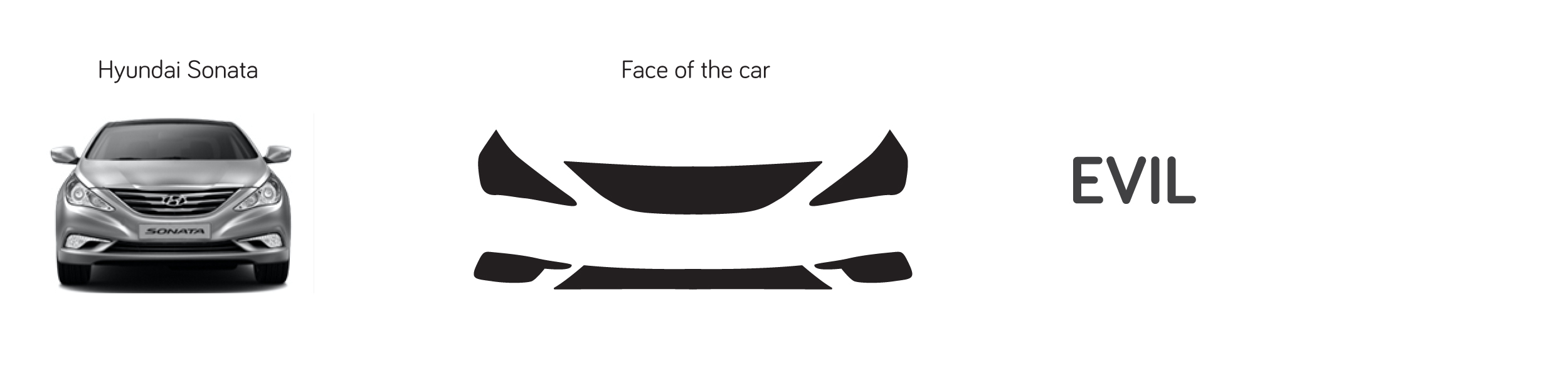
Hyundai Sonata - Evil
Mercedes S Class Coupe - Serious

Skoda Octavia - Content

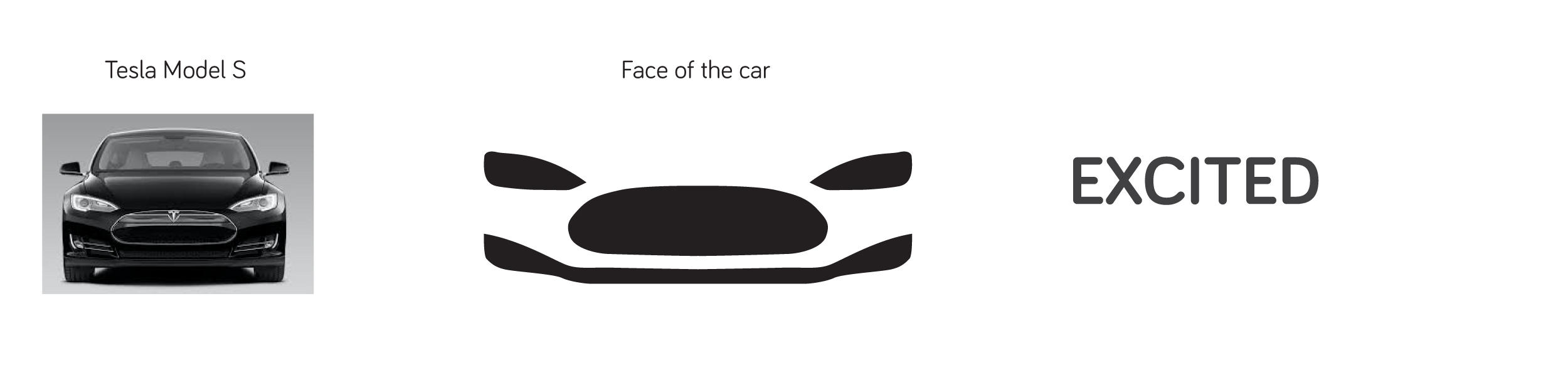
Tesla Model S - Excited
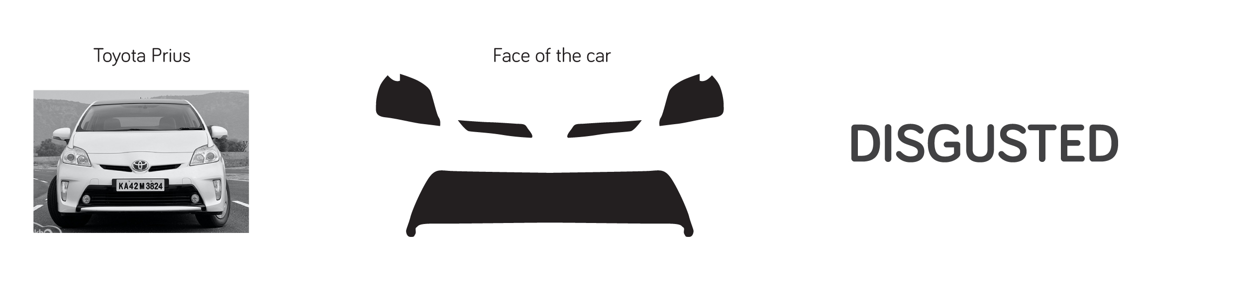
Toyota Prius - Disgusted
Types of Logos & their Uses
Broadly there are 3 types of logos. Before getting into that, let us take you through the fundamentals first.
Importance of Logo in your brand identity: A logo is the most important element of a brand's visual identity. It defines who you are and builds image of your brand. Believe it or not, human brains can sub-consciously determine whether to trust a company or not, just by looking at its logo...

Broadly there are 3 types of logos. Before getting into that, let us take you through the fundamentals first.
Importance of Logo in your brand identity
A Logo is the most important element of a Brand's Visual Identity. It defines who you are and builds image of your Brand. Believe it or not, Human Brains can sub-consciously determine whether to trust a company or not, just by looking at its Logo. This happens in the Limbic System of our Brain. A finely crafted & confident Logo can help create intended Brand Image and also create affinity.
A Logo is the simplest and most powerful tool of recall. And that's how we recognise Brands too. It has direct impact on a Brand's Recognition and its Recall. Brand Recognition & Brand Recall are important components of Brand Equity. A strong Logo and Brand Identity can actually increase the monetary value of your Brand.
Key pointers to bear in mind while you get your Logo designed
A. Keep it Simple: Keep the Logo simple and effective. Let it communicate everything in least possible strokes, lines and highlights. Get rid of the bevels, shadows, 3D effect, gradients and vignettes if they don't add any visual meaning to the Logo. Avoid stylish fonts that may hamper legibility of the Brand Name. The simpler the Logo, the more effective will be the Brand Identity. It is easier to recall Nike's Logo compared to Alfa Romeo's.
B. Make it Timeless: A Logo shouldn't be created following any trend or popular rendition style. Logos should be relevant for at least 5 years. It must reflect your business values. A Logo created on whims and fancies is merely an art. The Colour Palette and choice of Fonts should be defined by the values of the Brand.
C. Make it Scalable: All Logos should be designed with scalability in mind. Do consider future JVs and sub-brands - how will those be placed should they appear in future. You will also need to consider various applications of the Logo. It will appear as a favicon of 16 pixels and on large surfaces like billboards. It should look good on all applications.
D. Make it Meaningful: There is no merit in creating a Graphic Element that doesn't mean anything. Your Logo should mean something to you and to your Customers. Use Colours that evoke right feelings. Use fonts that project right Brand Image.
Okay, so now that we have covered the importance of logo and the DOs of creating an effective one, let's dive into the types of logos.
1. Typographic logo
Such logos are made up of simple typography without any significant graphics. It is preferred that you customise an existing font to create such Logos. Disclaimer: Never use an existing font as is. Give unique character to it. Examples: Facebook, Disney, Absolut, FedEx, Google & Visa.
2. Combination logo
Majority of Logos in the world fall under this category. These logos have graphical element beside the Symbol or within the Symbol. Examples: Taco Bell, Puma, Harley Davidson, NBA, WWF & MasterCard.
3. Symbolic logo
Such Logos have a symbol with no text. They start out as a Combination Logo. When the Brand becomes popular and known enough, they can drop the text and keep only the Symbol representing the Logo. Popular car brands are known for doing this, like Volkswagen. Twitter, Apple and Starbucks are the most popular examples here. Even Yellow Fishes' logo falls in this category.
Disclaimer: Your Brand will be able to sustain this Logo type only when
i) Your offerings are very different from the competition, and
ii) You've stayed with Combination Logo for long enough for your Customers to identify you with the Symbol only
Bonus
We appreciate you for reading this and we have 2 bonus points for you.
1. Ambigram: A logo that can be seen/read in exact same way from opposite directions. Yellow Fishes' logo is an ambigram- i.e. it will be read as same YF from two opposite directions. An ambigram logo can be made in Typographic, Symbolic or Combination Logos.
2. You can't please everyone with your Logo. Ask people for their opinions but keep the Brand Values as the lynchpin.
Brand Expansion - How to make a local brand global?
If you're reading this, our best guess is that your brand is doing well. Congratulations! And probably you're ready to grow outside the Geographical Limits - moving to another city, state, country or continent. This goes without saying that before finalising your next business location, you should have enough Customer and Market Understanding. And once you've finalised the location, you should be taking the following steps to make your brand a success in new markets.
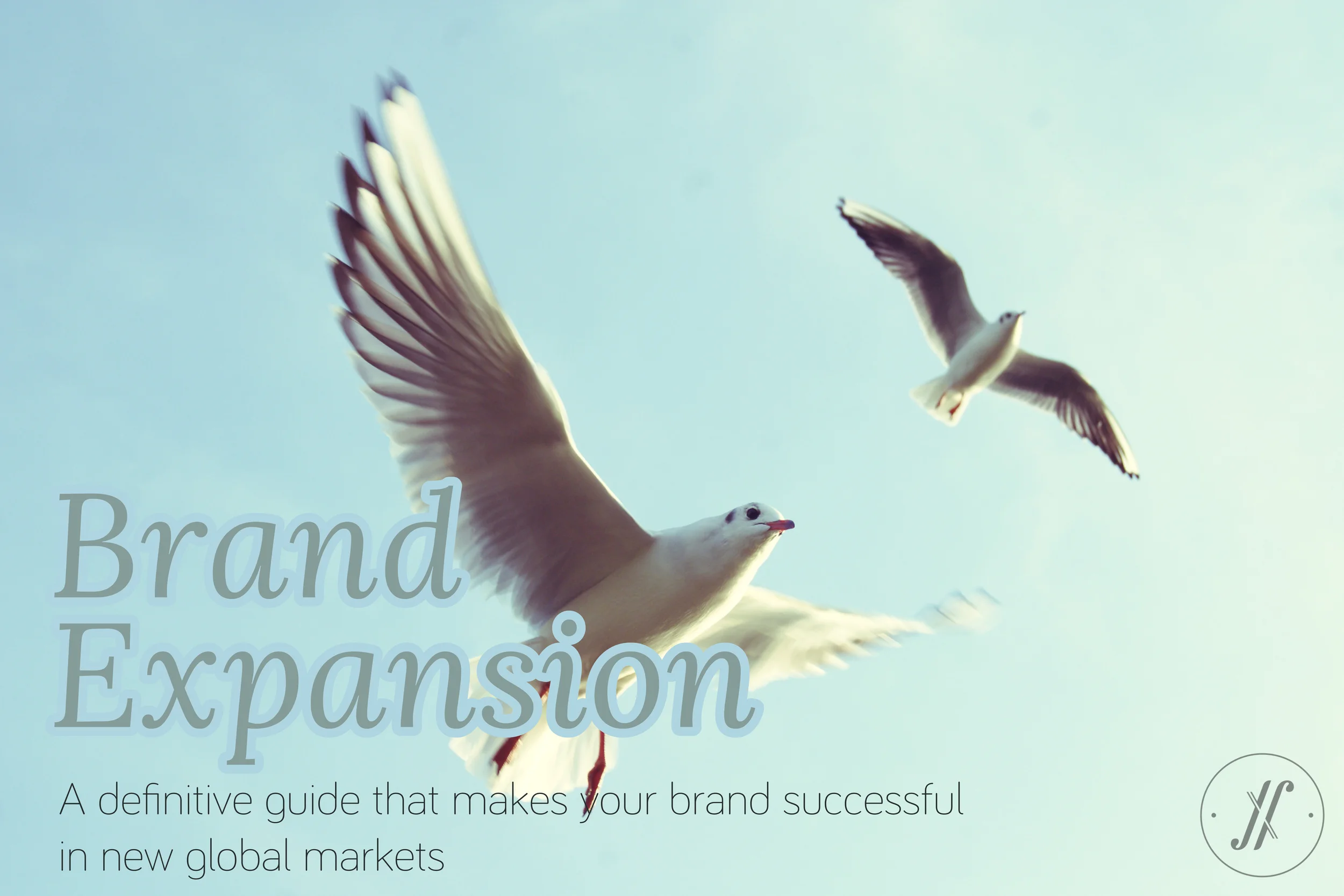
If you're reading this, our best guess is that your brand is doing well. Congratulations! And probably you're ready to grow outside the Geographical Limits - moving to another city, state, country or continent. This goes without saying that before finalising your next business location, you should have enough Customer and Market Understanding. And once you've finalised the location, you should be taking the following steps to make your brand a success in new markets.
1. Standardisation and Consistency
When you're expanding to new geographies, the most important thing is standardisation of Brand Experience. It doesn't matter whether you're a Retail Champion, a Restauranteur, a Fashion Label Owner, or a Service Provider. You stand for something today and you've spent time and energy in getting there. When you expand to new location, your Brand should continue to stand for the same Promise. Have the same taste in your Restaurant, same fragrance, lighting and ambience in your retail store, and same Business Values, Ethics and Principles. This is critically important and hence it is Numero Uno on our list.
2. Localisation Strategy
While expanding, staying consistent and bringing in Brand's own legacy is important. But, Brands should also adapt themselves to the local markets. This is best implemented in the Food Industry. Mc Donalds remodels and alters its menu for each country. Starbucks couldn't sell lot of coffee in China (because it is a tea-loving country). This led them to create a menu specific for that country - with loads of tea on offer. This applies to you too - no matter what your business.
This may appear dichotomous. Hire a Branding Expert to strike the right balance between "what to continue" and "what to change". In India, "Bata" - the Footwear Retail Brand is perceived so Indian, that now we have hard time believing it is an international brand, that too from Europe. Hyper-Localisation can ruin the Brand Imagery. And so does Franchise Model without strict Guidelines. Here, an outsider's POV is paramount. Branding agencies have best understanding of market and customers. Write to us if you're looking at entering Asian markets.
3. Distribution and Reach
Distribution is important for Product Brands. For a Product Brand to be successful, it needs to have significant reach in the new Geography. Customers should be aware of the Brand, what it offers and how it is different. So, in addition to the robust Supply Chain Management, you should also have good Communication Budget to announce your entry into the Market. You could do this with extensive Social Media Engagements also.
4. Research and Penetration
Once you're in the new market, you should continue to Research on the Trends, Beliefs, Aspirations of the new Market. The impulses & triggers to purchase a Product or buy into a Brand differs every 250 miles. When you introduce a Product specifically for new Markets, the Consumers are pleased. We often see this in car Market when country-specific Models are launched. They are very often successful, and are based on their Research and understanding of the Market needs. But, you could do it in any Category. Leverage your Brand, capitalise on your strengths and live upto your Brand Promise.
Recession and Brand Building — Put the pedal to the metal, when everyone else slows down.
In a car race championship, if you're trailing behind and want to win the race, what do you think you can do? Nope, accelerating won't help, because you're already pushing your car to its limits and so are all others. So, how will you win? Well, you can. Read on to find out how...
In a car race championship, if you're trailing behind and want to win the race, what do you think you can do? Nope, accelerating won't help, because you're already pushing your car to its limits and so are all others. So, how will you win? Well, you can. Read on to find out how.
Drawing a parallel to the business world, perhaps you have strong growth plans but the competition is doing better than you. Your company is hustling every day, your teams are giving in all they have got and your competition is still ahead. So, how will your Brand win? Wish there was Nitro in real world too.
If you want to take the lead and win in the car race, the only opportunity you have are the corners of the circuit — where every one will slow down. You too, have to slow down, but accelerate harder and quicker than others. That's your only chance. Don't miss it.
In business, if you want to be the industry leader, or start a new business — NOW IS THE TIME. Use this economic slowdown to your advantage. Everyone else around you is slowing down. Go Zag, when the world goes Zig. While they cut down on expenses with layoffs, you should be brainstorming on your next move, invest in Branding (the best time to do it), scale up your digital presence, revamp your website, build strong customer relations, plan diversification and international expansion of your business.
If you’re like us, you’ve always prided yourself on a particular process and/or a certain way of doing things. We immensely respect your commitment to who you are and how you work. But, unique circumstances demand unique responses. Don’t be afraid to adapt your perspective, shift processes, offer online ordering, and refocus on how your business can maintain cash flow and build momentum for the future. Who knows? You may find a new, profitable revenue stream as you adapt and shift your business that you can take with you long into the future.
The worst thing you can do is panic right now. Remember what got you here. Rest easy in that, while we don’t know how long things will be this way, it is temporary and there is a return to normalcy at the end of the tunnel. Understandably, we’re all refocusing and shifting to survive and sustain something none of us have really faced before. No one has all the answers, and “figuring this out” looks very different for each of us — but don’t panic. Take things in stride. Be open to change and new ideas. Be flexible with what you may have to do to sustain and thrive in the near term so you can sprint out of the gate when things return to normal.
Our only request is DON’T SLOW DOWN! Put the pedal to the metal. This is your only chance, until the next recession.
What does it take to be an entrepreneur?
"Everyone can be an entrepreneur. But very few truly are.”
To be an entrepreneur you need not have: - Money - Place to set up your office - A large team - Enough job experience Surprised? Don’t be.
If not these, then what do you need to be an entrepreneur?...

"Everyone can be an entrepreneur. But very few truly are.”
To be an entrepreneur you need not have: - Money - Place to set up your office - A large team - Enough job experience Surprised? Don’t be.
If not these, then what do you need to be an entrepreneur?
1. You need courage. And you must be full of courage. You should be willing to hustle every day of the year. Period.
2. Self-Motivation & Perseverance. No matter what the world thinks about your business- if you love it, keep going.
3. Trust your gut. This is a big one. Your gut will talk to you often - listen to it and act wisely. If you feel butterflies at 3AM just fantasising about your business - you will succeed.
4. Adaptability & Flexibility. Be willing to adapt. Be agile. Don’t overthink. If you make a mistake, accept and move to the second best alternative. You will hit quite a few walls in your entrepreneurial career, and its okay. Everyone does. Don’t be bogged down. Keep moving. Hustle. And lastly, “Don’t be afraid to start small. Every great company was once small, confined within a room."
Brand Association - Why do we associate with a Brand?
When you interact with products, be it your morning coffee to what phone are you using, how do you feel about it? You walk into a Starbucks for coffee or own an iPhone is because you want to be associated with these brands. They make you feel in a certain way. You trust them and its image appeals to you, it matches or exceeds your expectations and it doesn’t let you down...

When you interact with products, be it your morning coffee to what phone are you using, how do you feel about it? You walk into a Starbucks for coffee or own an iPhone is because you want to be associated with these Brands. They make you feel in a certain way. You trust them and its image appeals to you, it matches or exceeds your expectations and it doesn’t let you down.
Brand Association refers to particular impressions a Consumer has about the Brand. These impressions are imprinted by the marketers in our minds using associations that are memorable and strong. This helps one Brand differentiate from other competing Brands. To my mind, Samsung has a stronger association with colour Blue, even stronger than Microsoft. These associations take shape over a period of time by all forms of communication like Advertising, Promotions, and more. It is the Brand Image that differentiates one Brand from another in the eyes of the Consumer. Brand Image is the overall impression in Consumer’s mind that is formed from various associations. Brand Association is not a factor of Sales or Market Share, but it sure is a factor of memorability or Brand Recall, like they say. For example, some feel Apple's MacBook is a better brand as it exceeds expectations. On the other hand, some feel Samsung is a better Brand as it is simple and affordable. They both appeal to different mindsets. And appropriate Associations are pushed by the Brands to appeal to right Benefit Groups. While both the Brands appeal best to its Consumer Classes equally- which is a better Brand remains debatable. When a Consumer buys a Product or a Service, s/he is not only paying for the Product or Service but is also paying for the Brand Image and how s/he associates her/himself with the Brand.
I associate with Burberry Body perfume as it gives me the sense of exclusivity and it carries an elite image. The fragrance is just different from any regular one. May be its just my perception. But, I feel so.
Ask yourself, why do you associate with your favourite Brand?
Article contributed by - Ashni Shah, Marketing Team, Yellow Fishes
Do you need a Branding Agency?
You may wonder why does your company need a branding agency? You are doing just about fine, or better you could be surpassing expectations. So, why fix something when it is not broken? You shouldn’t. But, remember branding is as much about building as it is about fixing...
You may wonder why does your company need a Branding Agency? You are doing just about fine, or better you could be surpassing expectations. So, why fix something when it is not broken? You shouldn’t. But, remember Branding is as much about building as it is about fixing.
You may be wondering that you have an in-house Design team or a pool of freelancers who can do a fair job, so why hire a Branding Agency? Well, Design is not a commodity, nor is Branding done on whims. Brands are built on Promises and Experiences (the whole wide world of Branding can be deciphered in these two words)- you need to Identify what your Brand is Promising to its Customers or what it can/should Promise and then translate that Promise Visually and Verbally into Brand Experiences across touchpoints.
A Branding Agency understands your Customers better. You may have Marketing mavericks who are well travelled and have multifarious background but they are in most cases restricted by their own views of Marketing Strategy and Aesthetics. Branding Agencies specialise in defining the Core of your Brand and translating them into Brand touchpoints. A Branding Agency sees your Brand in ensemble, beyond a deliverable like Identity Design, Positioning, Communication Design or Verbal Identity.
You must talk to a Branding Agency about your company’s Branding if:
1. Your company is an SME and have big Aspirations
2. Your BHAG is daunting
3. You want to grow your Market or Market Share
4. You want to build a stronger Brand
5. You have a superior Product or Service but your Customers don’t know about it
6. You're growing and want to perceived differently
7. The vision of the Brand has evolved and matured
8. You have just started your business, or starting up
We’d love to hear from you, please write in to us hello@yellowfishes.com
Brand strategy is the key to effective marketing.
Branding preceeds all marketing and communication. Infact, defining a brand should be the first step in any marketing strategy. To define a brand, a branding agency needs to study and understand the market dynamics, category trends and consumer behaviour...
Branding defines. Marketing communicates.
Branding preceeds all Marketing and Communication. Infact, defining a Brand should be the first step in any Marketing strategy. To define a Brand, a Branding Agency needs to study and understand the Market Dynamics, Category Trends and Consumer Behaviour. Once the Agency is acquainted with the Dynamics, the next step is Analysis of the Data and closer look at the Competition to see what they are doing best and what are the learnings. Brand Positioning is not about identifying an empty spot in the Market and pitching in the Brand there, it’s about owning one-something that your Brand can stand for and leveraging that. The next step is translating the Brand Positioning and Proposition into Visual Language and Verbal Language of the Brand. Hereafter, it’s a two-pronged Approach. One is to maintain Consistency in Visual and Verbal Languages (for Recall and Recognition) and the Second is to create enough Variations in Visual and Verbal languages so there is no monotony in the Marketing of your Brand.