Decimal
Identity & Packaging Design // Beverages, Health Shots

Brand Name: Decimal
Sector: Food & Beverages
Brand Reach: UK, France & Spain
Services:
Brand Strategy & Brand Personality
Brand Storytelling
Logo Design
Brand Identity Design
Packaging Design
Brand Identity Guidelines
Communication Design
A niche category with few brands (RTD Health Shots). In a market that is highly evolved (Western Europe). For the discerning consumer set (the health-conscious). We’re then looking at a really small aperture.
For such a small market size, we set out to build a meaningful brand.
The Brand Strategy: Steering away from mainstream mediocrity
Since the category is so niche, the messaging, brand story and purpose needed to be crystal clear - to draw in new customers. We started by creating a strategic framework of branding strategy to communicate the brand’s offerings and positioning in a meaningful way. This would inform the name, logo & identity and packaging design to bring the brand to life.
Finding an unoccupied market position: We held discussions with young western europeans across 3 countries, to determine how we could best disrupt the functional shot category. Our dipstick revealed a market gap between low-status RTDs and pricey imported Japanese/Korean/American shots.
By first creating a blueprint of brand strategy, we tapped into why and how the customers drink health shots. Yellow Fishes helped unearth a number of insights around: how the shots are consumed, where they consume it, importance of ingredients, its flavour, and profile. It’s about the experience a brand is promising — not just taste, functionality and type, and that’s what the brand would need to deliver.
The Brand Name: Decimal
The thought and ideology behind the coined name is simple and metaphorical. When reading the value of Pi, we slow down after the decimal 3.141592… and start to pronounce each number individually. Or when reading 97.32 we would say ninety seven point three two.
It sloooows you down, makes you mindful. It’s a small pause. One that you can’t ignore. It has immense significance. It is small (50ml), but has a mighty purpose. Decimal health shots are pictured to be the daily pause, that adds meaning to life. A pause that makes you better & more mindful. It is the daily Pause that adds meaning.
The Logo Design: Utter Simplification
I guess we’ll let the animation do the talking first.
Packaging Design:
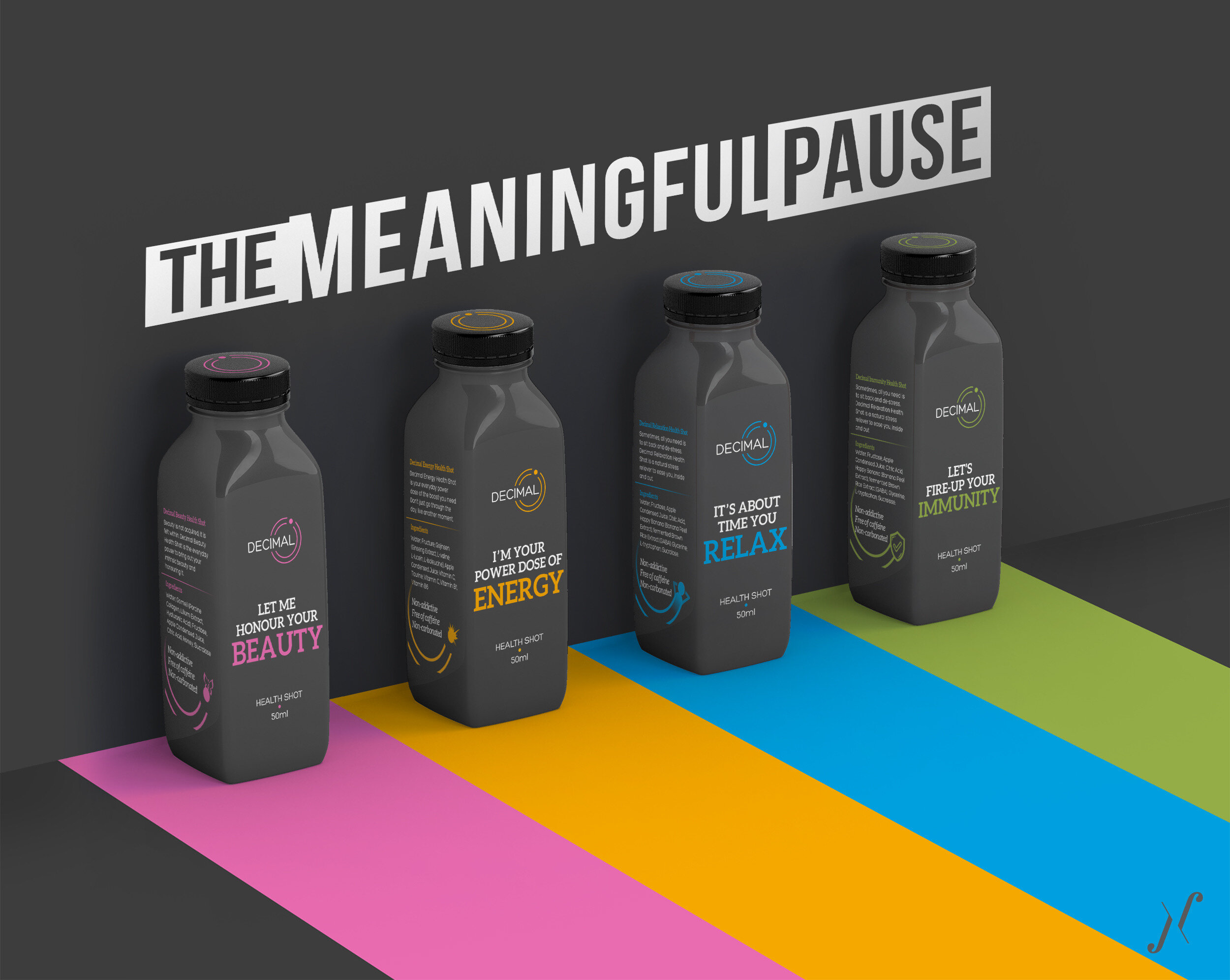
The brand team had an interesting mix of personality characteristics. There were some who were fun and cheerful, and some were very articulate. But everyone loved to talk. The denominator of these personality attributes were baked into the Brand Personality. The result is a Packaging Design that talks, in a fun tone.
And figuratively speaking, sometimes, you should say less to say more. That’s what we let the packaging do for the brand. Simple, minimal and to the point. The design communicates the premium quality and scientific lineage, while delivering on its authentic and spirited brand personality.
The playful graphics in communication lent the brand sociability and attitude.
To create clarity and simplicity for consumers, the variants are aligned with their respective positioning & product functionality. The Design Platform we crafted affords Decimal the freedom and flexibility, for future brand extension. Although simple, the brand’s identity effortlessly communicates its desire to provide only what is necessary.
Decimal is now starting to disrupt the entrenched attitude of the European functional shots industry. The brand experience is slowly shifting consumer perceptions. We feel this was yet another example of a successful category shake-up. But the best proof of success was the addition of a new flavours within few months.
Love our work?
SIMILAR CASE STUDIES
Auric
India // Brand Strategy, Naming, Logo, Identity & Packaging Design
Rostaa
India & Middle East // Strategy, Logo & Packaging Design


