Rostaa
Identity & Packaging Design // FMCG, Nuts, Dried Fruits

Brand Name: Rostaa
Sector: Packaged Food & Beverages
Brand Reach: India
Services:
Brand Strategy
Brand Identity Design
Brand Visual Expression
Brand Storytelling (Tone of Voice)
Photography Direction
Packaging Design
Communication Design
Ongoing Brand Building Support
Rostaa is a young Dried Fruits & Nuts brand that is globally recognised as a major player in the category. It is also India’s largest brand in organised sector of the market. From its humble roots in Mumbai, Rostaa has grown manifolds in less than 6 years. It has very high reach across India and some middle-east markets through its flagship stores and tie-ups with modern retail outlets. However, they envision a future broader than dried fruits and nuts, by de-commoditising the market and becoming a lifestyle brand present in every household.
The Brand Strategy:
Before we started the engagement, Rostaa was communicating multiple benefits - quality products, great taste, health benefits and all natural ingredients. We believe that more a brand talks, the less it is remembered. And a brand is made stronger when it narrows its focus. That’s exactly what we did for Rostaa. After extensive market audit, and customer interactions - we created a strong, relevant and scalable Brand Strategy that pins the brand around 2 key promises: Taste and Health. The other two promises of Natural Ingredients and Quality products formed the second line of communication - being industry hygiene.
We believe, a strong brand is what communicates its message effectively and promises exactly what it delivers to customers.
Building on this strategy, we cleaned up the logo unit. By doing away with the tagline first, we reduced visual weightage of the symbol against word mark and rotating it just a bit - adding dynamism and movement to the logo unit. The word mark and the symbol are now in golden ratio to each other. The new tagline ‘Harvested at its best’ make the brand story vocal.
Creating New Line of Products:
We created a range of Quinoa Packaging - that although simple, works very effectively on the shelf. The smart juxtaposition of the quinoa grains with the cooked dishes stoke imagination and aspiration. The health claims are depicted in simple and direct manner.
The packaging of Quinoa have been designed keeping in mind the consumer attitudes, beliefs and perception of the category.
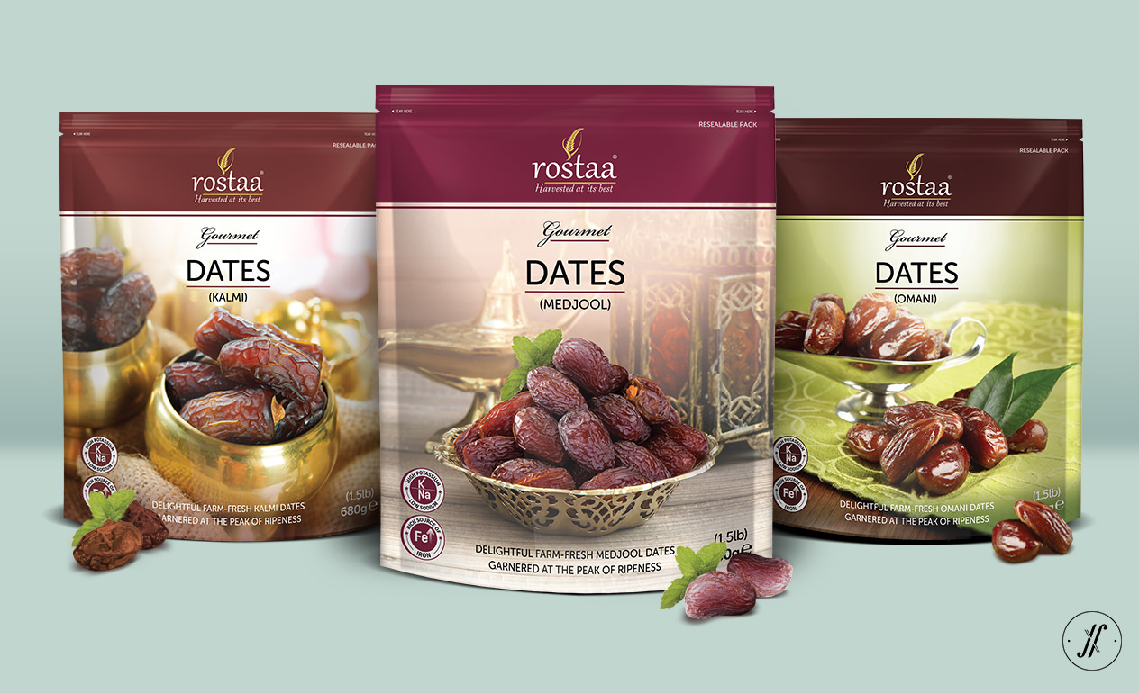
Alongside creating Quinoa products, we also helped the brand introduce new products on the market including Almond Butter, range of Dates packaging and Seeds line called as Healthy Essentials (with differentiated architecture).
Harmonising the existing line of products:
The subtle, deliberate shift in packaging design added maturity to Rostaa. The obvious changes include - enhancing the product shots, refining the colour palette, and inclusion of health claims on the front of packs.
We believe small, inconspicuous details make a world of difference. Therefore, while reinventing the packaging range, we also made the following tweaks (i) we made sure that logo symbol won’t be cut while tearing open the pack, (ii) Gourmet is written in more legible typeface, and (iii) each class of product gets its own architecture.
The Back of Pack details out health benefits, in schematic Tone of Voice that is consistent across the range. A quality icon seal that goes on the back side of each packaging reinforces the product benefit - as second level of communication.
We are continuing to rejuvenate the brand's entire line of packaging.
The Communication Campaign:
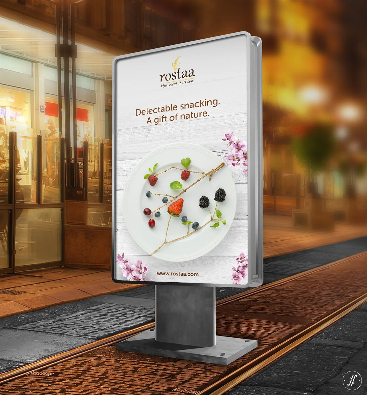
We also designed a series of advertisements for large scale media - communicating Brand Promise of health and taste. The thoughtful food art makes for an effective narrative, allowing us to express in deeply memorable ways. The art-direction of the photoshoot was done with a very specific objective - to create communication that smartly communicate the Brand Promise.
In the following months, new advertisements will be released across major markets with the Brand Ambassador - who is better known as Miss Universe India.
Very recently, Rostaa has been awarded as India’s Most Promising Brand in Food Category. We think the brand is now at a compelling beginning of its journey to become the global leader.
EDIT: We've been closely working with Rostaa for the past two years and have grown the yoy revenue by 82%.
Client Testimonial:
"A great, smiling team at the top of their job. Yellow Fishes is the perfect balance of Strategic thinking and Creative execution.
I value their approach to designing backed by insightful Secondary Research and Primary Dipsticks. The design possibilities they present are so good that it often makes the decision making difficult."
Zeeshan K.
VP Operations – Rostaa, Royal Dry Fruits Pvt. Ltd.
Let’s work together
Similar Case Studies
Dabroh
Packaged Food & Beverages // Brand Creation
Day Healthy
Packaged Food & Beverages // Brand Creation


