Auric
Naming, Identity & Packaging Design // Beverages

Brand Name: Auric
Sector: Food & Beverages
Brand Reach: India
Services:
Brand Strategy & Brand Personality
Brand Naming - Let’s go Fishing
Logo & Brand Identity Design
Packaging Design
Brand Storytelling
Brand Identity Guidelines
Communication Design
Website Design
Social Media Management
Making Ayurveda relevant today
With innumerable brands promising Ayurveda, having fuddy-duddy personality - how do you build a brand that is relevant and contemporary?
Auric is a new Indian beverage brand that is looking at revolutionising the Food & Beverages industry. We set out to build this brand with a unique approach. Our engagement started in mid-2017 and what a journey it has been!
Auric’s foundation is centred around 21st century lifestyle problems - polluted air, little time for exercise, and not enough good food choices. On top of that, there are too many contradicting notions about health foods. With various diet trends coming in, how do consumers know which one is right for them?
Creating a new category of beverage
We crafted Auric to disrupt the beverages market and Ayurveda industry. A beverage, so well-made that you can’t find faults with it.
Auric’s ethos was identified as Empowering people to lead a healthier life. In line with this ethos, the 3 variants Mind Rejuvenation, Body Defence and Skin Radiance, deliver a comprehensive solution for those looking at holistic health. Contemporary Ayurveda, crafted for our 21st Century Lifestyle.
The Brand Name — Auric
We generated over 1250 name possibilities at our proprietary Naming Workshop - Let’s go Fishing to arrive at the perfect brand name. Inspired by the words ‘Aura’ and ‘Aurora’, describes the mystical beauty of the nature & its divinity. The name Auric also hints at the chemical name of Gold in Latin. It depicts the ‘trivalent form’ of Gold (meaning formed of 3 atoms) - signifying Mind, Body & Soul. There can’t be a name more befitting than this.
The Symbol — Unique in meaningful ways
The Logo Symbol represents an artistic version of the Celtic Symbol of the ’Tree of Life’. Being nature inspired, it strongly communicates the Ayurvedic Science and many facets of it. Smart internal divisions create 5 leaf-like forms symbolising 5 human senses.
Typography — Handcrafted. Inherently Distinctive.
The custom-created typeface has curved terminals and sharp edges denoting the Brand Personality to be bold & edgy, yet friendly and empathetic. The typography is inspired by nature, which is subtly cued by the leaf-like terminals of the letters.
Logo Unit — Gold and all Bold
The interplay of the positive and negative spaces in the symbol produce a life-like form sitting in a meditative posture while subtly creating the likeliness of a lotus - quintessentially Ayurveda.
The colour of the symbol is derived from the brand name; thus represented in various shades of gold. The Gold Symbol and Grey Word-mark complement each other well, as they are in perfect contrast; giving each other adequate visual space and navigating visual attention. They harmoniously create a strong Visual Identity of the brand - a modern spin on the traditional art of Ayurveda.
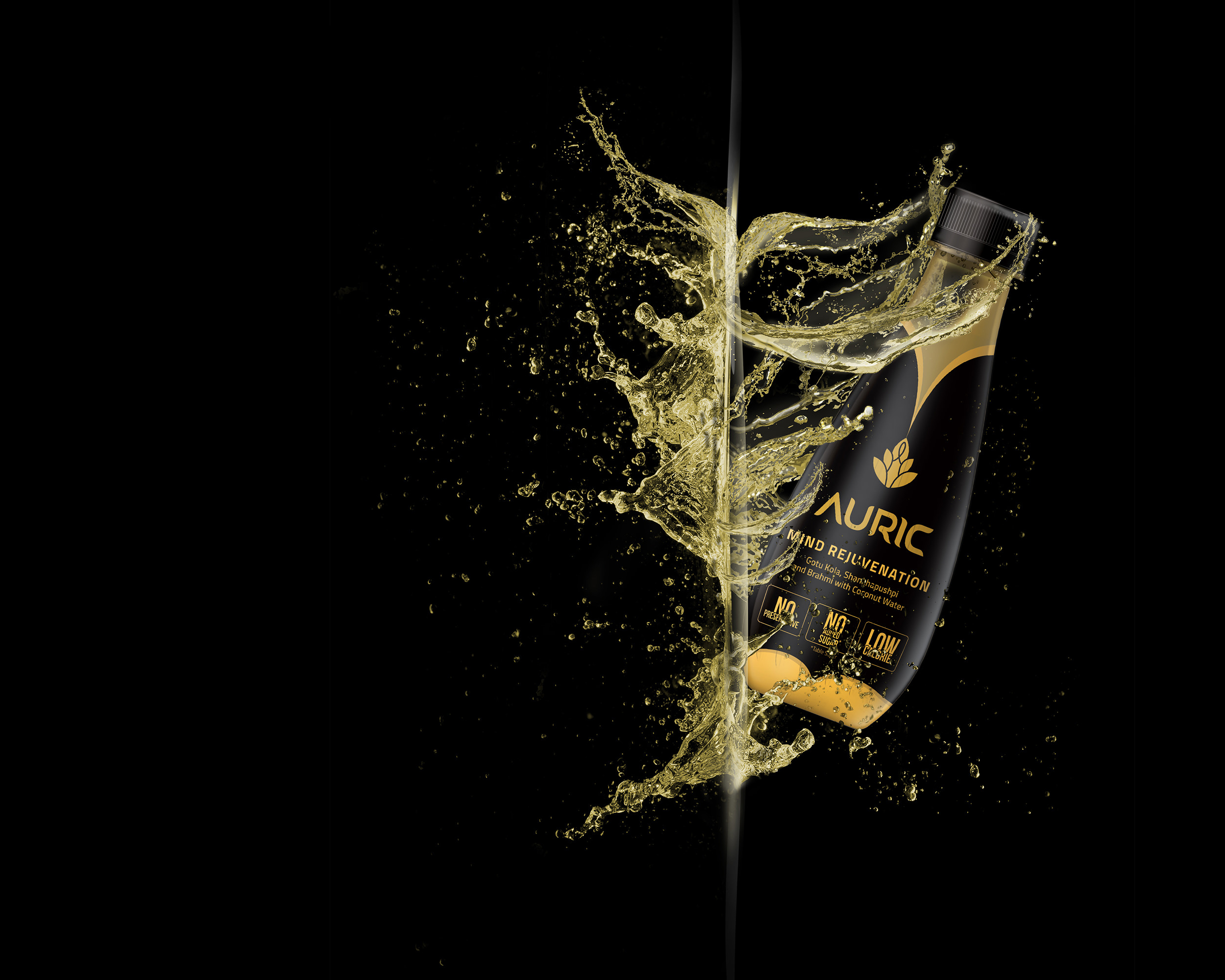
Bottle Structure Design — A health potion
The unique bottle shape defines what it means to have “health in a bottle”. We brought in subtle cues from the ancient health potion bottle. This stimulating bottle structure is steeped in tradition, while incorporating contemporary style and lightness through the smart use of transparency.
Packaging Design - Simple. To the point.
The wrap-around sleeve label adds magic to the potion bottle by bringing in vibrancy, depth and colours. The ensemble becomes a distinct signature that underwrites the brand promise. The packaging design - both bottle and label establishes the brand as a true icon of Ayurvedic conviviality.
We are closely working with Auric right from inception of the idea - defining every aspect of the brand. In fact, our association with Auric is so close that we even went on to manage this brand on Social Media and shape up its digital presence.
Read more about Auric’s social media journey on Strongly Positive and check Auric’s Instagram page.
Auric successfully launched in October 2018 and has proven to be nothing short of a marvel for health enthusiasts. The Auric experience is shifting consumer perceptions; and how they see Ayurveda. They are uniquely crafted, bottled goodness of nature.
It is the World’s First Beverage for Mind, Body and Skin. Powered by Ayurveda. And Yellow Fishes.
Client Testimonial:
The entire journey from google searching branding agencies to brand development work of YF had few things in common - great customer service, commitment on quality & time and most importantly - letting the heart do the talking. The entire approach to brand development was methodical and scientific with appropriate inputs from consumers to testify hypothesis.
After Auric brand has been in market for last 4 months, I can confidently say it is the best name with great recall value. The packaging does stand out on the shelves and in the minds of consumer. The objective of building an Ayurvedic, yet not-so-Ayurvedic brand was done justice through and through. The design capabilities & sensibilities of finest team ensured that the thought is well executed. Thanks for helping Auric to bring its personality out.
Deepak Agarwal
Founder & CEO, Auric
Let’s collaborate?
SIMILAR CASE STUDIES
Rostaa
India & Middle East // Strategy, Logo & Packaging Design
Day Healthy
Packaged Food & Beverages // Brand Creation


