Queen of India
Brand Identity Design // Restaurants, Fine Dining

Brand Name: Queen of India
Sector: Hotels & Restaurants
Brand Reach: Saudi Arabia
Services:
Brand Personality Definition
Logo & Brand Identity Design
Brand Storytelling
Menu Design
Packaging Design
Brand Identity Guidelines
Website UI Design & Communication Design
Delighting the Middle East with Finest Indian Cuisine
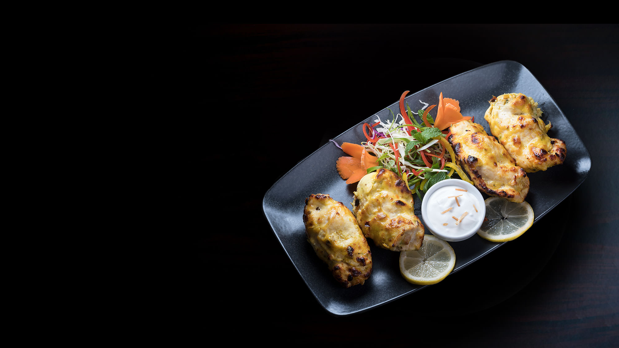
Queen of India is one of the most popular restaurants in Al Khobar, Saudi Arabia; specialising in Indian (Mughlai) Cuisine. The decade old restaurant brand is particularly famous for its Gourmet food and Indian hospitality. With tall aspirations, Queen of India was all set to redefine the brand and sharpen its positioning.
The Brand Rejuvenation entailed articulating Brand Personality characteristics, refinement of logo, developing a high-recall Brand Identity and creating a truly memorable experience for its customers.
Crafting the logo
Once the Brand Personality was defined and articulated in clear, meaningful words - the Brand Team & Yellow Fishes team worked to express the Personality in the logo & Identity. It was evident that this rejuvenation won’t be a minor enhancement to the logo, but a complete overhaul (in line with the Personality).
Queen of India Wordmark was created in great detail to express the gourmet presentation & finesse of the brand.
The lotus flower represents wealth, Indian heritage and flamboyance - befitting the fine dine restaurant brand.
Being a long brand name, Queen of India word mark sits better when stacked. After thorough research and numerous variations in the colour selection stage, we decided on this perfect shade of deep red and gold. These two shades are derived from the colour of Spices (quintessentially Indian). The contrast of the colours add a dash of premiumness of the brand.
The symbol and word mark (with stylised letter “f”), pronounces gourmet quality, great taste and Indian hospitality.
The Visual Language was designed around Spices. Globally, Indian food is synonymous to Spices - there isn't any stronger marker to represent India.
The New Brand Identity was then announced to the world being used on myriad of applications - all unified and purposeful.
Distinct elements in the visual language and realistic depiction of the food convey the image, impart vitality, and facilitate understanding of the offering. The interplay of elements subtly highlight the messaging and convey interactivity between the brand and its consumers.
This aesthetic integrity of the rejuvenated brand represents how well its appearance and personality integrate with its offering.
Client Testimonial:
We are very impressed with the design output and whole design process was nothing less than exceptional. Yellow Fishes excels at really listening to the client needs, and translated that to create something that everyone throughout the organisation has been impressed with. Truly professional, a huge talent and would highly recommend their services.
We would work with them again and again, in a heartbeat. Working with Yellow Fishes is a breeze.
Mohammed Liyaqhat
General Manager, Queen of India
Love it?
Similar Case Studies
Poetry
India // Logo, Identity Design, Menu & Communication Design
8 food
India // Brand Identity, Packaging & Menu Design


