QUE
Identity & Packaging Design // Beauty, Cosmetics, Skincare

Brand Name: Que
Sector: Health & Beauty
Brand Reach: Europe
Services:
Brand Personality Definition
Logo & Brand Identity Design
Brand Storytelling
Packaging Design
Brand Identity Guidelines
Communication Design
The Foundation of Beauty
With countless brands promising “Perfect Beauty” - how do you build a brand that actually delivers it?
Que is a new British luxury brand that is looking to create a strong mark in the beauty industry. We set out to build the brand that meets wide variety of simple, advanced and niche consumer requirements. The European beauty customer is evolved & well-travelled. And Que heightens their delight by providing a sense of beauty that is obvious and intrinsic.
The Divine Proportion (Φ)
Metaphors are strong communication methods that express with sheer simplicity. Golden Spiral is the perfect metaphor for Beauty. It is the Divine proportion. A golden spiral can be progressively constructed by forming several golden rectangles, infinitely. It is a solid foundation of geometric symmetry - that can be seen in Botany, Meteorology, Architecture and Art. The concept of Golden Ratio (Φ) & Golden Spiral has been understood by Ancient Mayans and Greeks in 2000 BC. It is not a concept that is created by humans, but understood & admired.
It is the ultimate accord of the universe — the perfect symmetry. And this (the metaphor of beauty) becomes a strong visual element for Que.
Design Principles
Translucency is the basic building block of the unique design and packaging system; where the packaging is largely defined by the Fibonacci spiral.
Taking simple Geometric solids to form the packaging that is translucent — inviting the consumers to pick up the product. The beautiful interaction of light and shadow gently whispers the unadulterated luxurious experience that the brand offers.
A very consistent packaging architecture allows for familiar experience and paradigms.
Throughout the brand communication, the language of Golden Spiral is strong & lucid, dominating colours are bold & appropriate; and sharp focus on product functionality informs the design.
Client Testimonial:
Yellow Fishes team is highly skilled, creative and versatile. They demonstrate a high level of Design and Branding Methodology all through the project. They are adept in every role from building Product Brands to Strategic Communication Development. The one thing that sets Yellow Fishes above every other Branding Consultancy is that they go beyond the brief, identify the unsaid requirements and deliver nothing less than the best. Their execution process, too, is excellent; they are innovative, highly professional and proactive.
It was indeed a pleasure to have worked with the team so open-minded and responsive.
Mohit M.
President, MWH.
Let’s build your brand
SIMILAR CASE STUDIES
Naturma
India // Brand Strategy, Logo, Identity and Packaging Design
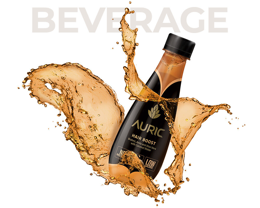
Auric
India // Brand Strategy, Naming, Logo, Identity & Packaging Design


