Naturma
Brand Identity & Packaging Design // Skincare, Beauty

Brand Name: Naturma
Sector: Health & Beauty
Brand Reach: India
Services:
Brand Audit
Competitive Analysis
Brand Strategy
Brand Storytelling
Logo & Brand Identity Design
Packaging Design
Brand Identity Guidelines
E-commerce Website UI Design
Turning Skin Care category on its head
If you add up Organic + 100% Natural + 100% Vegetarian + Women Empowerment + No Animal Testing; the number of beauty brands you’d end up with will be only a handful. And you'd also note that 'Natural Cosmetics' is a healthy growing category with strong consumer affinity.
But, things get tricky for consumers, when you also factor in numerous brands that sell "somewhat-natural" products. If there was only a way to jump past the established (not-so-natural) brands and deliver something genuine, honest and pure; something that consumers care about. That’s exactly what we set out to do with Naturma.
Mother. Nature.
Naturma (Na-toor-ma) is a contemporary, all-natural brand that promises greater-good for all humanity. After extensive consumer research and category immersion - Yellow Fishes revealed uncharted paths, shedding new lights and future opportunities for the brand. We identified that consumers drift towards conventional (synthetic) cosmetics because of higher efficacy and bold claims. Natural cosmetics industry on the other hand, were too busy communicating that they were natural; missing out on the benefits and efficacy of their products. We created this sophisticated brand to drive a premium appeal and strongly connect with the consumers.
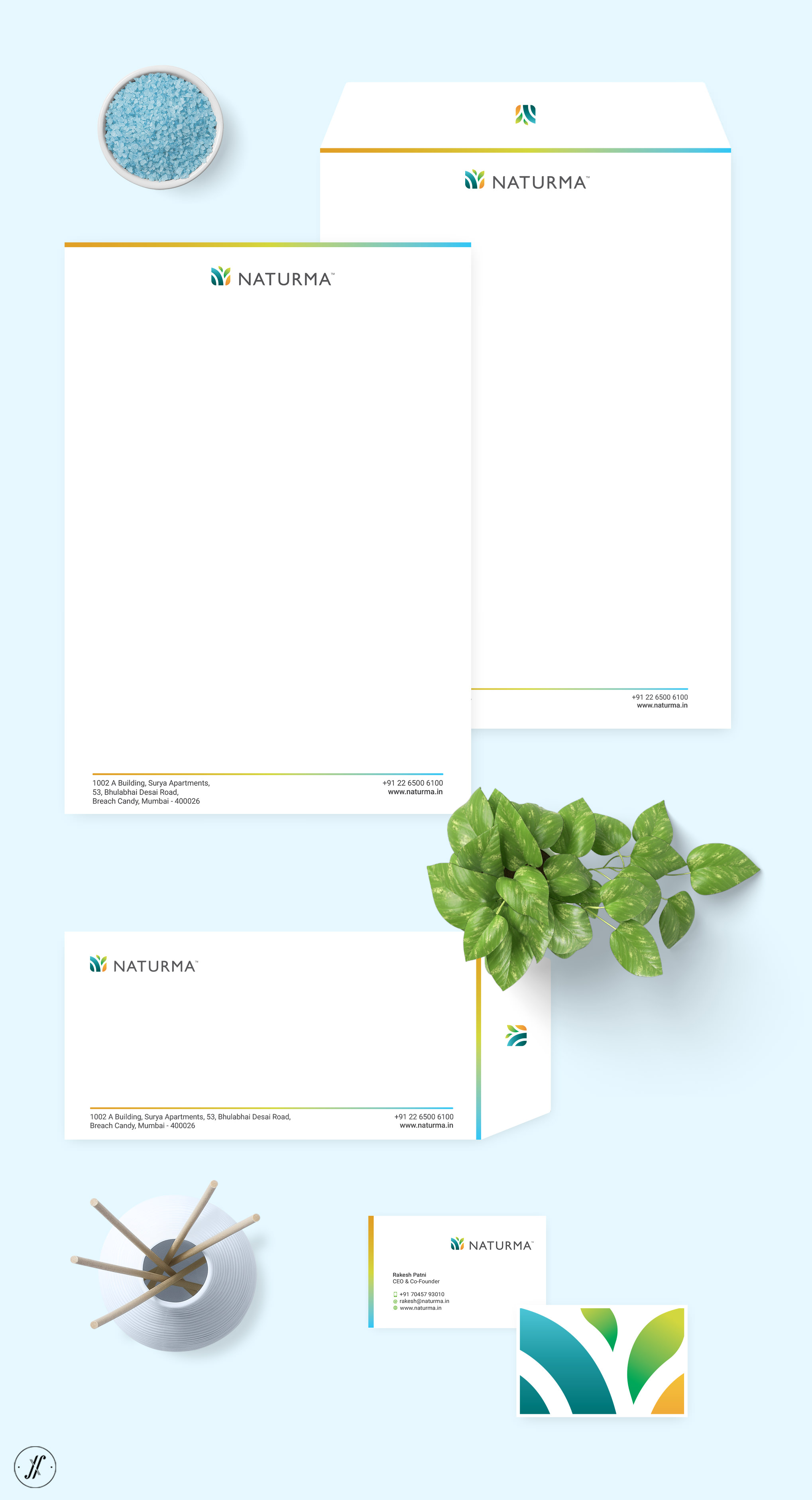
The logo is made up of essential nature elements - that support life. The simple and ingenious logo form allows for a unique narrative and inspires consumer interest in the brand.
Naturma Wordmark was also created in great detail to express the distinctive flair of the brand.
Simply Natural. Naturally Simple.
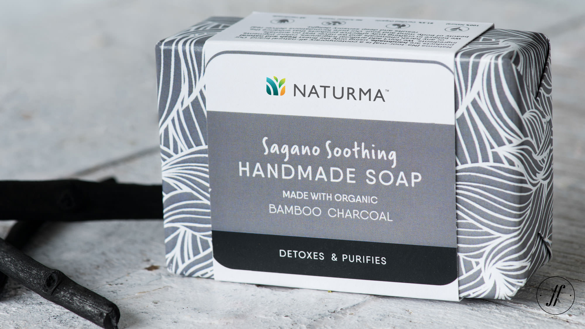
To create clarity and order for consumers, we devised an architecture system across the entire range that was inherently simple. On the packaging, well-deliberated Visual Hierarchy communicates all the things, in the right order.
The Brand Strategy and Positioning informs the packaging design in meaningful ways. The packaging design concept of “magnified nature” draws the consumer into the product and helps establish trust. Nature after all, is intuitive to all. The design communicates the premium quality, authentic ingredients, and presents a visually stunning experience.
This cohesive Packaging Design system was then expanded to all 50 products, ultimately crystallising the vision of the brand to the world.
The result is an invitingly modern, and complete visual identity that feels refreshingly natural. The brand has started gaining good consumer base and you should be experiencing this brand soon - taking the category on its head.
Client Testimonial:
Yellow Fishes have been working with us for the past 6 months from inception to launch - creating a Brand Identity that included, Logo Creation, Packaging Design & prototyping to Web Design. In Yellow Fishes, we have found an honest, sincere, hard-working and very insightful partnership. There was a two-facet process that made them unique - not only were they able to translate our ideas and views into cutting edge design but they also helped us shape our own vision and carved a unique brand for us based on our values and belief system. Thorough research and sound brand vision, based on their Proprietary Brand Strategy Tool (The Brand Anchor Model), provided a solid foundation on which all else was built on; the process was very structured and well thought out. Look forward to working with them again.
Rakesh Patni
CEO & Co-Founder, Naturma Life LLP.
Let’s build your brand!
Similar Case Studies
Que
Europe // Brand Strategy, Logo Design, Packaging Design
Iryasa
Singapore & SEA // Strategy, Naming, Identity & Packaging Design


