


Pertue
Brand Identity Design // Cafe, Cake Shop, Restaurant
Brand Name: Pertue
Sector: Hotels & Restaurants // Pâtisserie
Brand Reach: India
Services:
Brand Identity Design
Brand Visual Expression
Ongoing Brand Building Support
Indulging in Sweet Artistry
From the outset, it was evident that Pertue was no ordinary pâtisserie. The founder, Arshia, sought to create a brand that would elevate the dessert experience in Mumbai, captivating the senses and making everyday a celebration.
Much like the craft of pâtisserie itself, the branding process for Pertue was a delicate dance between creativity and precision. Yellow Fishes immersed themselves in the world of desserts that defines true culinary artistry. The agency distilled the essence of Pertue, capturing its spirit in a brand personality that exuded joy, passion, and a touch of whimsy. This essence was then translated into a visual identity that would captivate the senses and ignite the imagination.
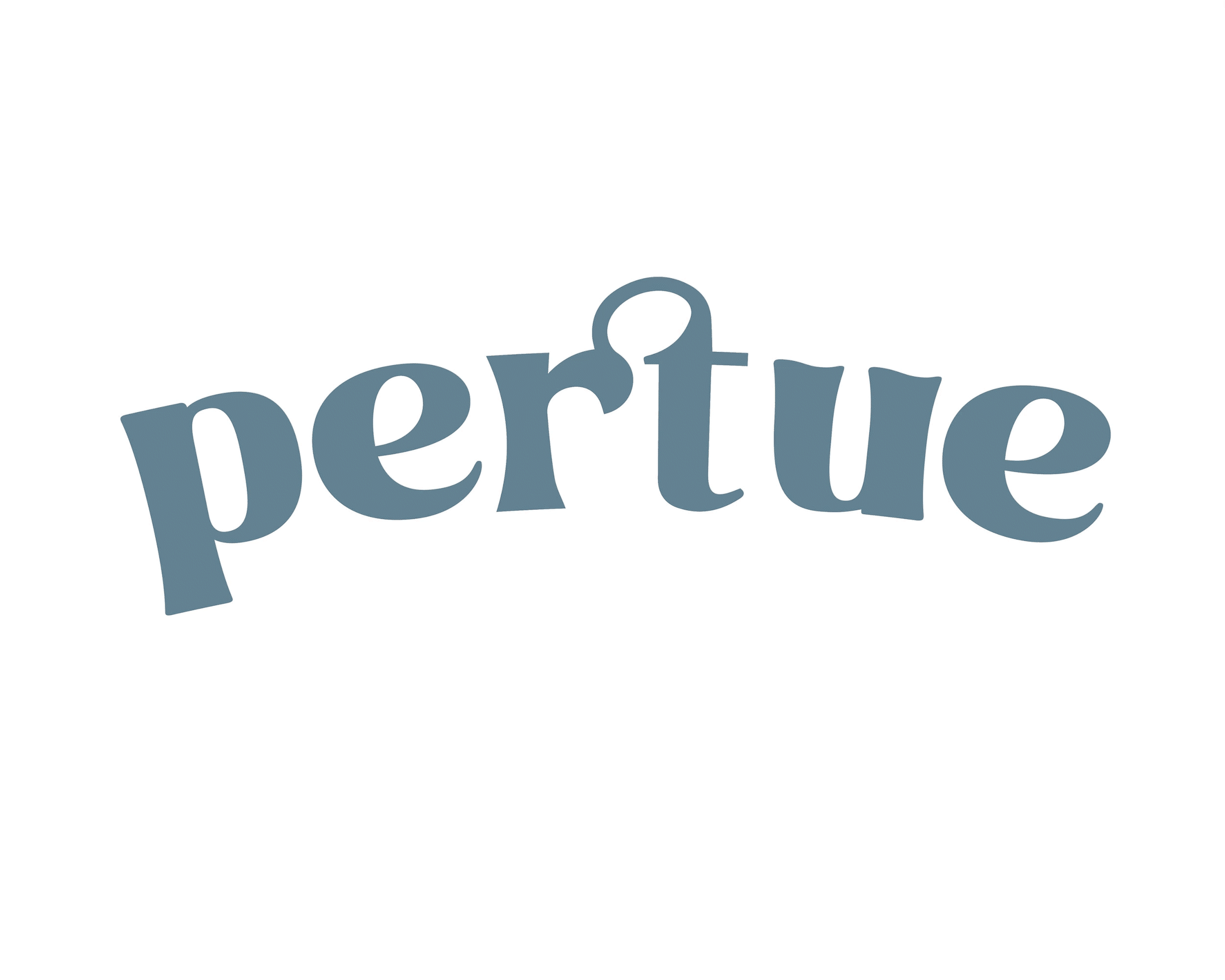
The Logo: A Delightful Arc of Artistry
At the heart of Pertue's identity lies its logo. We crafted the logo to be a delightful arc that embodies the brand's playful spirit and unwavering commitment to excellence. Eschewing the traditional straight lines, the arc symbolises the fluid motion of a pastry chef’s hand as they craft their bite-sized desserts with passion and precision.

The curved formation of the word mark exudes a whimsical vibe that aptly represents the fun and passionate brand personality. This unconventional approach breaks away from traditional straight logotypes, while adding a sense of movement and artistry.
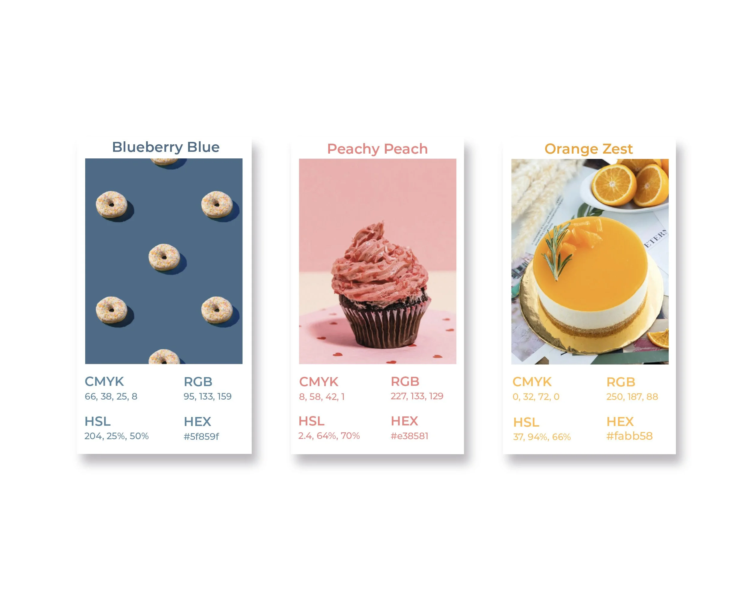
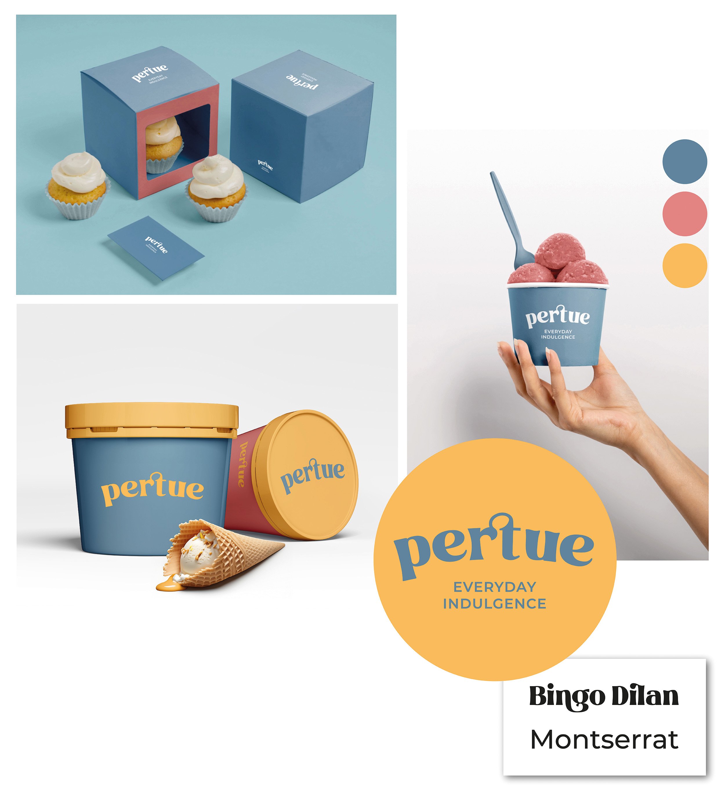
The Colour Palette effortlessly communicates warmth and vibrancy, anchored by the Blueberry Blue hue that lends an air of sophistication. The Peachy Peach and Orange Zest accents infuse the brand with energy, while the precise inclusion of CMYK, RGB, HSL, and HEX values underscores the meticulous attention to detail that permeates every aspect of Pertue's identity.
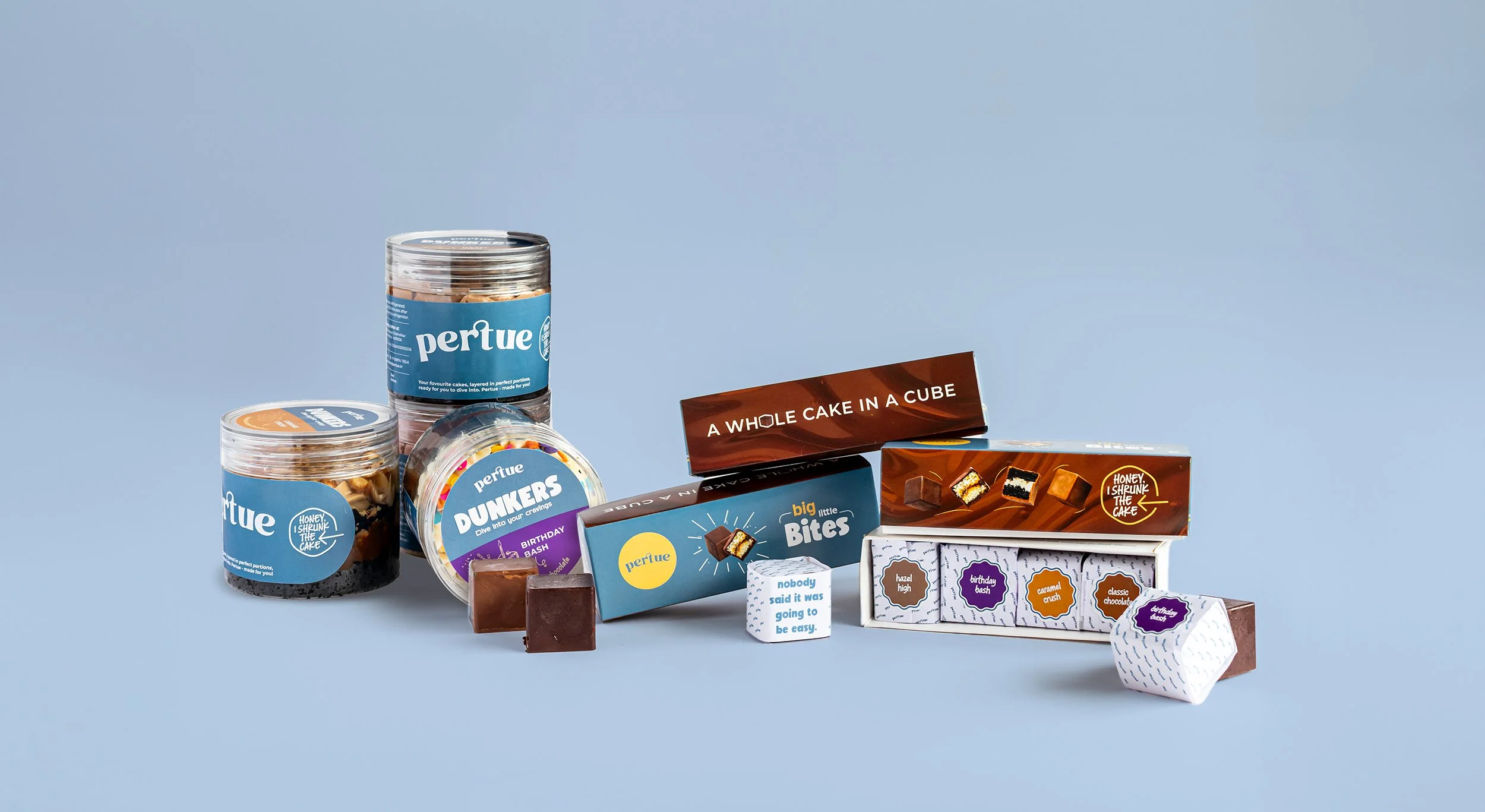
Pertue means ‘for you’. And it embodies the brand’s customer centricity. From the exquisitely crafted pastries to indulgent ice creams, every element is a celebration transporting you to a pâtisserie in Paris or the charming cafés of Rome. The fonts and hues defined as the visual vocabulary, add an air of international flair, hinting at the brand's global aspirations and artisanal pedigree.


In a world inundated with choices, Pertue stands out as a shining example of how a brand identity can captivate the senses, ignite the imagination, and leave an indelible mark on the hearts of those who experience it. Pertue is a celebration of life's sweetest moments, crafted with passion, artistry, and an unwavering commitment to delivering pure indulgence.
Client Testimonial
“Yellow Fishes has been a dream to work with. As a first time entrepreneur, I find myself apprehensive a lot of the time, and Ashish and his team have been extremely patient and helpful through the way, especially by providing unwavering support whenever curveballs have hit. They’ve helped me bring my vision to life, and even discover parts I hadn’t originally visualised. Their team of designers especially are truly exceptional at what they do, and I’m so glad to have trusted them and couldn’t be happier with the final product. Would definitely recommend Yellow Fishes for the amount of effort they put into their thought process and creativity, that truly translates into your brand. Super excited to continue working with them as the brand grows - thank you for dedication and commitment!”
Arshia Agarwal // Founder, Pertue