Food Trek
Brand Identity Design // QSR, Restaurants
Brand Name: Food Trek
Sector: Hotels & Restaurants
Brand Reach: India
Services:
Brand Proposition
Brand Storytelling (Tone of Voice)
Brand Identity Design
Brand Visual Expression
Communication Design
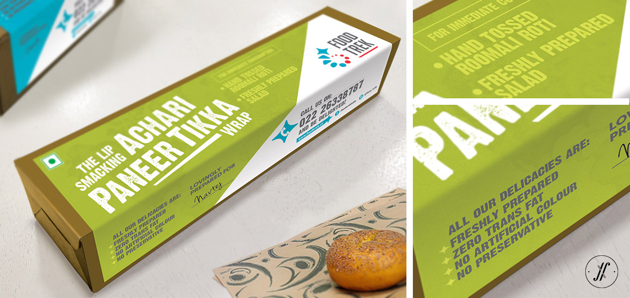
Packaging Design
Food Trek is a simple, authentic and cheerful QSR brand in Mumbai. Yellow Fishes partnered with the brand to define the Brand Purpose, its Promise and develop an inviting, expressive Brand Identity. Food Trek believes in giving an experience to its customers and India being a food-loving nation, we are always game for some more exploration. Food Trek is not about achieving perfection, but making hand-crafted dishes that leaves mark of the brand.
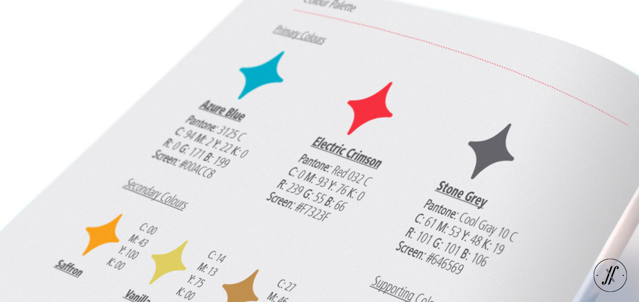
The Logo depicts the trail of a trekker and his quest to find the extraordinary. Metaphorically, his long pursuit ends with delight and gratification. The overall result is sassy and welcoming. Electric crimson trail stoke the appetite, along with Azure Blue make the Brand Identity exciting and friendly.
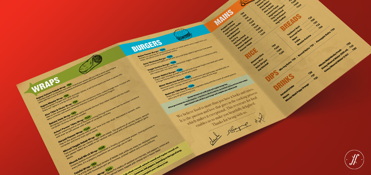
New Brand Identity brings together the food, QSR’s service, and the brand. This gives Food Trek its own rich territory to build its future on. The cohesive look and feel establishes Food Trek as modern Indian brand that is comfortably and confidently unique against its competition.
As part of the Brand Identity, we defined the hand-drawn food illustration style, as it gives room to the brand for exploration and not stereo-type its dishes to look in a certain way.
The Brand Development took us three months to go from Market Audit to restaurant opening. Here are some logo explorations that we did along the way.
Let’s talk
SIMILAR CASE STUDIES
POETRY
India // Logo, Identity Design, Menu & Communication Design
Rostaa
India & Middle East // Strategy, Logo & Packaging Design


