Xindus
Visual Identity Design // Technology, Software, Logistics
Brand Name: Xindus
Sector: Technology
Brand Reach: India
Services:
Logo & Brand Identity Design
Brand Identity Guidelines
Website UI Design
Redefining Global Commerce
Picture a world where small businesses aren’t held back by borders but are empowered by them. That’s the vision behind Xindus, an online platform designed to help small businesses succeed globally.
Founded by experts in global trade, Xindus knows the struggles small businesses face when trying to expand internationally. They believe every small business deserves the chance to thrive globally. That’s why they’ve made a simple platform to handle all the complicated stuff in international trade, making it easy for even the smallest businesses to join the global market.
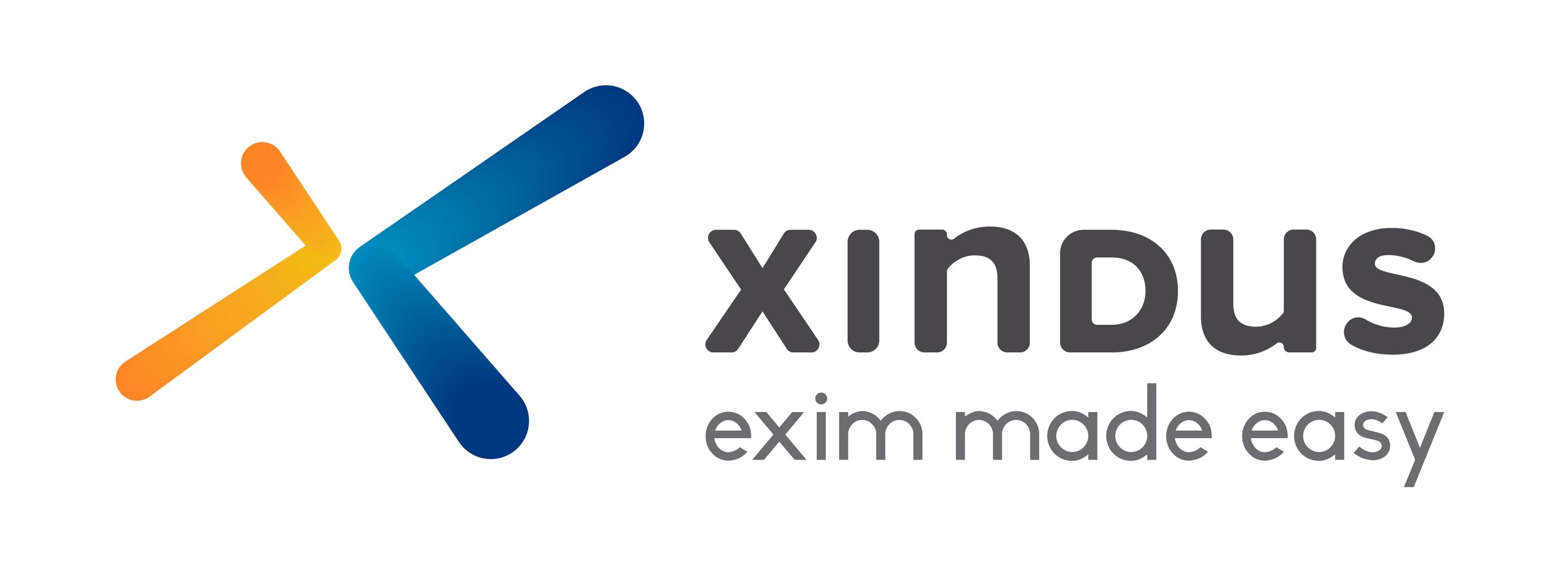

The Logo Design — Multi-dimensional. Multi-directional.
The symbol X in the logo is crafted to show the directions N,E,W,S (signifying global accessibility); but with dimension and purpose. The colours are derived from the brand pillars of Simplicity, Smart technology, and Dependability. The subtle gradients add perspective and depth to the form. The word-mark Xindus is handcrafted using lowercase and uppercase letters, to show expertise, along with approachability for SMEs.
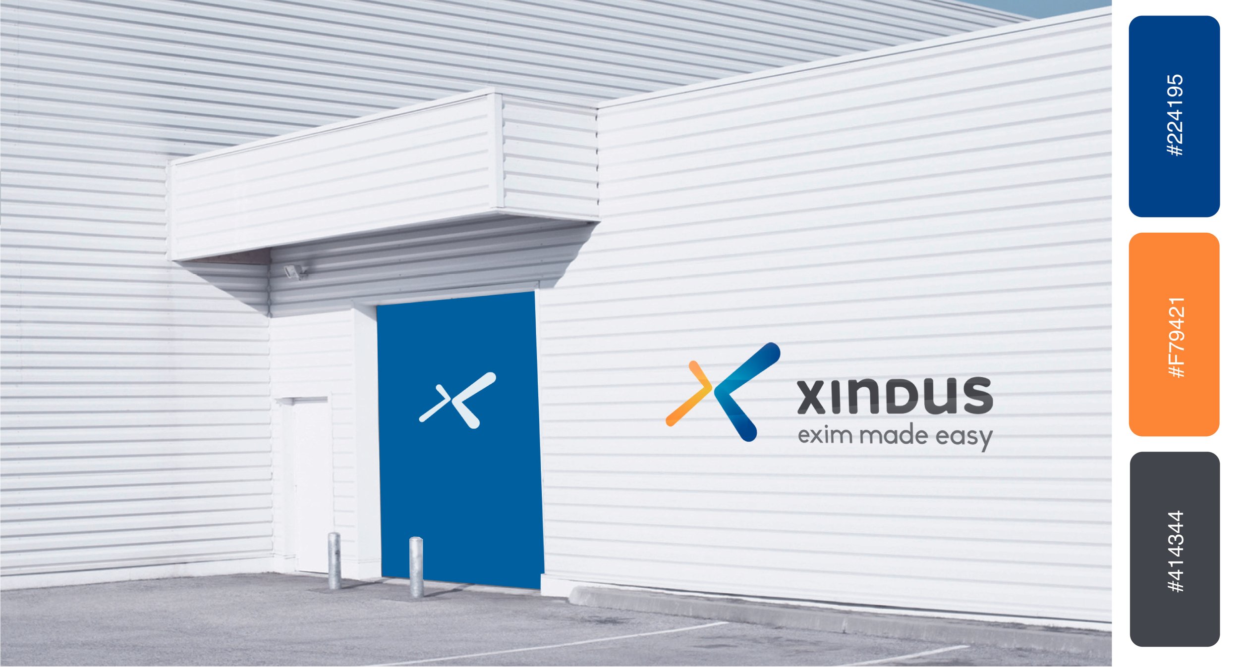
Colour Palette — Unmissable, fresh, global.
The colour palette is created keeping in mind the SME’s ambition and the brand’s ethos of providing clear, simple technology platform that empowers them. Taking deep colour tones allow for a wide variety of application, maintaining optimum visibility. The balance of warm and cool colours make this brand identity vibrant, young and fresh.
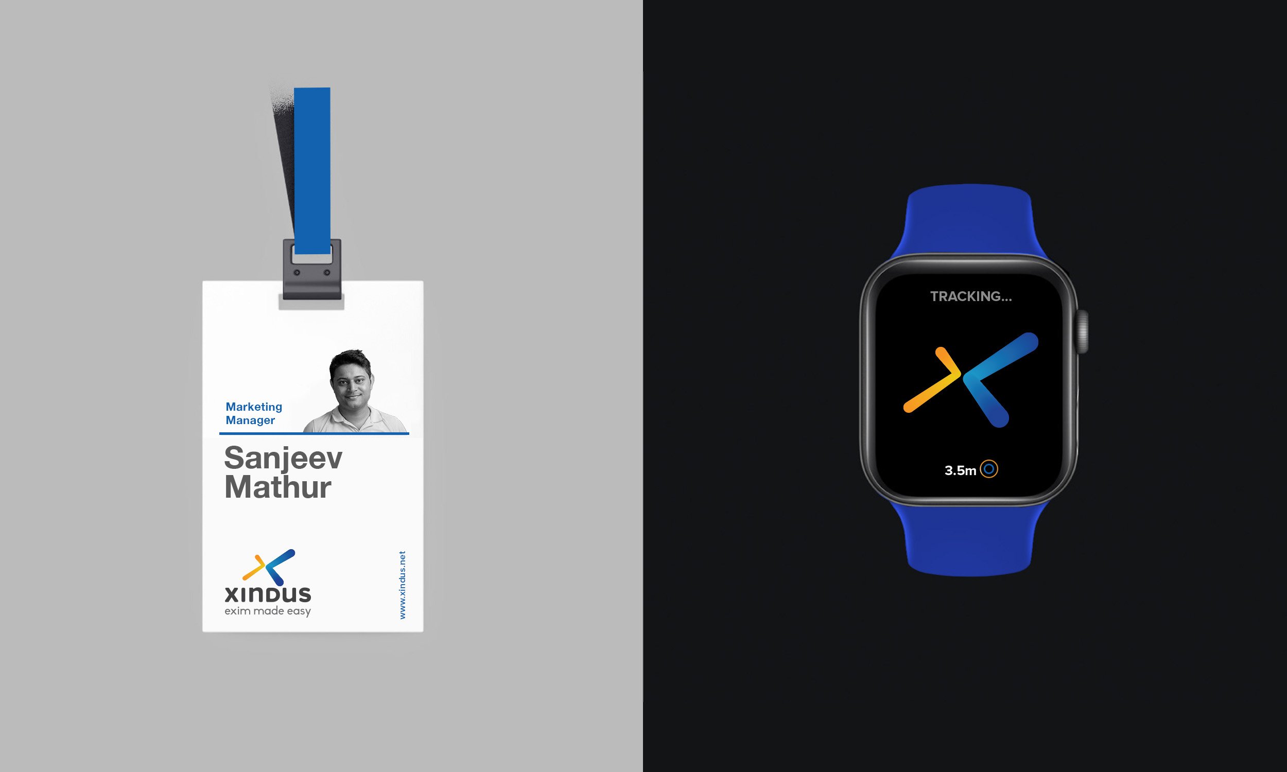

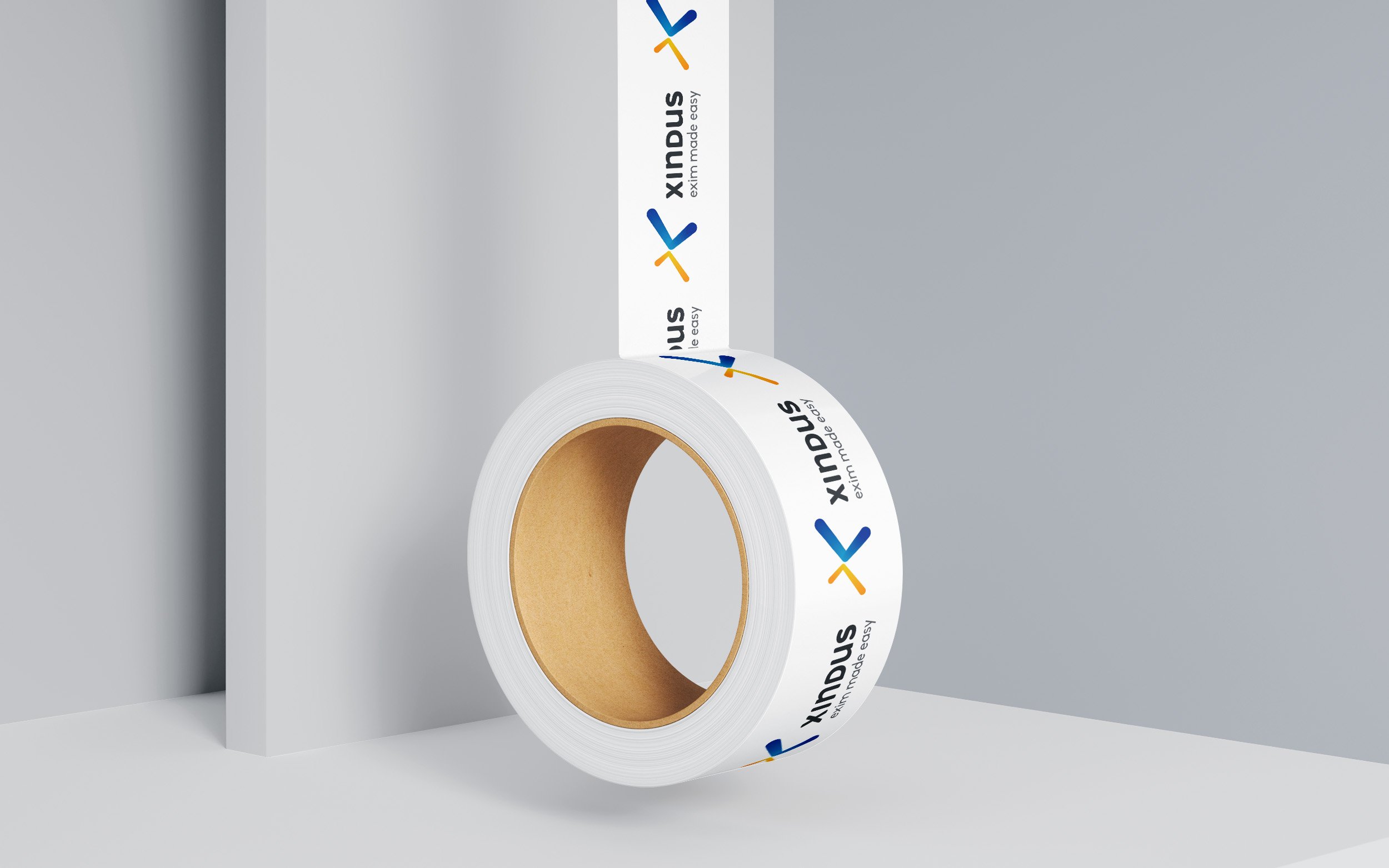
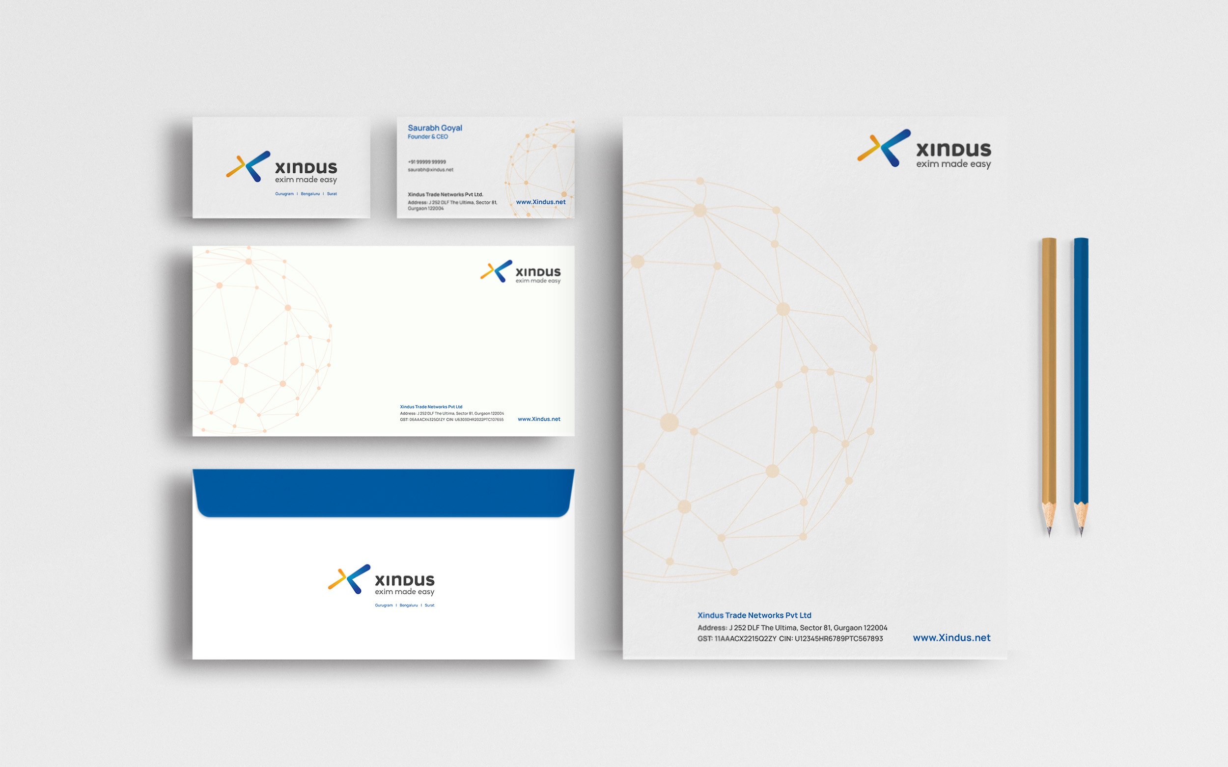

Our goal was to craft a brand identity that reflects their unwavering strength and unyielding dedication to SME’s success. Our artistry focused on crafting a visual identity that embodies simplicity — where every curve and colour conveys understated expertise. This is akin to Xindus’ brand promise: making simplicity conquer complexity.


