Pravara Bioenergy
Brand Identity Design // B2B, Corporate, Ethanol
Brand Name: Pravara Bioenergy
Sector: Energy // B2B // Corporate
Brand Reach: India
Services:
Brand Strategy & Brand Personality
Logo & Brand Identity Design
Packaging Design
Brand Storytelling
Brand Identity Guidelines
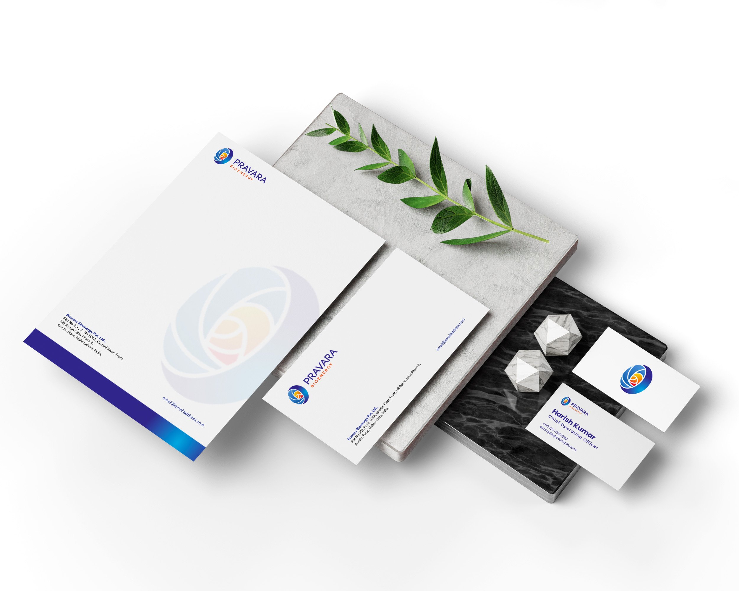
Communication Design
Website Design
Energising for a Sustainable Tomorrow
Pravara Bioenergy is one of the prominent brands in the bioenergy sector and wanted to reposition strongly with India's E20 vision. This was an initiative aimed at growing the use of petrol blended with ethanol to reduce carbon emissions and enhance India’s energy security. Pravara wanted to refresh its brand in a spirit of innovation and sustainability, clearly signifying its place at the core of this initiative.
Springboard for future
The project began with the broad discovery phase, which included enquiring & consultations with the leadership team of Pravara to understand the vision and goals. This helped us identify what major brand attributes need amplification and elevation, and what areas need to be transformed. Based on a comprehensive Brand Strategy, a set of Brand Values were defined. These values were translated into a visual mood board for visual identity, setting the tone for the new identity of the brand and its approach toward clean energy.

Advancing the visual identity
We rejuvenated Pravara's logo into something that echoed the newly defined brand values, with a modern touch of geometry & graphical elements, signifying development, sustainability, and modernisation. The changes from the old logo to the newer one are quite visible in this comparison. The careful consideration in the placement of letters and leading between them makes the new Wordmark more balanced and navigates the user’s eye movement. The closeness of letters and the deep colours signify reliability & confidence. While the abstract symbol underlines the organic nature and collaborative values of the business.

Colours — deep and expressive
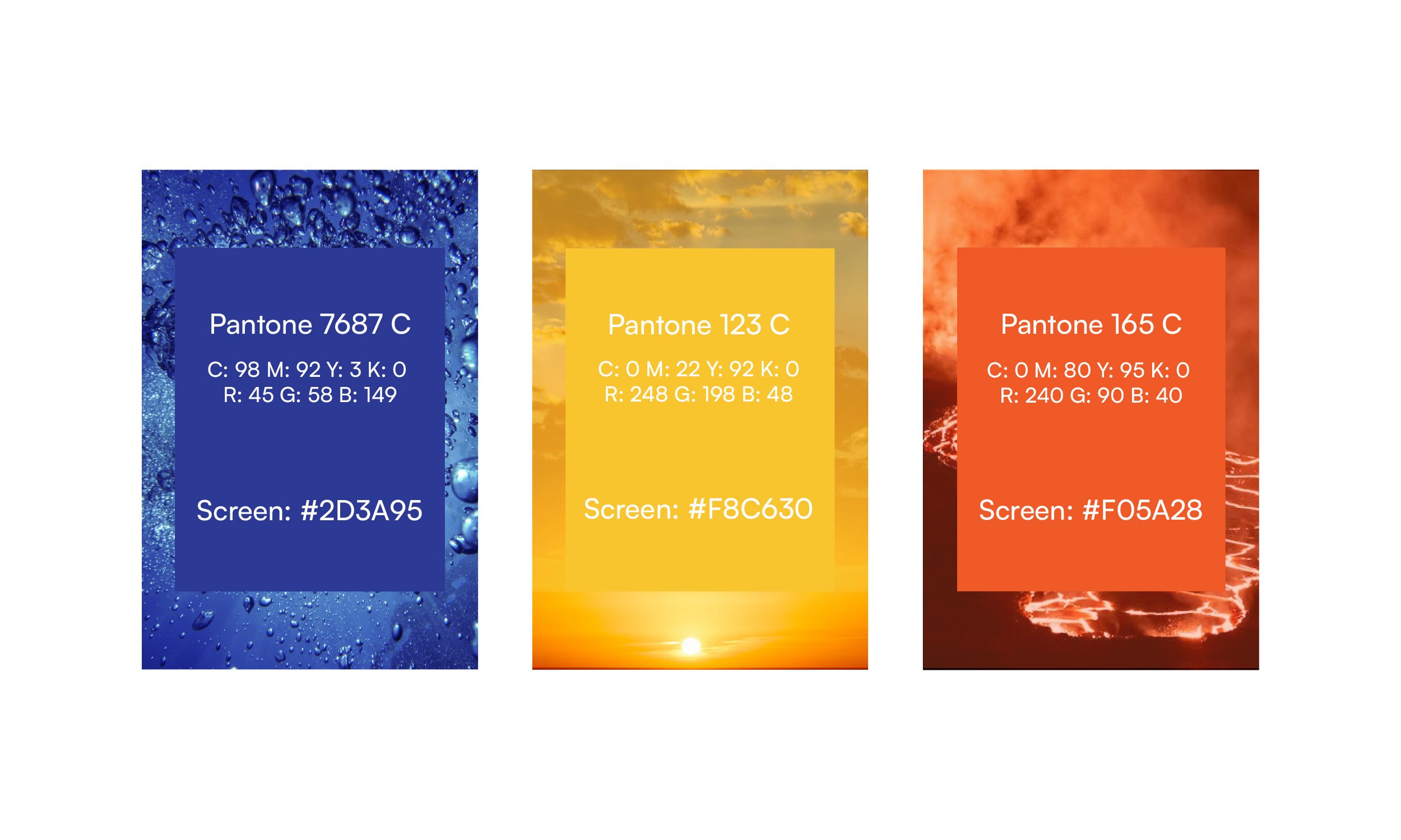
Nature-driven and energetic, the colour palette defined the commitment of Pravara to the environment and innovation in technology. The primary colours solidified the brand's association with clean energy and sustainability.


The Brand Rejuvenation of Pravara Bioenergy is one fine example of what strategic branding can do within the clean energy sector. Sustainability is a transformation that supports business goals and, at the same time, strategically supports countrywide gains for India in the areas of environment and energy. Our approach ensured that the new brand identity for Pravara Bioenergy was not just only aesthetically pleasing but strategically aligned with their mission and the emerging energy landscape.


