Vserv
Brand Rejuvenation // Technology, Mobile Advertising

Brand Name: Vserv
Sector: Technology
Brand Reach: Worldwide
Services:
Brand Proposition
Brand Storytelling (Tone of Voice)
Brand Identity Rejuvenation
Brand Architecture Strategy
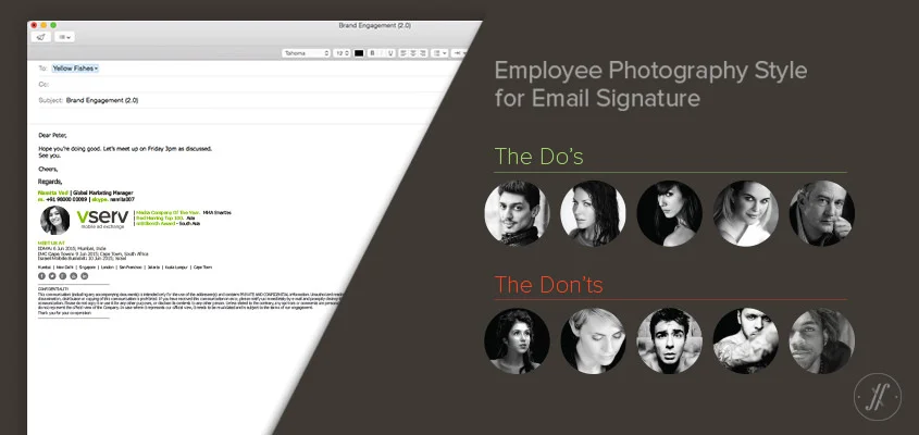
Image Style Guide
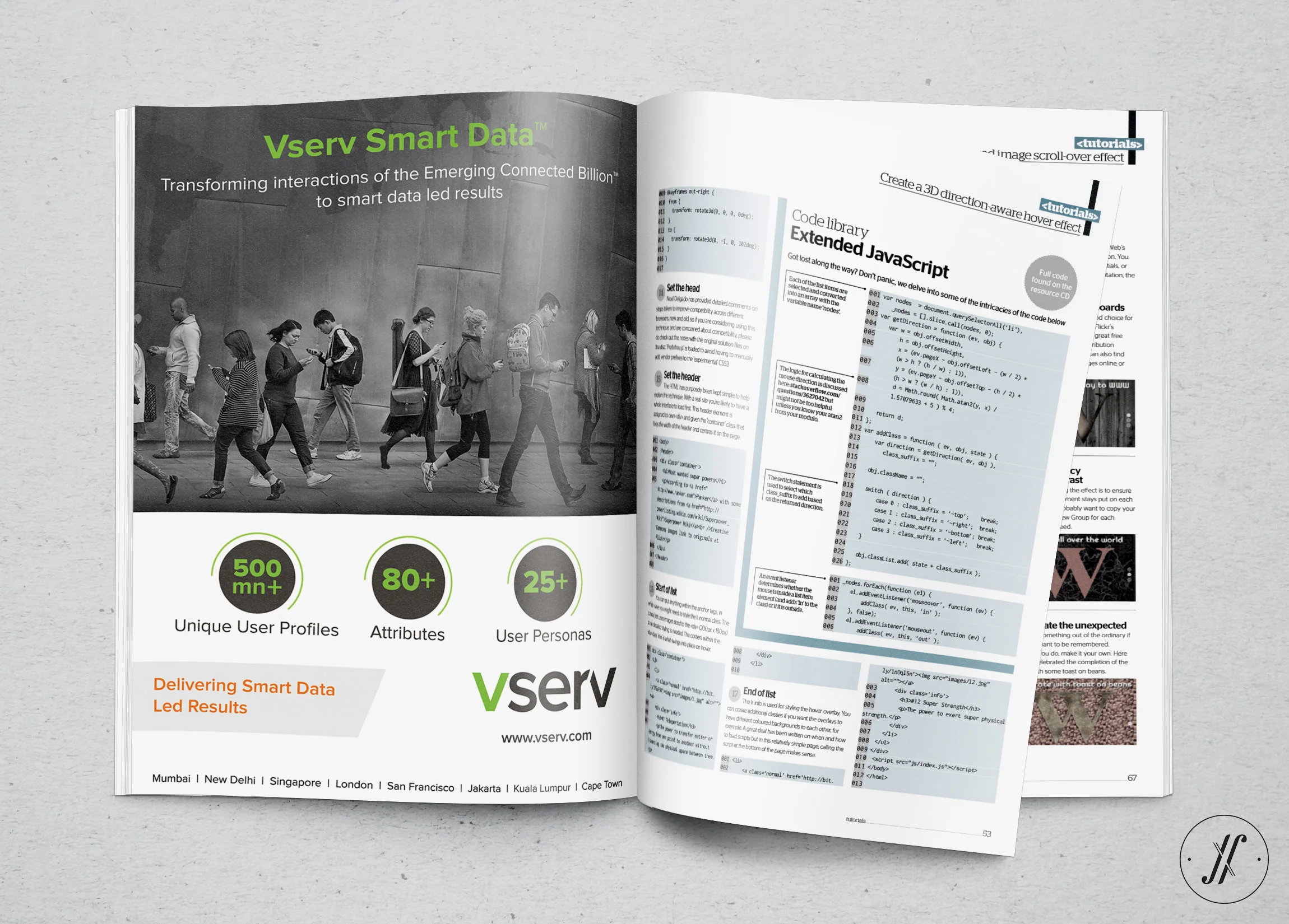
Communication Design
Office Signage
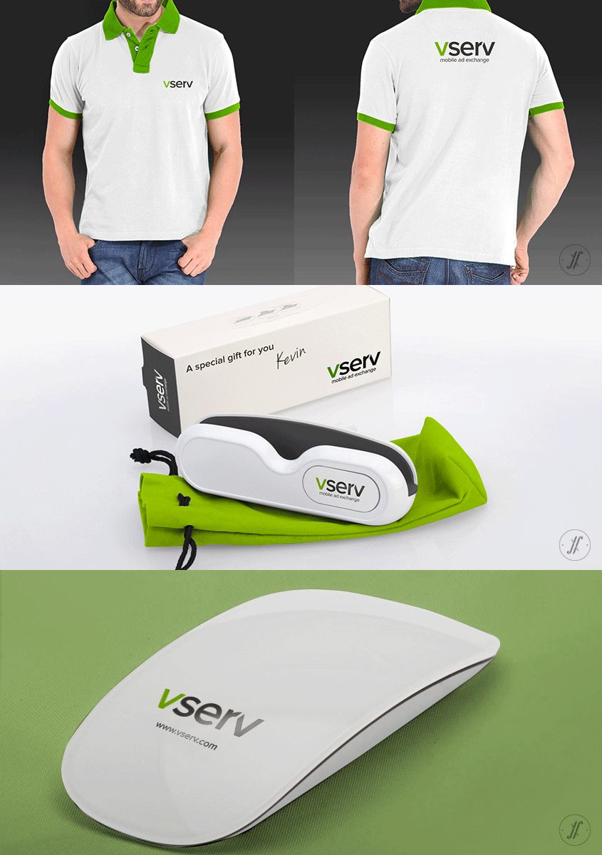
Merchandise Design
Ongoing Brand Building Support
Vserv started in 2010 with a unique Positioning of delivering Targeted Mobile Ads to feature phones. Over the years, with the progression of Mobile Technology and adoption of Smart Phones, Vserv has served billions of Ad Requests across the globe. From simple and useful innovations like AppWrapper to a more rewarding user targeting product – AudiencePro has made creating and delivering mobile ads easier for the entire value chain. From a Mobile Ad Network, Vserv has evolved to global Mobile Ad Exchange.
With the evolution, their Beliefs and Values have also gained more definition over the years. Yellow Fishes partnered with Vserv to define the brand promise and the overarching purpose of the brand. Yellow Fishes shares the belief with Vserv that Mobile screen is the most versatile medium for content. It is way more versatile and capable than a tv screen, a radio set or a laptop screen. And that is why the brand is laser-focussed on Mobile screen. In the years to come, they’re geared to make best use of the surfaces of the future – that are going to make Mobile screen as the hub of media consumption.
Vserv now has profound purpose and stronger Brand Identity. It exists to simplify the technology for all partners in the value chain. It exists to enhance the user engagement. The two aforementioned -
1) user engagement (being the end result), and 2) simplified technology (being the means to it), are possible only when the brand goes beyond Ad Content. And think about Ad Context. The brand now delivers Contextual Ads, and more and more relevant users click them and enjoy content.
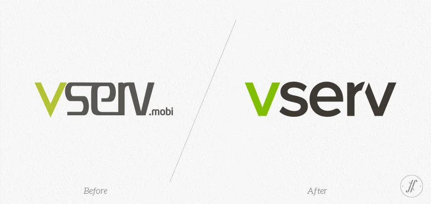
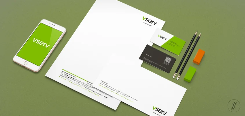
Alongside articulating Vserv’s Brand Core, we’ve refreshed the Brand Identity to reflect new Values and Brand Personality.
The New Logo is fresher, more proportionate and symmetrical. The equal spaces between the letters and the vibrant palette makes Vserv a truly global brand.
The well-balanced gap between letters ‘r’ and ‘v’ creates harmony while making the logo unique. The angle of 68° is used as metaphor for optimism and passion.
Soft rounded terminals along with the sharp edges cue approachability and professionalism. The distinctive & open character shapes ensure high legibility.
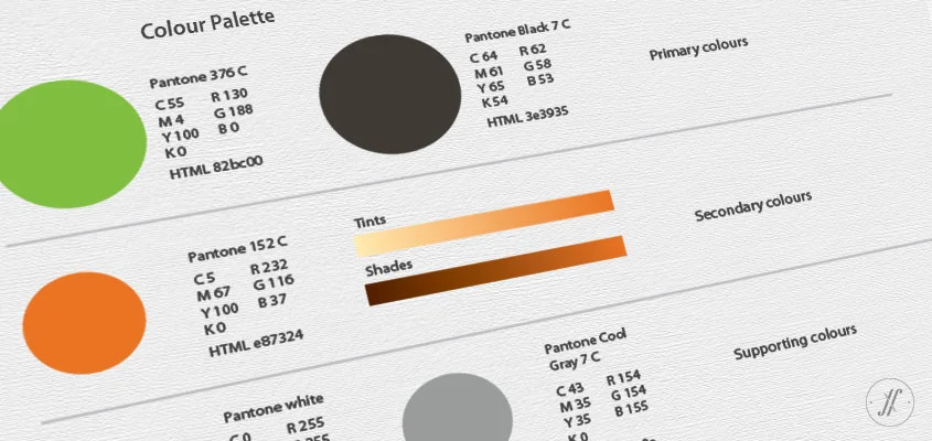
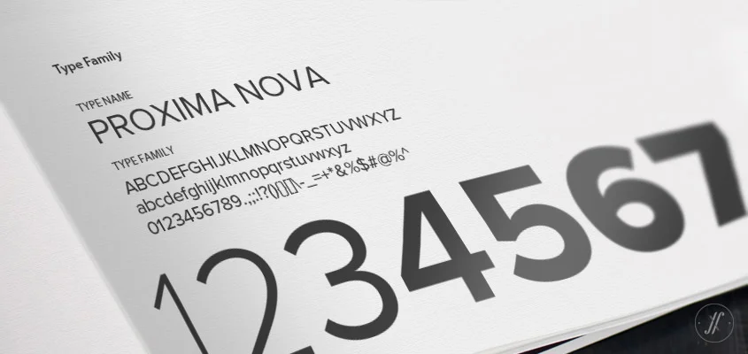
The new Brand Identity is very purposeful Visual-Articulation of the brand. The refreshed Colour Palette is contemporary and more meaningful to the brand, being a reminder of their purpose. The new Typography and Visual Language of the brand help accentuate the messaging with a clear hierarchy and order. This re-branding brings in a sense of vitality to Vserv, that makes it more cohesive brand.
Let’s start today!
SIMILAR CASE STUDIES
Bista Solutions
USA // Brand Strategy & Full Brand Rejuvenation
VMAX
Global // Visual Identity and Visual Language Development


