Bista Solutions
Brand Rejuvenation // Technology, Corporate, ERP

Brand Name: Bista Solutions
Sector: Technology
Brand Reach: Worldwide
Services:
Brand Strategy
Brand Proposition
Brand Identity Design
Communication Design
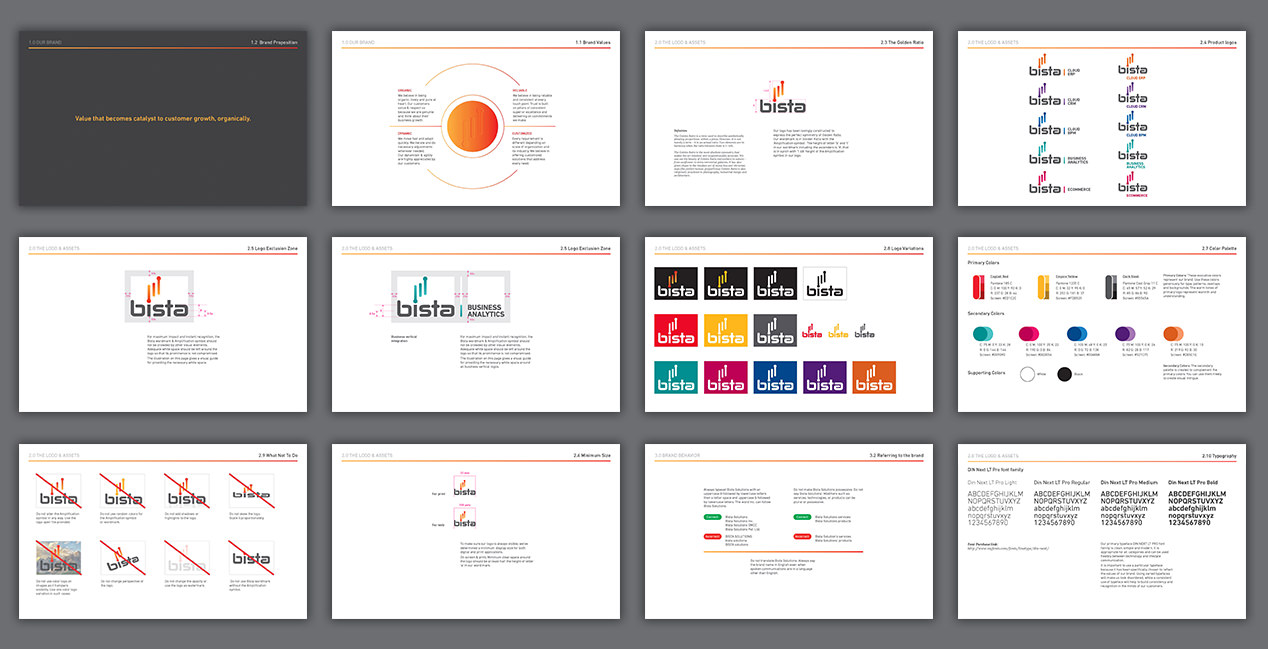
Brand Guidelines
Ongoing Brand Building Support
Bista Solutions Inc. is a fast growing American Technology Company that is revered for its world-class Business Applications. Their various business verticals (ERP, CRM, Business Analytics, BPM, and eCommerce) help customers transform their business by making them time & resource efficient.
We partnered with this ambitious brand to redefine their Brand Strategy and create a more meaningful Brand Identity. To define the Brand Strategy, we conducted an extensive Global Brand Audit (with its employees and customers) to identify the customer needs, perceptions, and its competitive position in the market. Bista Solutions had always kept ‘Customer Delight’ at the core of their business - and the same was strongly echoed in our Brand Audit. The brand differentiated itself by making strong connection with its customers, solving their business issues and focussing on their growth. As part of this evolution, we aligned the leadership team around the new Brand Promise, Positioning, and Key Messaging. An empathetic Brand Strategy helped shift the focus from features and benefits to a more Aspirational Human Promise - ‘Delivering Value’.
Designing the Brand Identity for such a meaningful, ambitious Brand is exactly the type of work we love to do. We wanted the new Identity to measure up to the same high standards of ‘Quality’ and ‘Service’ that they put into their products for customers. We created a simple and evocative symbol that represents Customer Growth - in line with the Brand Strategy.
The Customer Growth story is effortlessly expressed by connecting the Symbol and the Logotype. Every stroke and curve was carefully considered. The sharp ends along with smooth terminals balance the Logo; maintaining the energy and dynamism. The new Logo reveals that customers are at the center of the Bista brand.
The chosen colours - English Red, Empire Yellow, and Dark Steel, represent the harmonious combination of the brand’s Efficiency and Passion. Strong design decisions complemented smaller thoughtful details. The overall look of the brand now shows a fine balance between contemporary and classic in a very meaningful expression.
Perfectly complementing colours were chosen to define its various Business Verticals.
Tight Brand Guidelines become the lighthouse for the brand, setting it for the future.
Finally, with all the tools in place, we worked with the Bista Solutions team to activate the brand both internally and externally. We engaged employees in the Brand Launch with a presentation of the new Brand Promise, Identity, and its Expression across touchpoints.
Client Testimonial:
"We hired Yellow Fishes for our rebranding initiative at Bista and it was a pleasure to work with them. These guys are very creative and aren't afraid of challenges. They have an amazing team that brings attention to detail and supreme quality to the table, and I will definitely be working with them again."
Prateek Kulkarni
COO – Bista Solutions
One email away!
SIMILAR CASE STUDIES
VMAX
Global // Visual Identity and Visual Language Development
Vserv
Global // Brand Strategy & Full Brand Rejuvenation


