

TATA SAMPANN
Packaging Design // Chutney, Packaged Food, FMCG
Brand Name: Tata Sampann
Sector: Food & Beverages
Brand Reach: India
Services:
Packaging Strategy & Visual Design
Brand Storytelling
FMCG Packaging Design
Bringing Authenticity to FMCG Packaging Design
For generations, chutneys have been at the heart of Indian cuisine. Deeply rooted in tradition, handcrafted in home kitchens, and bursting with bold, familiar flavours. Tata Sampann — a name synonymous with purity and quality under Tata Consumer Products, set out to introduce a new range of chutneys that would bring this tradition to modern households.
But, this wasn’t just another FMCG product launch. We wanted to capture the soul of Indian cooking in a way that felt authentic, premium, and relevant to today’s consumers. That’s where Yellow Fishes stepped in. As a branding agency with deep expertise in FMCG packaging design, we took on the challenge of crafting a visual identity that would do justice to the richness of these recipes. And create designs that would evoke nostalgia, spark curiosity, and command attention in an oversaturated retail space.
Translating Tradition into Design
With three distinct chutneys to bring to life:
Chatpati Dhaniya Pudina Chutney with its herbaceous, zesty notes,
Meethi Imli Khajur Chutney balancing the perfect sweetness with tang, and
Teekhi Imli Saunth Chutney delivering a bold, spiced flavour,
each needed to feel true to its heritage while standing out in a modern retail landscape. The brief was clear: design packaging that didn’t just represent a product, but told a story. While also being true to Tata Sampann’s legacy.

The Power of Packaging: Every element is Purposeful
We believe packaging should do more than just catch the eye. It is a great advertising tool. It should speak, engage, and build trust. Every design decision was made with purpose, ensuring that the packaging felt like an extension of Tata Sampann’s ethos of mindful processing, 100% quality ingredients, and chef-crafted authenticity.
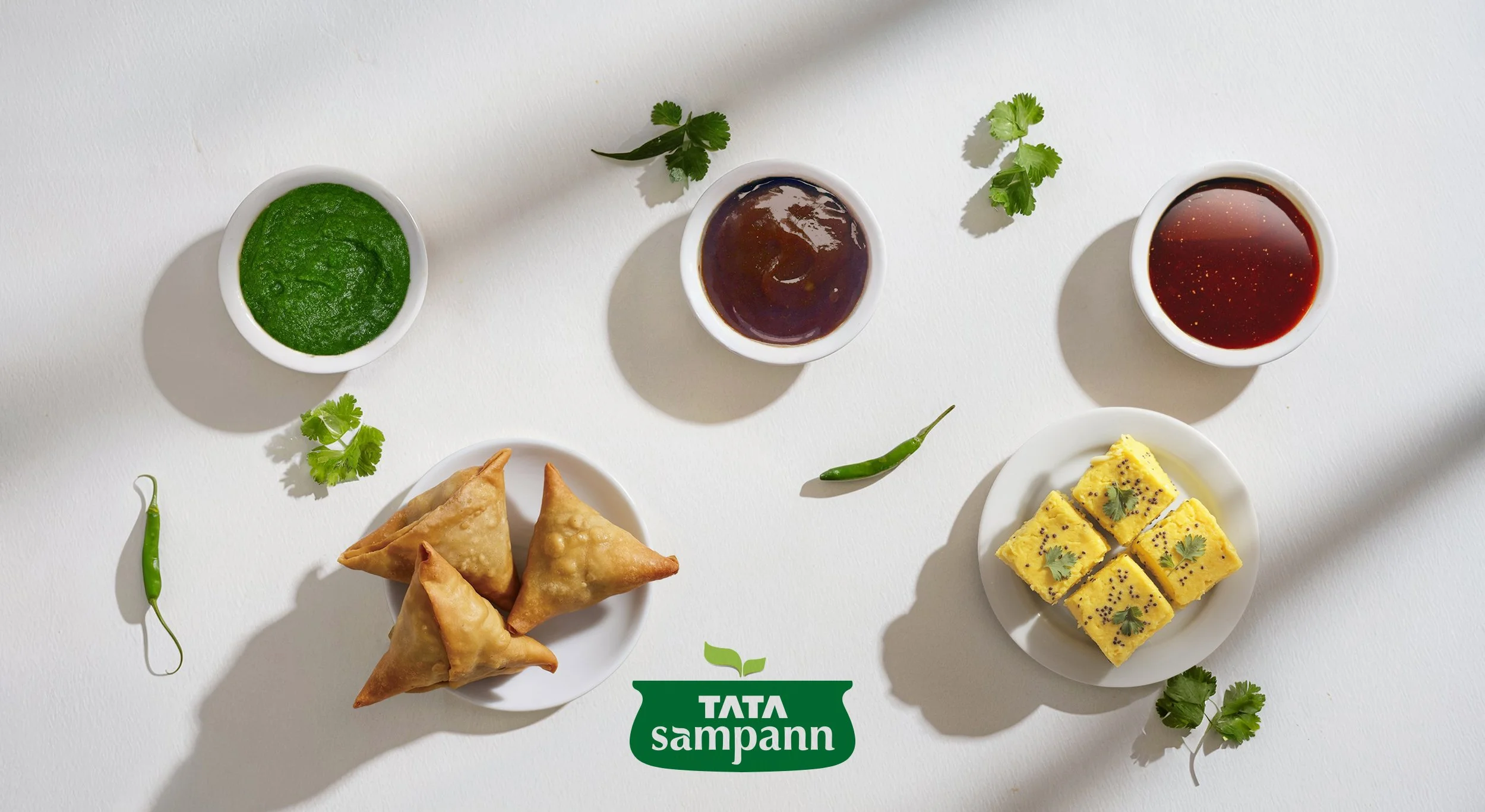
Flavour is a visual experience before it is even tasted. Each chutney was given a unique name and a distinct colour identity, ensuring instant recognition and a strong shelf presence.
Dhaniya Pudina Chutney in vibrant green, an immediate cue for freshness.
Imli Khajur Chutney in deep, rich brown, capturing its sweet, earthy profile.
Imli Saunth Chutney in warm, spiced hues, evoking its bold, tangy kick.

Ingredient-Led Storytelling
Trust is built through transparency, and nothing speaks louder than real, unprocessed ingredients. Whole coriander, tamarind, and dates take centre stage on the pack, reinforcing the promise of authenticity. The traditional silbatta (stone grinder) subtly appears in the visuals, a nod to time-honoured preparation methods. Chef Ranveer Brar’s endorsement brings credibility, positioning the chutneys as chef-approved, home-kitchen staples.
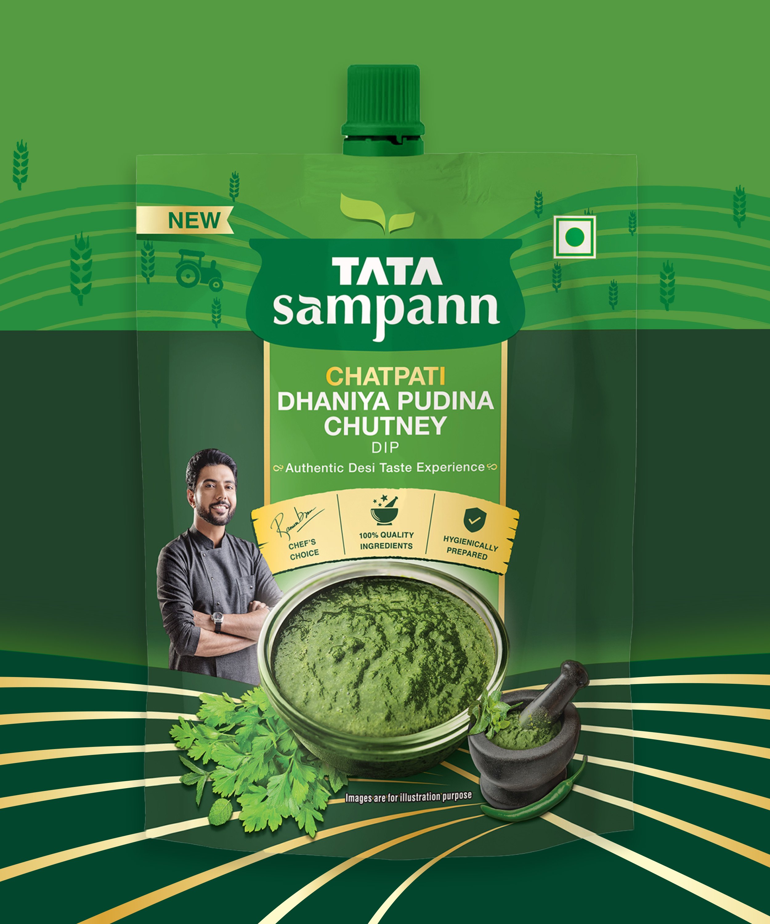

A form that complements function
FMCG packaging isn’t just about aesthetics, it’s about usability. How does it fit into daily life? How easy is it to store, use, and reseal? A spout pouch format makes it easy to pour, ensuring no mess, no waste. Ergonomic design considerations allow for better grip and functionality in the kitchen. The clear benefit callouts (hygienically prepared, 100% quality ingredients) add a reassuring touch, strengthening consumer confidence.

More than just Packaging design. A new standard in the Category.
This wasn’t just about launching a new line of chutneys. This was about creating a brand presence that felt as rich and layered as the products themselves. With this project, Tata Sampann didn’t just enter a new category; they are going to redefine it. Yellow Fishes delivered more than just packaging design. We created a story that consumers could see, feel, and trust.
The result? A packaging system that stands out, builds credibility, and makes an impact where it matters most — the consumers’ kitchen. Tata Simply Better has now gained significant market share, much higher than brand’s expectations. If your brand deserves packaging that doesn’t just sit on a shelf but commands attention, we should talk.
Client Testimonial:
YF team brought the creativity, deep knowledge & consumer outlook in designing our Tata Sampann Chutney Dip packs. They worked with agility & incorporated feedbacks seamlessly building the packaging from bottom up at the same time retaining Tata Sampann's brand voice, colours etc. It was a pleasure and we look forward to collaborating on multiple projects with them.

Aishwarya Gupta // Tata Consumer Products