

PIRENS
Brand Identity Design // Ayurvedic College & Hospital
Ayurveda is not an alternative medicine. It is the original.
That distinction changes everything. It changes how a brand speaks. How it stands. How it is seen. This is the story of an institution that knew its value but had no visual language to prove it.
Brand Name: PIRENS
Industry: Healthcare & Education
Brand Reach: Maharashtra, India
Services:
Brand Strategy | Logo Design | Brand Identity System | Uniform Design | Signage Design | Communication Design
The Gap
A name that carried weight. An identity that carried none.
PIRENS, the Pravara Institute of Research and Education in Natural and Social Sciences, is built on the legacy of Late Shri Eknathrao Vikhe Patil. An Ayurvedic college. A hospital. A commitment to semi-urban and rural Maharashtra that has served farmers, families, and first-generation medical students for decades.
The reputation was earned. The recognition was not.
The visual identity could have belonged to any of the dozens of Ayurvedic colleges across the Ahmednagar, Nashik, and Pune districts. Generic crests. Predictable colours. Forgettable typography. Nothing that said: this institution is different.
Three audiences. Students choosing where to study. Patients choosing where to heal. Regulatory bodies choosing who to trust. One identity needed to hold all three.
Before a single mark was drawn, we sat down and asked.
We worked directly with Dr. Supriya, who leads the institution, through a structured brand questionnaire. The responses were revealing.
Slightly friendly, not purely technical. No Sanskrit-heavy terminology. Communication that a rural patient can understand.
That answer told us more than any competitor audit could. This was not an institution trying to impress with obscurity. It was one trying to serve with clarity.
We asked what word, if only one, should carry the brand. The answer was immediate: PIRENS. Not Ayurvedic. Not College. Not Hospital. PIRENS.
The Listening
These two buildings sit beside each other on campus. A hospital that has served the community for decades. A college that has just begun. Both needed to live under one roof, one name, one mark.
From these conversations, one positioning emerged. Clear. Unforced. True.
Ayurveda as original medicine, not alternative medicine. PIRENS as the knowledgeable neighbour, not the distant expert.
This became the filter through which every design decision was made.
The Mark
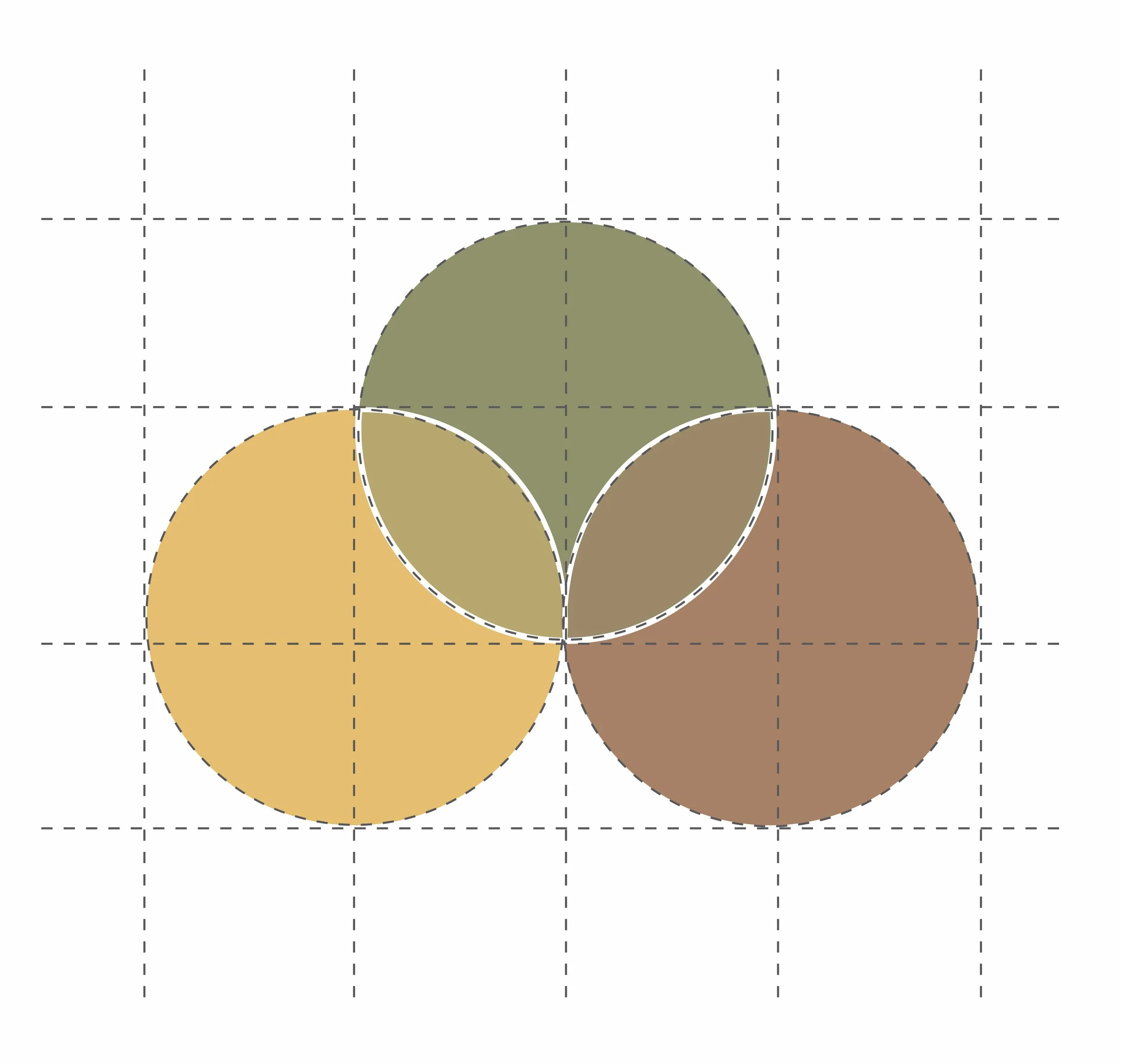
Three circles. One truth.
The PIRENS symbol is not decorative. It is an argument.
Three circles overlap. Green for Ayurvedic tradition. Yellow for knowledge. Brown for care and growth. Where they meet, a leaf emerges. Not drawn. Revealed. Ayurveda does not arrive as ornament. It appears naturally when knowledge and care converge.
The wordmark sits beside the symbol. The letter R carries a subtle leaf curl at its stem. A nod, not a shout. A vertical bar in yellow separates the master brand from its descriptor.
PIRENS commands. The descriptor clarifies.
At small scales, on a prescription pad, a student ID, a signage panel, the hierarchy holds. At building scale, in Marathi script above the hospital entrance, it holds.
Building sub-brands. Building familiarity.
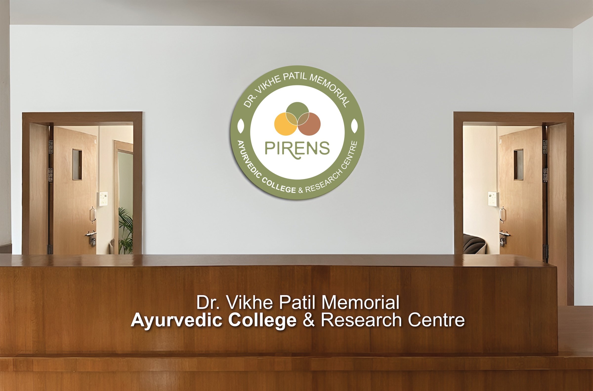
The master brand carries the full descriptor: Ayurvedic College & Hospital. Two separate sub-brand versions exist for legal and regulatory use, where the college and hospital require distinct identities. The visual system remains identical. Only the descriptor line changes.
The System.
Not a logo. A language.
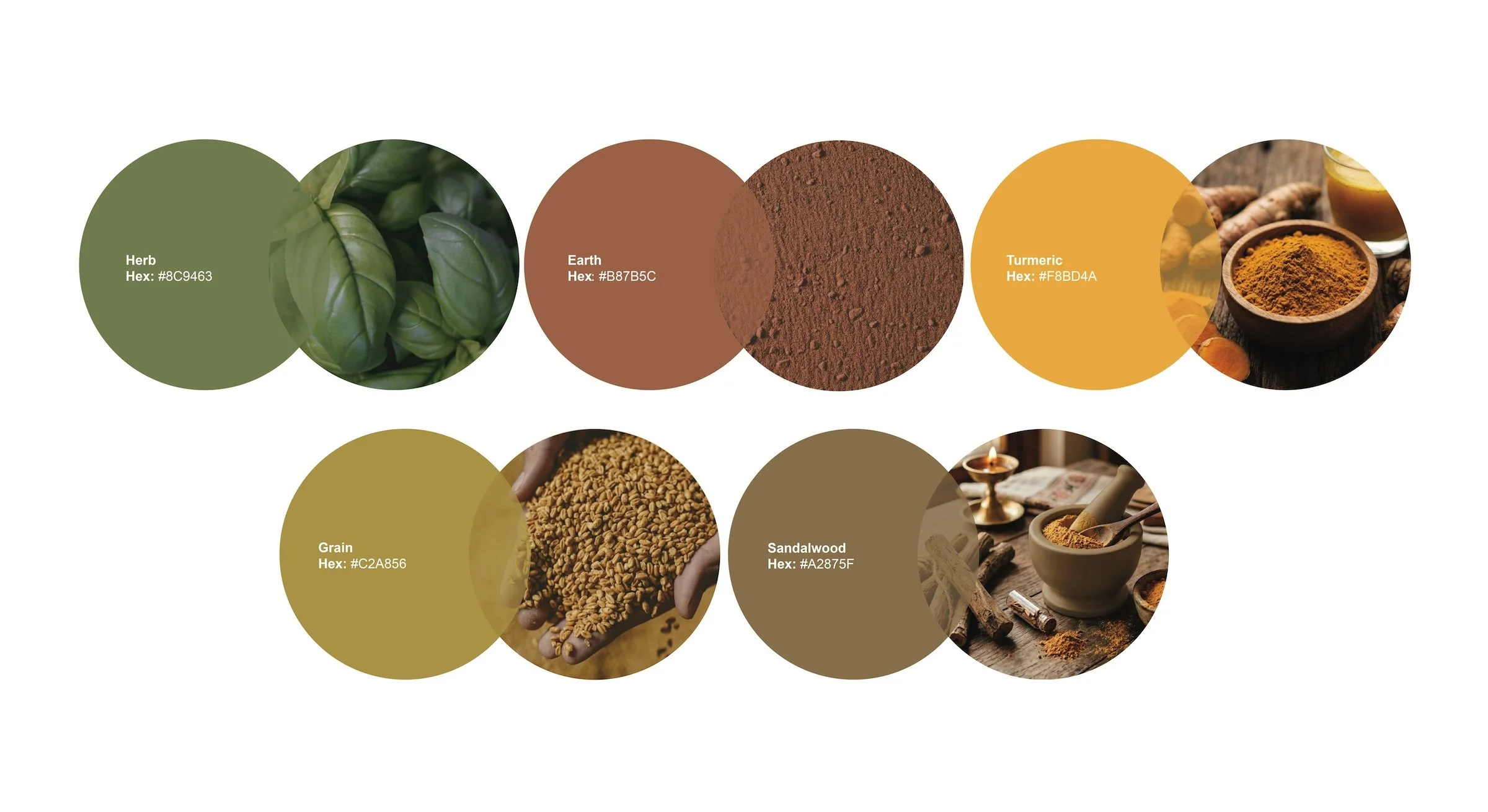
Colours.
Five colours. Three from the logo. Two supporting tones for extended applications. Herb, Earth, Turmeric, with Grain and Sandalwood completing the system. Drawn from the landscape: Maharashtrian soil. Medicinal herbs. Harvested grain.
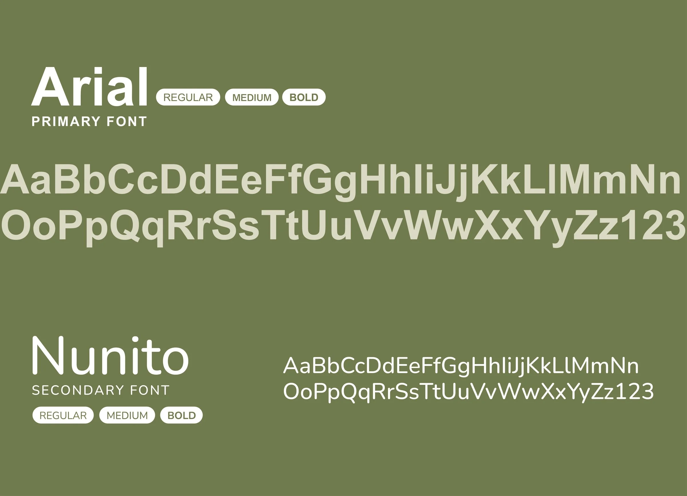
Typography.
Arial as the primary typeface. Because it renders in Marathi, Hindi, and English. Because it works on every printer, every screen, every government form this institution will touch. Practicality here is not a compromise. It is the point. Nunito as the secondary, for moments where warmth matters more than formality.
Guidelines.
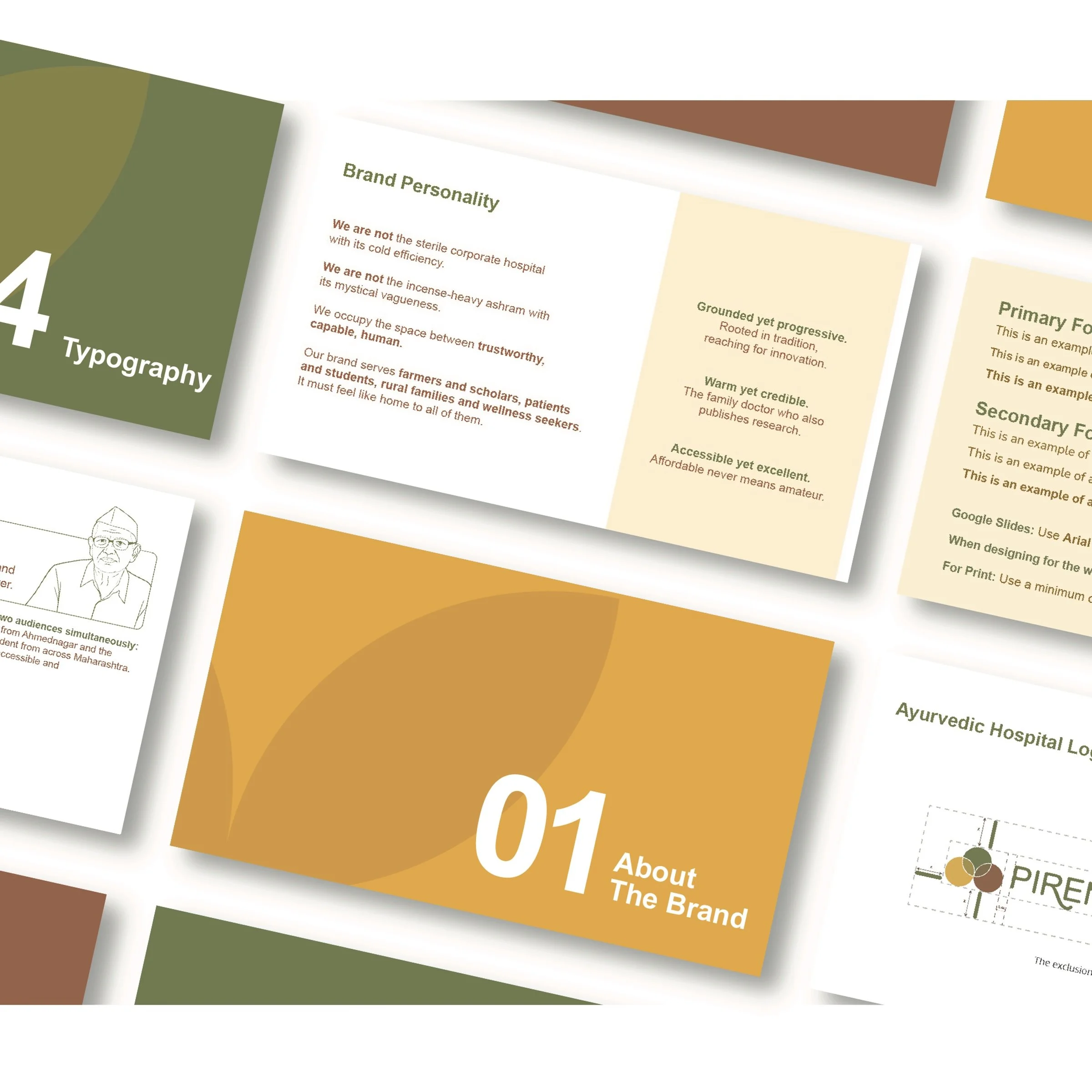
A comprehensive brand document governing every application was created. Written so that an administrator in rural Maharashtra, without a design studio within hours, can apply the brand correctly. Tools, not restrictions.
From building to business card. The system holds.
Where it lives.
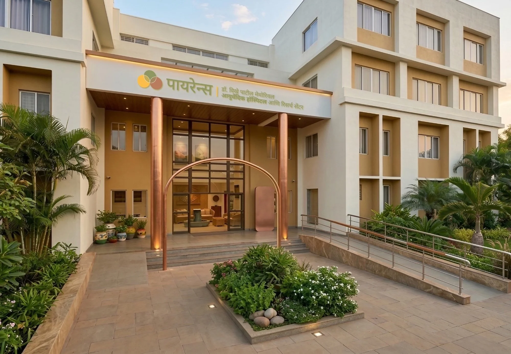
The hospital entrance carries the brand in Marathi. The language of the patients who walk through every morning. The three-circle symbol sits beside the Devanagari wordmark. Same hierarchy. Same clarity. Different script.
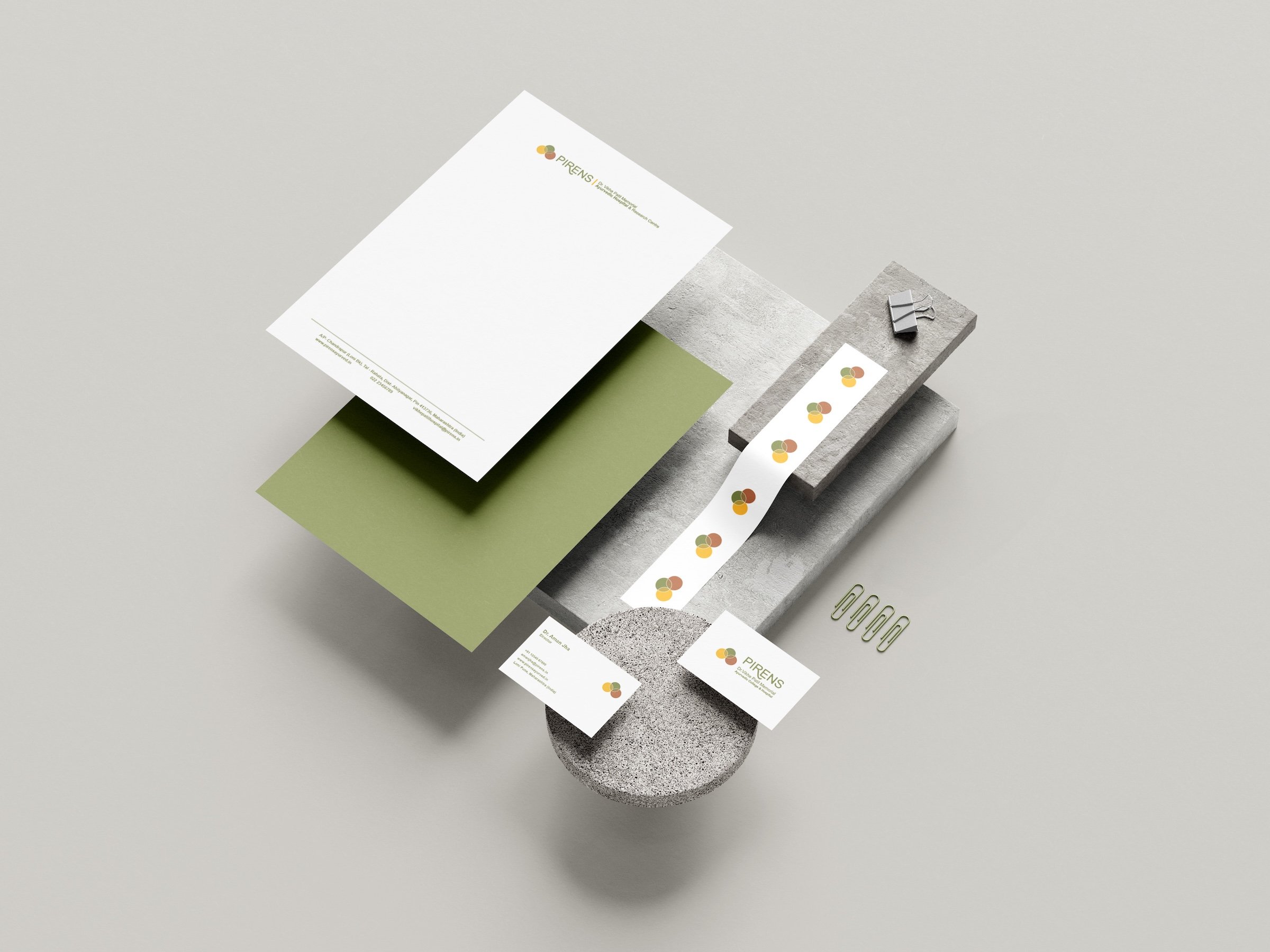
The identity scales to the objects people handle daily. Letterheads. Business cards. Stickers. Each touchpoint carrying the three-circle symbol consistently, whether it arrives by post or sits on a desk.

Across two buildings, thirteen modular templates govern every wayfinding touchpoint. Directional. Departmental. Regulatory. Each one built from the same system. Each one unmistakably PIRENS.
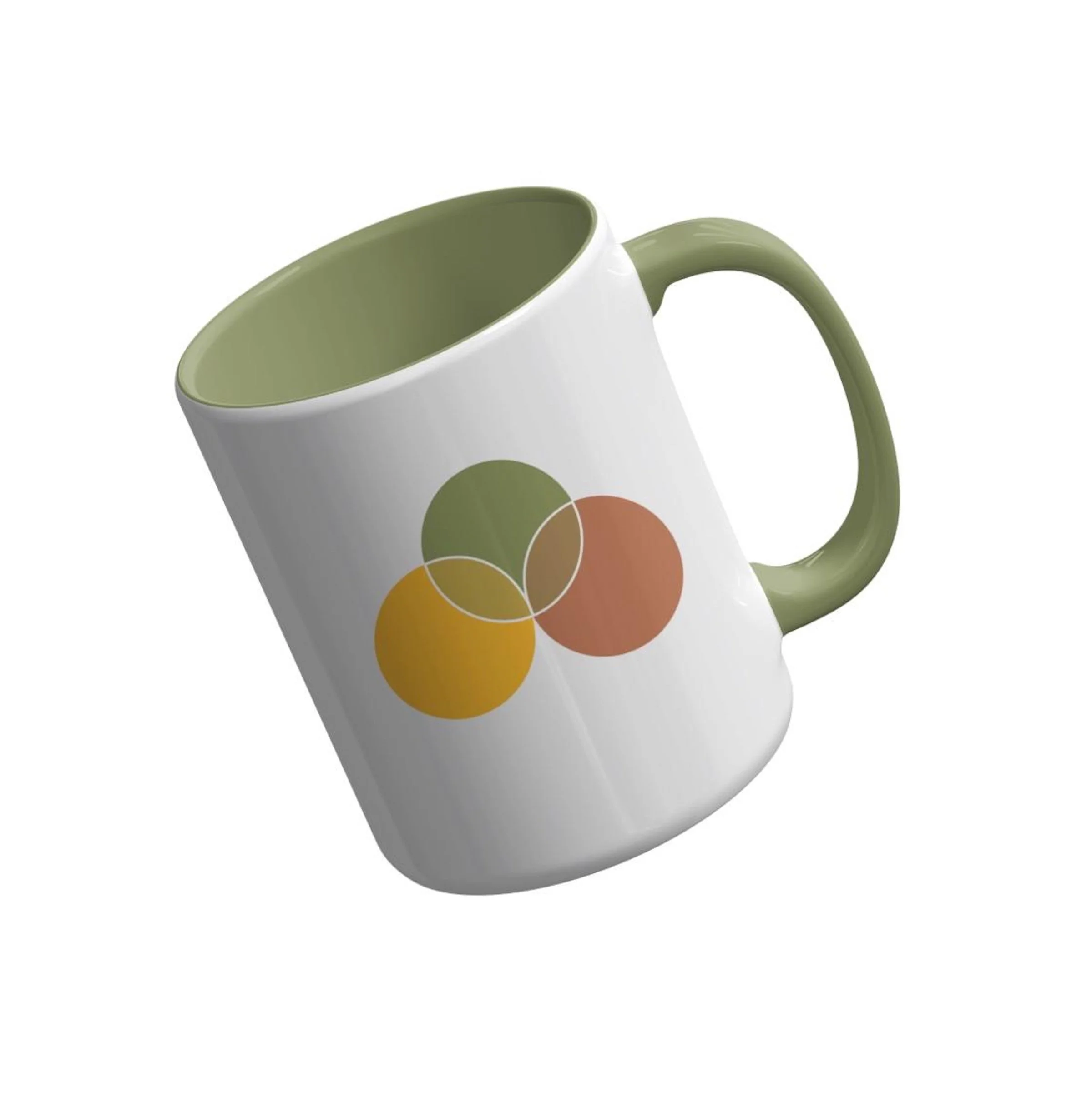
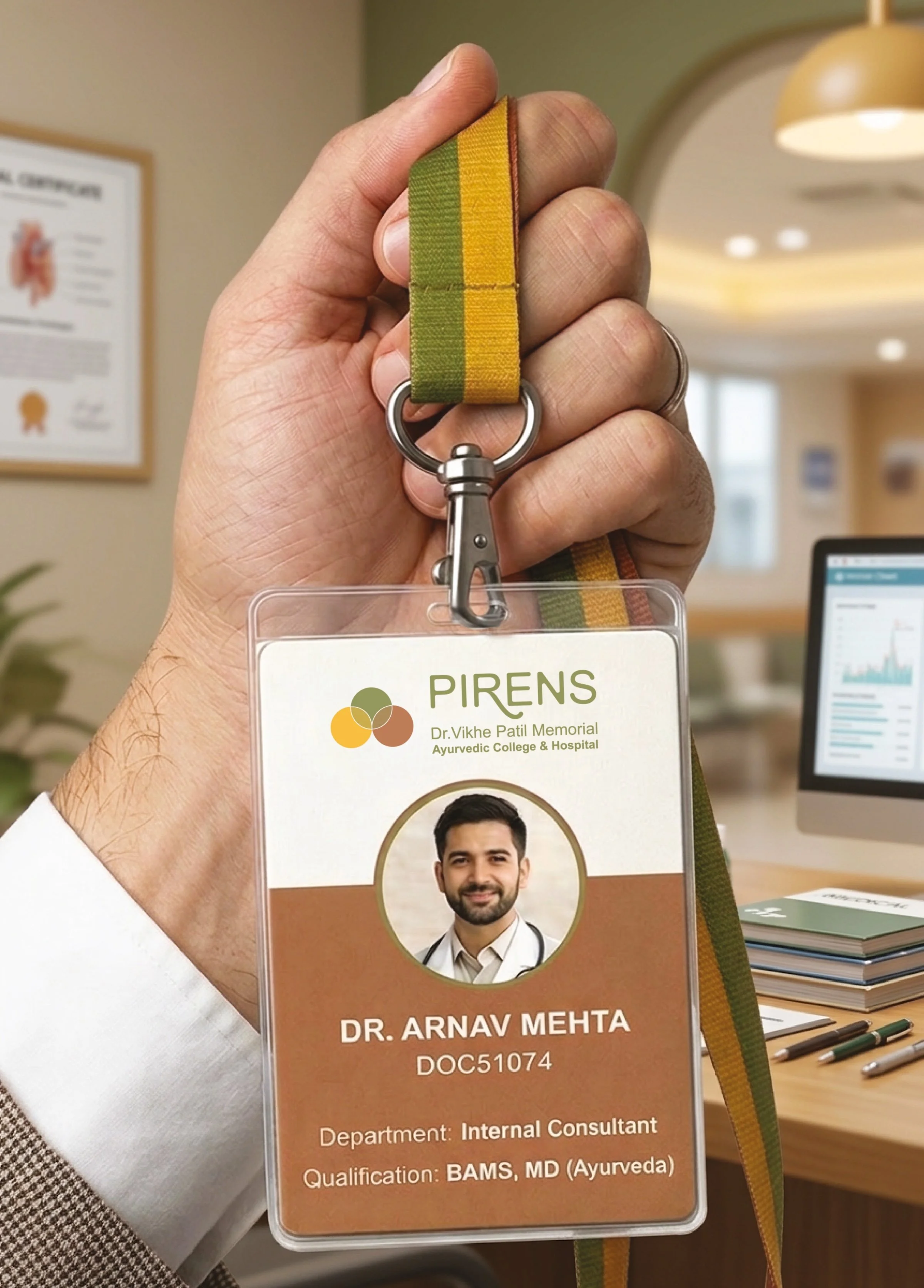
Staff ID cards with a branded lanyard, visible from across a hospital corridor. Colour-coded by role. The lanyard carries all three brand colours. The card carries the full logo. Identity as a daily worn object. A mug in the staffroom carrying only the three-circle symbol. No wordmark needed. The mark works alone.
What we built
A semi-urban institution that does not apologise for where it is. A visual identity as considered as the medicine it represents.
A system that works for the student reading in English, the patient reading in Marathi, and the regulator reading in compliance.
Original medicine. Original identity.
Client Testimonial
“Working with Yellow Fishes has been one of the most rewarding creative partnerships we've had at PIRENS. Over the years, they have handled branding for multiple projects and every single time, they've exceeded our expectations. Their most recent work, crafting the logo and marketing collateral for our Ayurvedic College, was nothing short of outstanding. Ashish understood the essence of what we were trying to communicate: a heritage rooted in tradition, yet forward-looking and credible. The result was a visual identity that we are deeply proud of.
We are proud to call them a long-term creative partner, and we look forward to many more collaborations ahead. Highly recommended. Without reservation.”
Dr. Supriya Vikhe, CEO, PIRENS