


Niora
Brand Naming, Identity Design // Dermatology Clinic
Most dermatology clinics in India shout. Too ostentatious. Before-after grids that weaponise insecurity. Promises of transformation in a single visit.
Niora was built to be the opposite. A dermatology practice that speaks quietly, leads with evidence, and earns trust before it ever asks for a booking. We named it. We designed every surface it touches. We wrote the words it speaks. And not a single one of them makes a promise the doctor cannot keep.
Brand Name: Niora
Industry: Healthcare | Dermatology Clinic
Brand Reach: Pune, India
Services:
Brand Naming | Logo Design | Brand Identity System | Staff Uniform Design | Patient Experience Design | Website UI Design & Development
When the science is real, the brand should not need to perform
Dr. Supriya Vikhe. Board-certified dermatologist. Eleven years of clinical experience. Twenty published research papers. By every measurable standard, the real thing.
But dermatology in India has a visibility problem. The category has been claimed by cosmetology, not medicine. Neon signage, influencer endorsements, fear-based language. The louder a clinic shouts, the more it blends in. And the doctors doing the most rigorous work are often the least visible.
Dr. Supriya did not want another cosmetic clinic with a medical licence. She wanted a medical practice with the confidence to look like one. The reputation existed. The credentials were impeccable. What was missing was a brand that could carry the weight of that credibility.
Before we designed anything, we listened
A structured brand questionnaire surfaced the values that would shape every decision.
The responses were revealing. Not for what she chose, but for what she rejected.
Perception? "Expert-led care with advanced treatments, offering value for money." Not affordable. Not premium-priced. Competent and fair.
Differentiator? "Patient-first, long-term skin health" and "Non-intimidating, warm, friendly." She did not select "elite team." She did not select "luxurious wellness ritual." A doctor with genuine credentials actively chose warmth over prestige.
Target audience? Young professionals, middle-aged individuals, and people with skin conditions. Notably absent: high-net-worth individuals. This was a practice for anyone who deserved honest care.
Brand attributes? Six words from a grid of twenty: Expert. Professional. Ethical. Safe. Holistic. Evidence-based. No mention of innovation. No transformation. No radiance. Just the quiet convictions of a practitioner who trusts her training more than her marketing.
The picture was clear. This brand had to feel like the doctor herself: knowledgeable without being intimidating, warm without being soft, premium without being exclusive.
And it needed a name.
Twenty-four possibilities. Just five letters.
Twenty-four names explored. Sanskrit roots like Tvachita and Varnika. European abstractions and Conceptual English names as well. Each evaluated against creative merit, phonetic ease, domain availability, cultural resonance, and numerological compatibility.
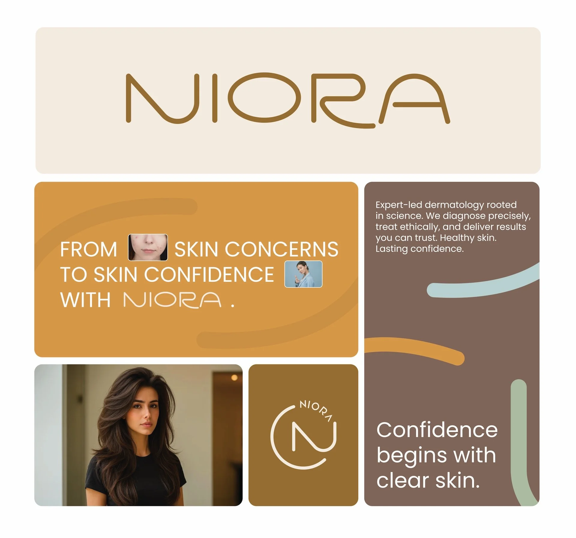
NIORA emerged from the intersection of "new aura" and "nurture." Soft without being passive. Warmth in its vowels, composure in its brevity. It does not explain dermatology. It does not reference skin. It evokes quiet renewal. Something beginning.
And it resolved to the right number.
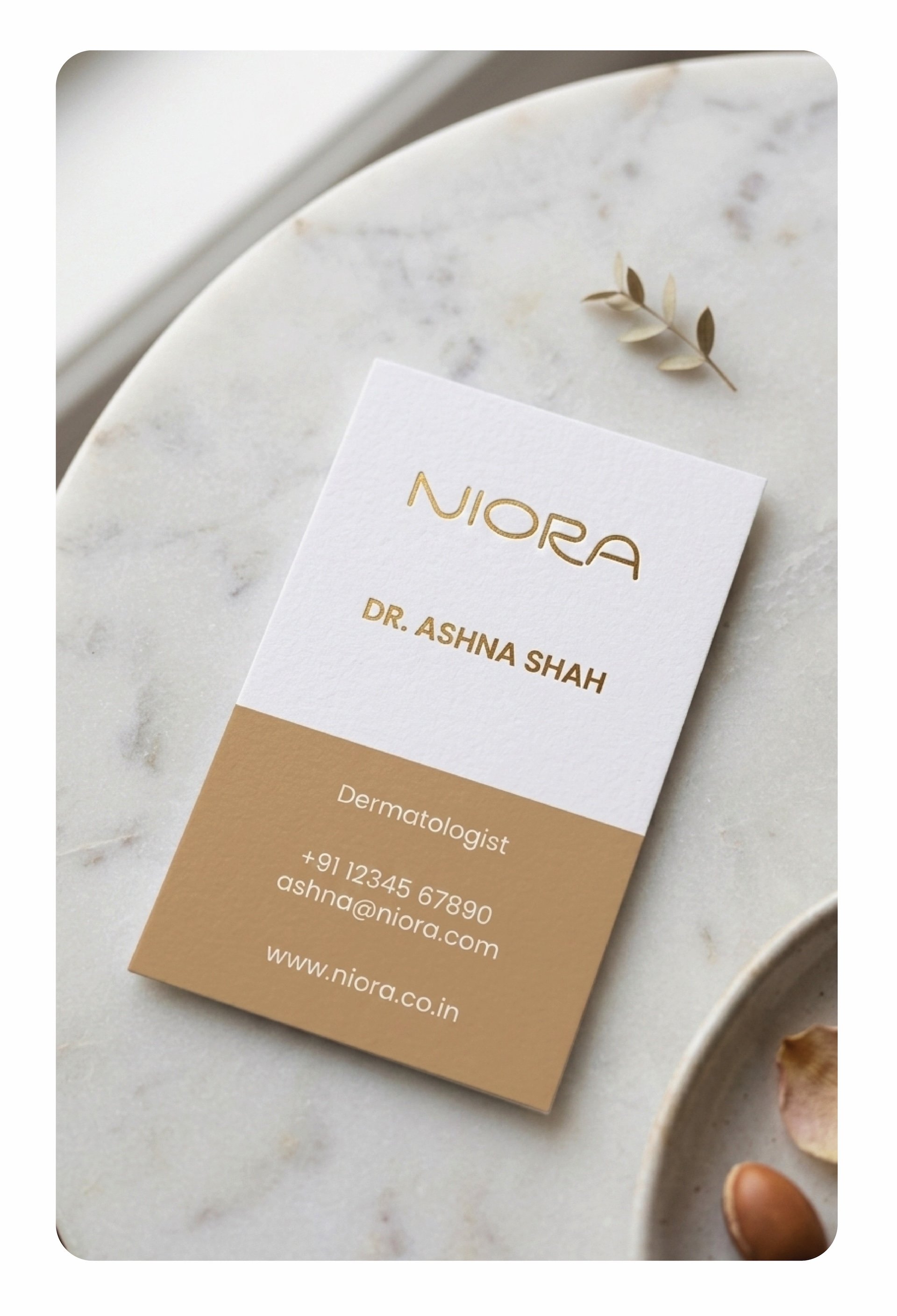
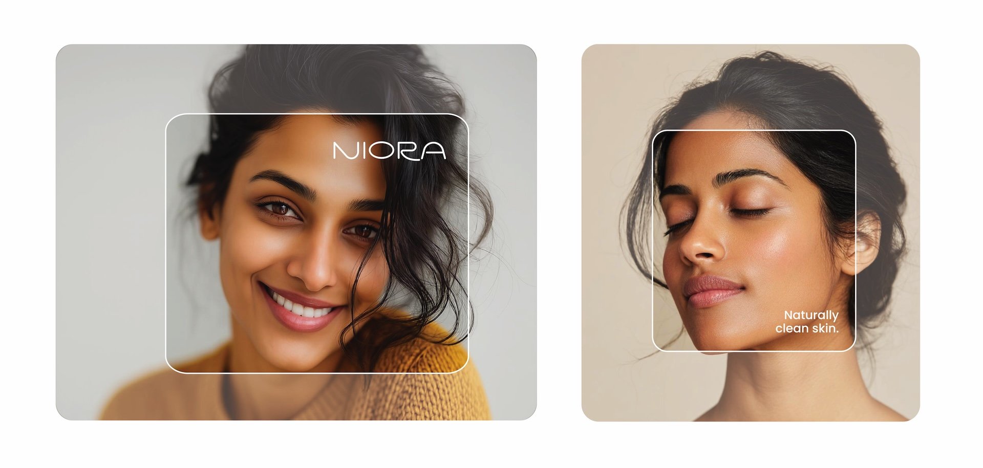
A wordmark that breathes
The primary logo is a custom wordmark. Clean geometric foundations softened with organic curves, particularly in the N, O, and R, where rounded terminals replace sharp endpoints. The strokes avoid both the fragility of ultra-thin luxury type and the heaviness of bold clinical marks. There is air between the letters. The O sits open, almost like a lens or a cell under magnification. The R resolves with a curve that mirrors the N, creating visual continuity across the word.
Medical in its confidence. Human in its touch.
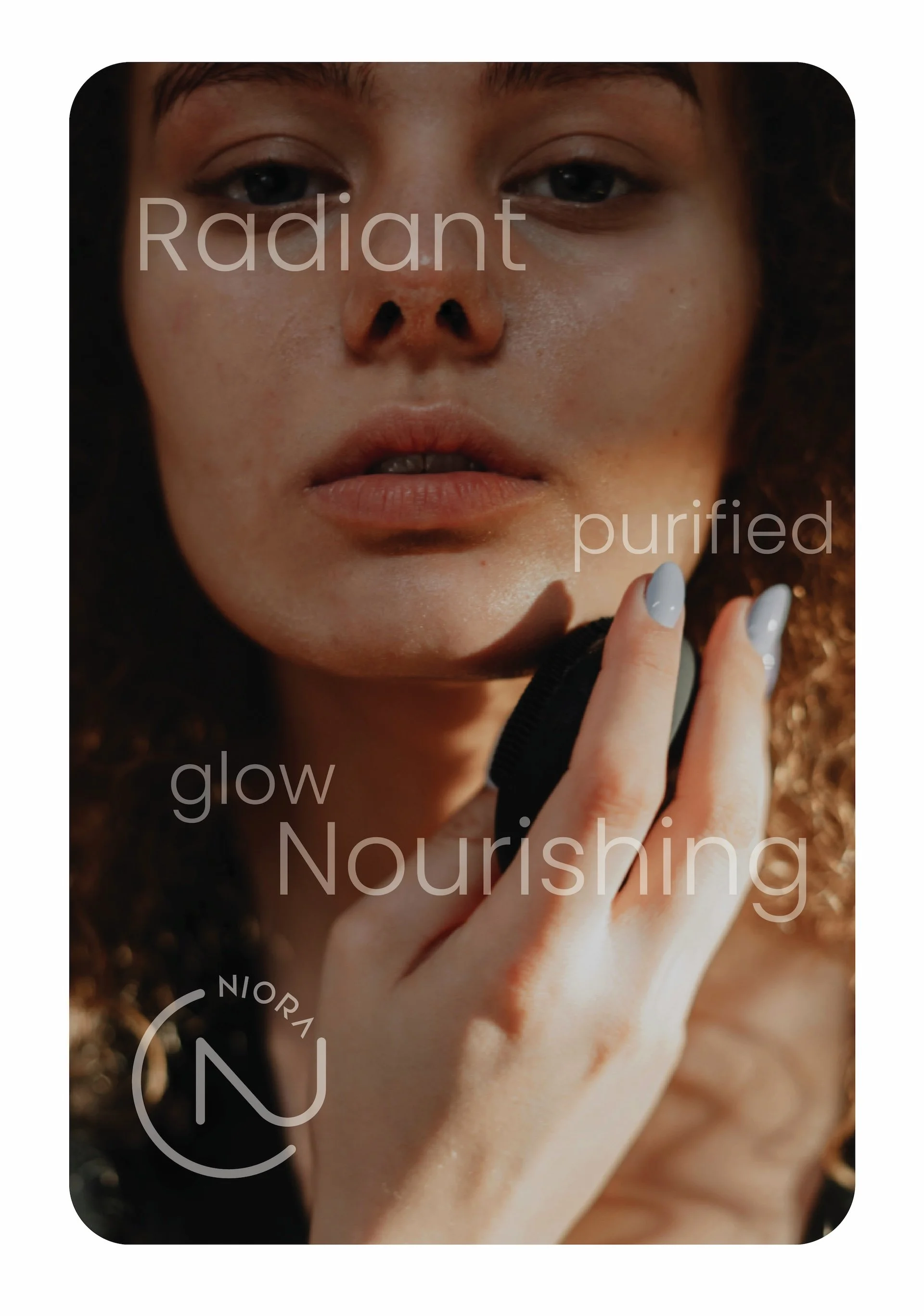
The secondary mark places a stylised N within a circle, with NIORA arcing along the upper edge. Favicon, stamp, recognition device.
Both rendered in NIORA Gold, a warm bronze that anchors the entire system.
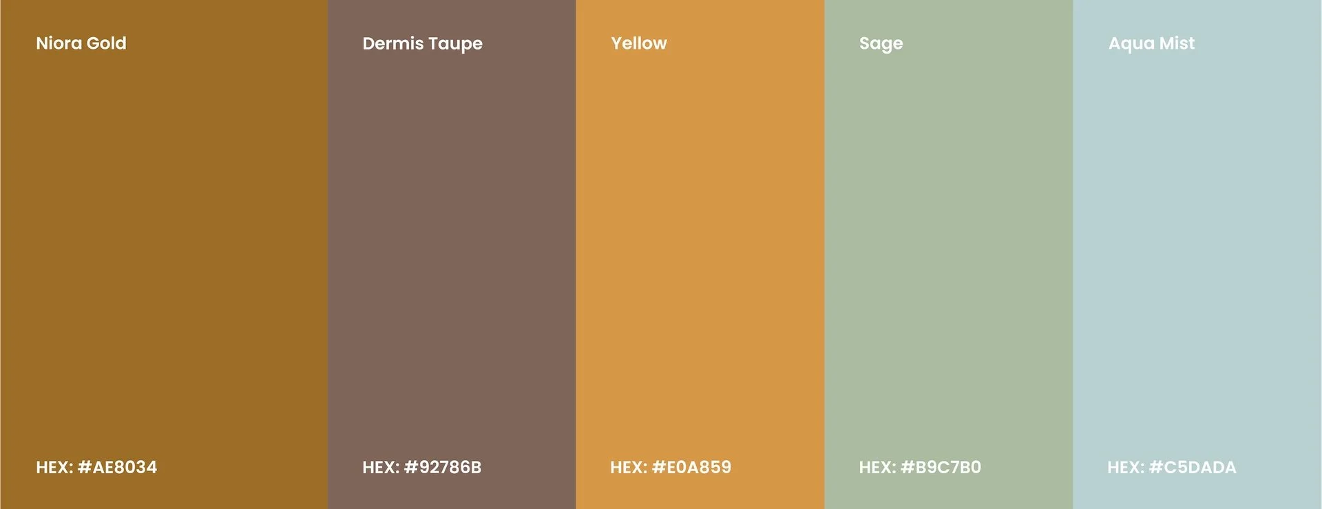
A palette that refuses to compete
Five colours. Each named. Each earning its place.
Niora Gold. The signature. Burnished bronze pulled away from jewellery-bright toward something earthier. It does not glitter. It glows.
Dermis Taupe. Named after the deeper layer of skin. A grounding, muted mauve-brown. Medical foundation made visible.
Yellow. Sun-warmed secondary. Vibrancy without aggression.
Sage. Calm, botanical, fresh. Breathing space within compositions.
Aqua Mist. The coolest tone. Clinical balance. Where the warm tones carry personality, Aqua Mist carries professionalism.
No clinical blues. No sterile whites. No hot pinks. No teal-gold borrowed from the beauty industry. The palette feels like a well-lit consultation room on a calm morning.
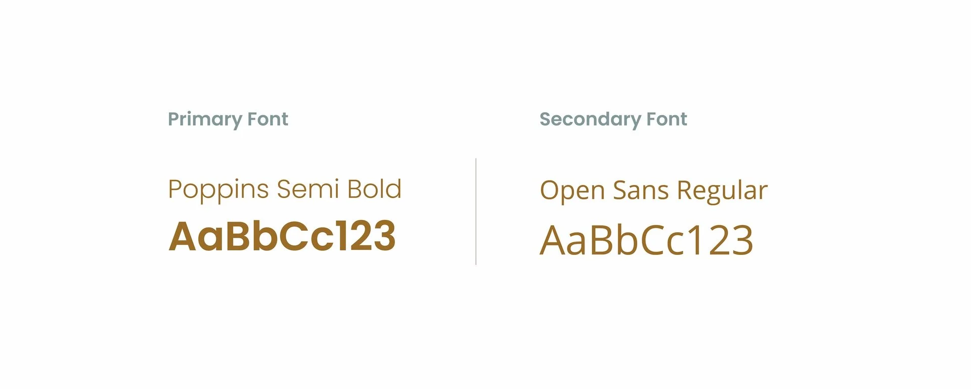
Typography.
Poppins Semi Bold for headings: confident, geometric, modern without being cold.
Open Sans Regular for body text: clean, readable, universally friendly.
Two sans-serifs that share a geometric DNA but differ in weight and personality, one speaks with authority, the other with clarity.
A language that treats people differently
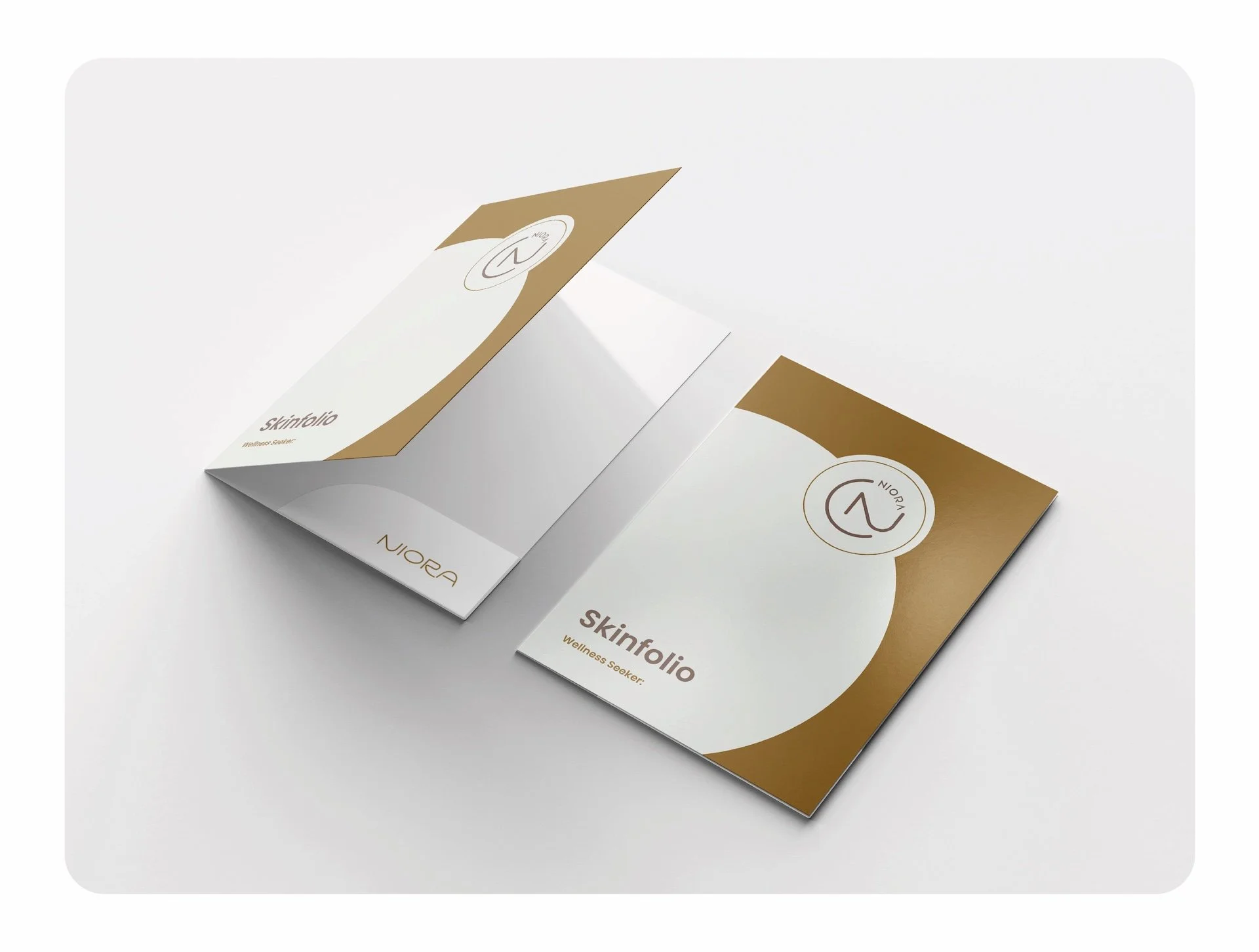
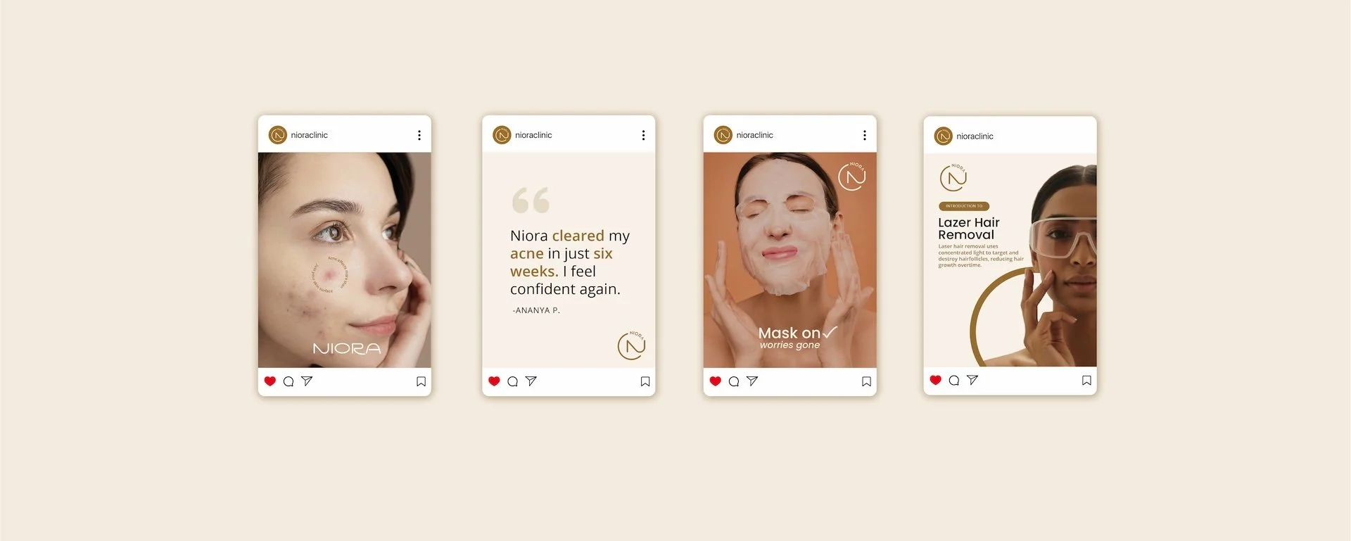
Most clinics call people patients. Niora calls them wellness seekers.
The patient folder is labelled "Skinfolio." Not Patient File. Not Case Record. The subtitle reads "Wellness Seeker." Consultation Notes instead of Medical Reports. Care Plan instead of Treatment Protocol. Visit instead of Appointment.
Small shifts. But they accumulate into a fundamentally different experience: one where the person across from the doctor feels like a participant in their care, not a subject of clinical process.
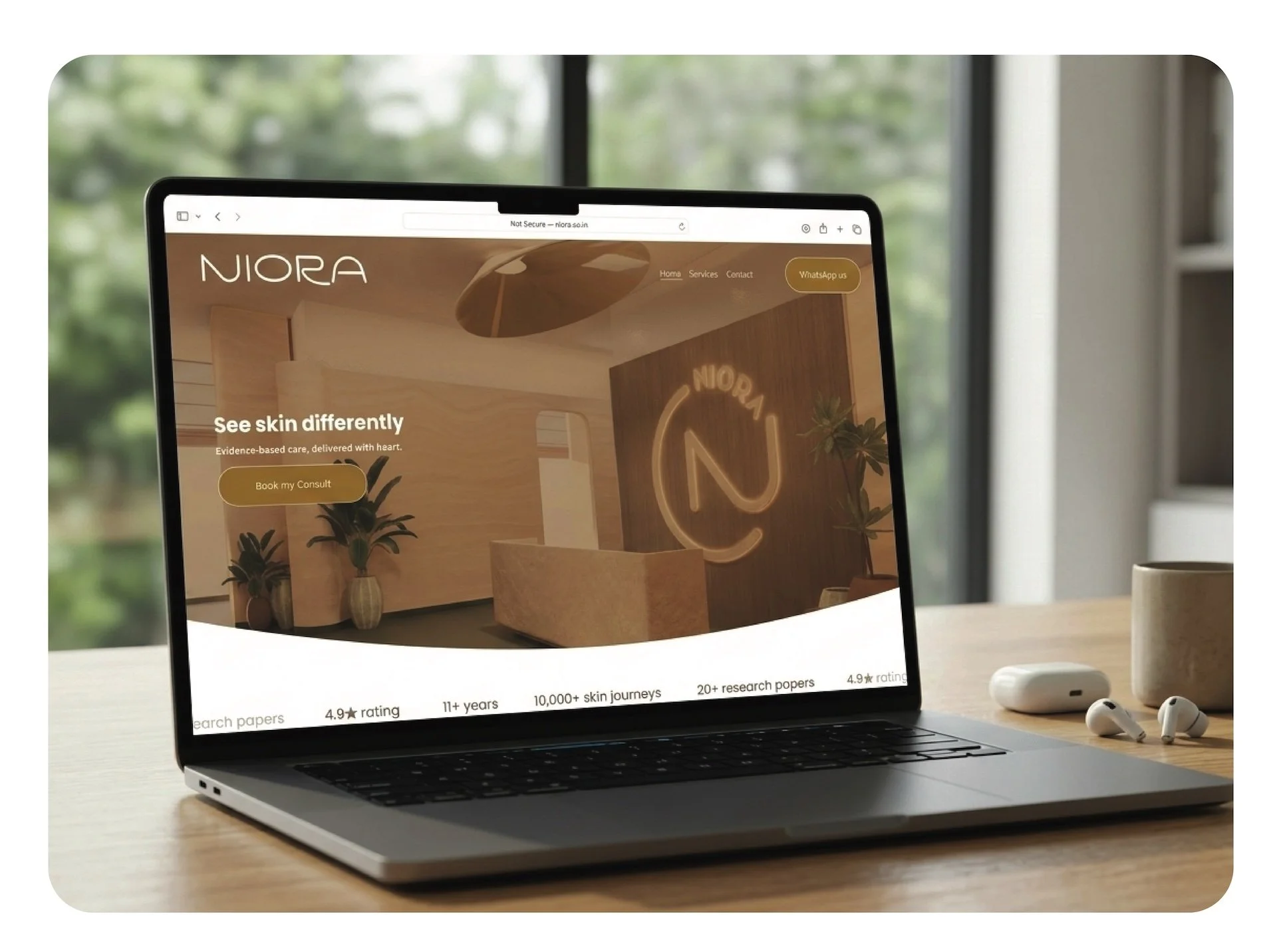
A website that builds trust before it asks for anything
The homepage opens with "See skin differently" and "Evidence-based care, delivered with heart." No exclamation marks. No countdown timers. No discount banners.
The services page does not depict treatments literally. No syringes. No laser beams. Instead: outcome and confidence. Healthy skin, calm expressions. Each service described in educational language that explains what treatments can do and what they cannot promise. Laser Hair Reduction, not Removal. Because accuracy matters more than aspiration.
Generous white space. Warm neutral backgrounds. The full experience lives at niora.co.in
From screen to space to skin
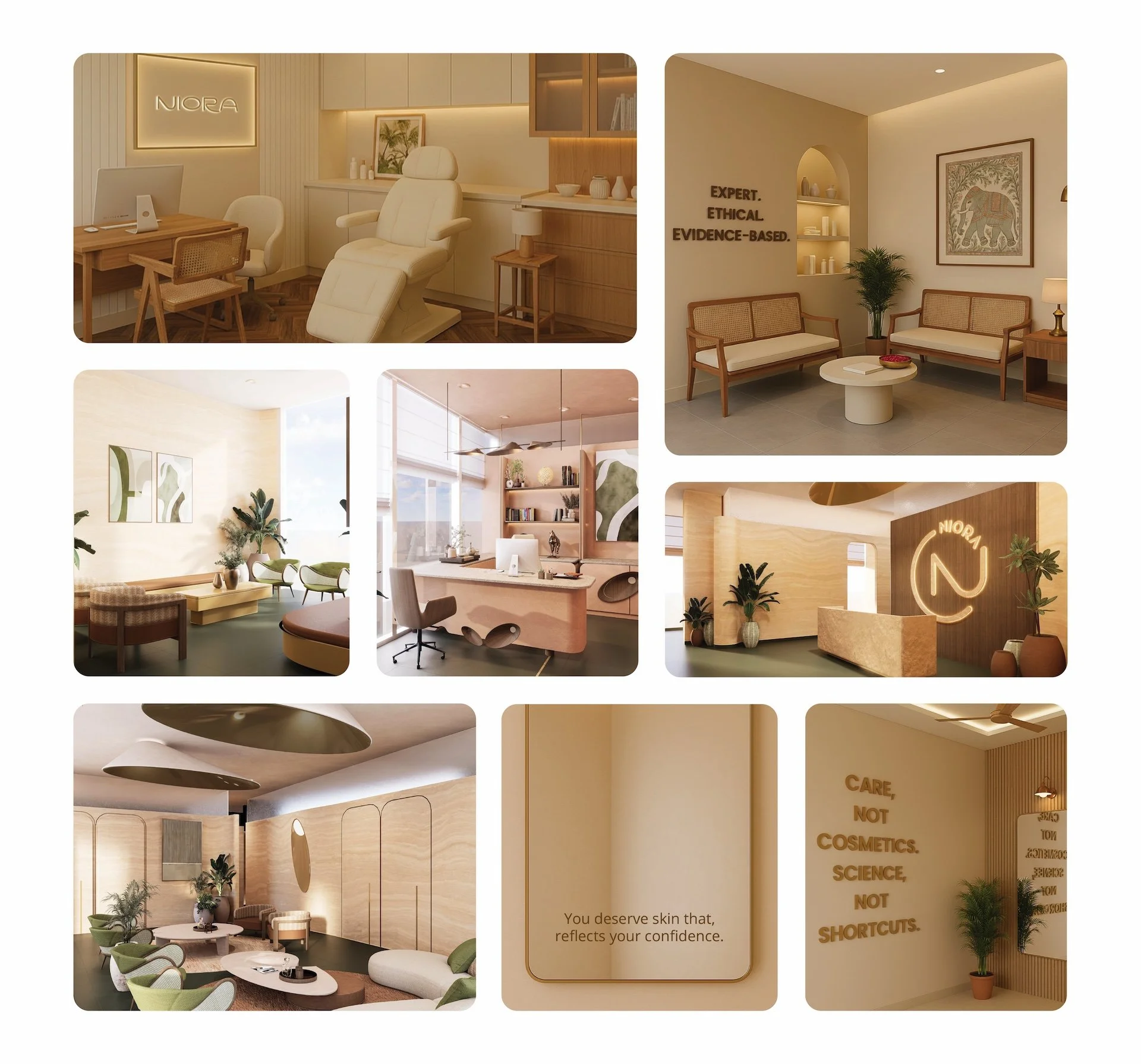
Space Design
The full identity
What we built
Dr. Supriya did not need a louder brand. She needed a visual and verbal language as rigorous as the medicine she practises.
We named a clinic that did not exist yet. Gave it a face, a voice, a palette, a Skinfolio, a website, a waiting room, and a way of speaking to people that treats them as partners in their own care.
NIORA is evidence-based dermatology, made visible.
Client Testimonial
“Working with Yellow Fishes has been one of the most rewarding creative partnerships we've had. Over the years, they have handled branding for multiple projects and every single time, they've exceeded our expectations.
Ashish understood the essence of what we were trying to communicate. The result was a visual identity that we are deeply proud of.
What sets Yellow Fishes apart is not just their design talent, but their ability to listen, understand, and translate our vision into something that truly resonates. This is a team that brings genuine passion and precision to every project.
We are proud to call them a long-term creative partner, and we look forward to many more collaborations ahead. Highly recommended, without reservation.”
Dr. Supriya Vikhe, Chief Dermatologist, Niora