

Antara Jewellery
Brand Identity Design // Gold & Diamond Jewellery, Retail
Brand Name: Antara Jewellery
Industry: Gold & Diamond Jewellery | Luxury Retail
Brand Reach: Mumbai, India
Services:
Strategic Brand Alignment
Logo Design
Brand Identity Guidelines
The space between legacy and identity
Forty years of gold. Government export awards. Recognition from the highest offices in the country. Over a lakh of customers who trust the name. Antara Jewellery, backed by the manufacturing powerhouse Vallabhji Malsi & Co., had earned something most jewellery brands in Mumbai spend decades chasing: credibility. What they did not have was a visual identity that carried the weight of that credibility.
The brand was operating with a standalone wordmark. Clean, functional, forgettable. It sat in a category where every competitor relied on the same visual shorthand: diamonds, sparkles, stars, generic serif fonts in gold. Antara's wordmark did nothing to separate them from the crowded jewellery landscape of Western Mumbai. And as the brand expanded from a single store to multiple locations, that gap between reputation and recognition was becoming harder to ignore.
The third generation was now at the helm. The ambition was clear. The visual language was not.
Before we designed anything, we listened.
Brand identity work that begins with design is guesswork dressed in aesthetics. We began where every meaningful brand transformation should begin: with alignment. We designed a proprietary brand discovery questionnaire and put it in the hands of four key stakeholders across two generations of the Antara family. Not a formality. A diagnostic.
The responses revealed something rare: complete consensus.
Every stakeholder independently chose the same two words to describe Antara's personality: “Sophisticated” and ”Innovative”. Not one person chose Traditional. Not one chose Conservative. This was not a family clinging to heritage for its own sake. This was a family that understood their legacy was the foundation, not the ceiling.
When asked to imagine Antara as a car brand, the answers were telling. Lexus. Toyota. Never Hummer. Never a brand that trades on flash. When reimagined as a hotel, it was Oberoi and Taj. Never Marriott. Never mass-market. When reimagined as a watch, it was Omega and A. Lange & Sohne. Quiet precision. German craftsmanship. Never Casio. Never loud.
And the rejections were equally precise. Balenciaga's provocative aesthetics. Versace's flashiness. Kalyan's dependence on perpetual discounting. Antara's founding generation and its inheritors agreed: the brand should feel premium without performing it.
A single stroke. An infinite idea.
The design process explored multiple directions. Abstract geometries. Animal-inspired forms suggesting quiet confidence. Symmetrical constructions built for embossing and foil stamping. Every exploration was tested against the strategic truths the questionnaire had surfaced: this mark had to feel modern yet rooted, premium yet accessible, sophisticated yet warm.
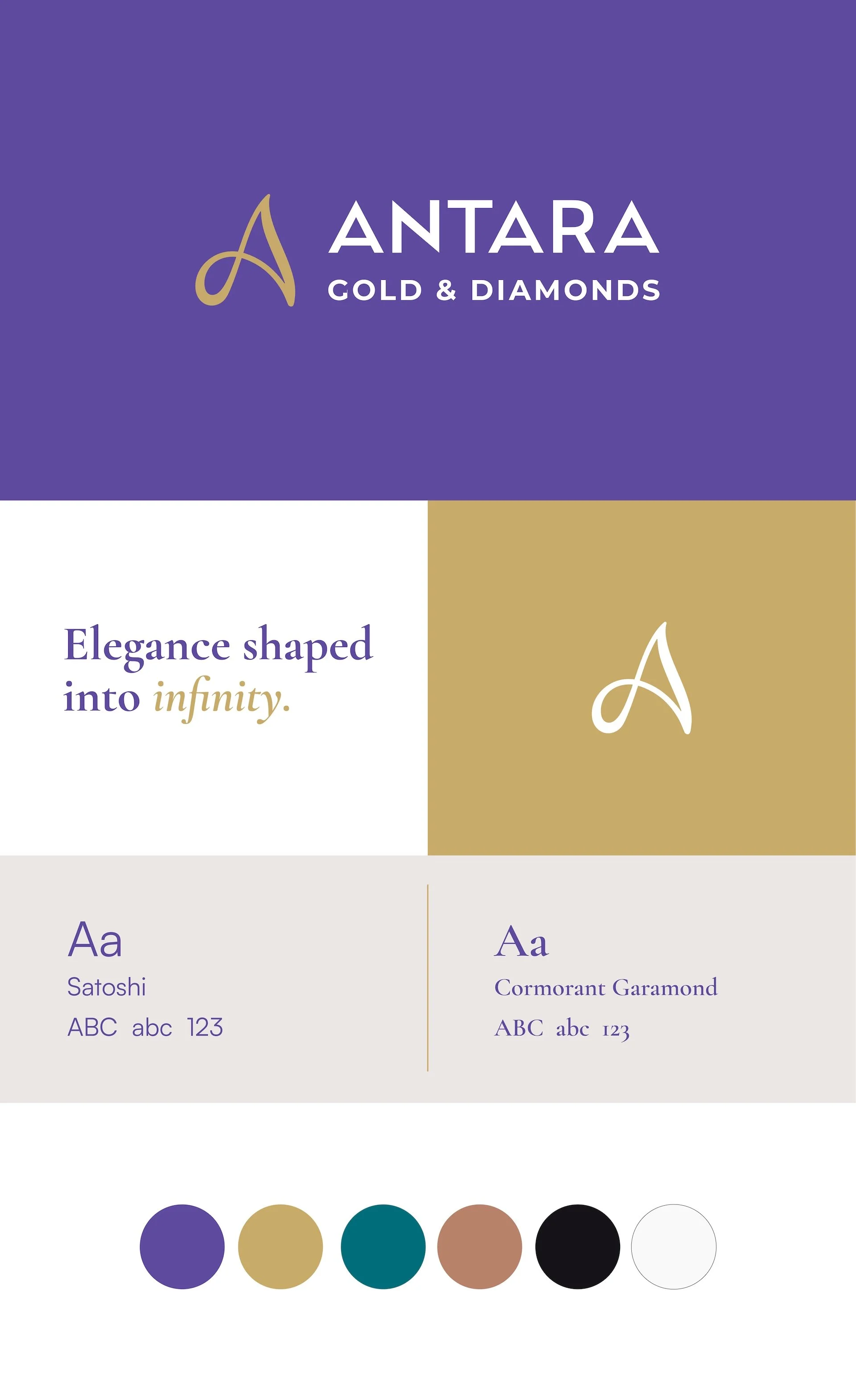
The final symbol is drawn from a single, unbroken stroke.
It forms the letter A, but it does so with the fluidity of a craftsperson's hand rather than the rigidity of a typeface. The stroke rises upward to a confident peak, crosses itself, and resolves into an infinity curve at the base. One line. No beginning, no end. Continuity made visible.
Three ideas live inside this single gesture:
The Flowing Single Line mirrors the act of making itself. The way molten gold moves. The way a jeweller's hand shapes precious metal with intention and instinct. It is a mark that feels crafted, not constructed.
The Infinity Curve embedded in the stroke carries the brand's deepest truth: that the value Antara creates is not transactional. It is enduring. The jewellery outlasts the occasion. The relationships outlast the purchase. Beauty without limits, craft beyond time.
The Gold Colour is not decorative. Rendered in Champagne Gold, the symbol speaks directly to the material at the heart of everything Antara does. Heritage, purity, and timeless value, compressed into a colour choice.
The result is a mark that can stand alone without the wordmark and still carry recognition. Embossed on a ring box, it whispers. Rendered across a storefront fascia, it commands. Worn as a pendant, it becomes the very thing it represents.
Building an identity system. Not a logo.
A symbol without a system is a gesture without a language. The logo design was the catalyst, but the brand identity we built around it gives Antara a complete visual vocabulary.
Colour Palette
Six colours, each with purpose. Regal Amethyst and Champagne Gold anchor the primary identity, carrying the sophistication and warmth the family unanimously identified. Petrol Teal and Rosewood Copper provide secondary range for campaigns and seasonal work. Midnight Charcoal and Porcelain Mist complete the system with depth and breathing room.
Typography
A dual-typeface system pairs Satoshi, a clean contemporary sans-serif for headings and primary communications, with Cormorant Garamond, an elegant serif that carries the brand's more emotive, editorial voice. The combination mirrors the brand's own duality: modern sensibility, timeless craft. For a brand operating across three languages, we specified Noto Sans Devanagari for Hindi and Anek Gujarati for regional communications, ensuring the identity holds its character in every script Antara's customers read.
Brand Identity Guidelines
A comprehensive set of rules governing logo usage, exclusion zones, minimum sizes, colour applications, placement principles, and typographic hierarchy. Not restrictions. Tools. Every person who touches the Antara brand, whether designing a social media post or briefing a signage vendor, now has a clear, unambiguous reference for how the brand should look and feel.
The system was designed to scale. From the intimacy of a jewellery box to the scale of a retail facade. From digital screens to embossed foil. From several stores in Mumbai to everywhere the brand's ambition takes it next.
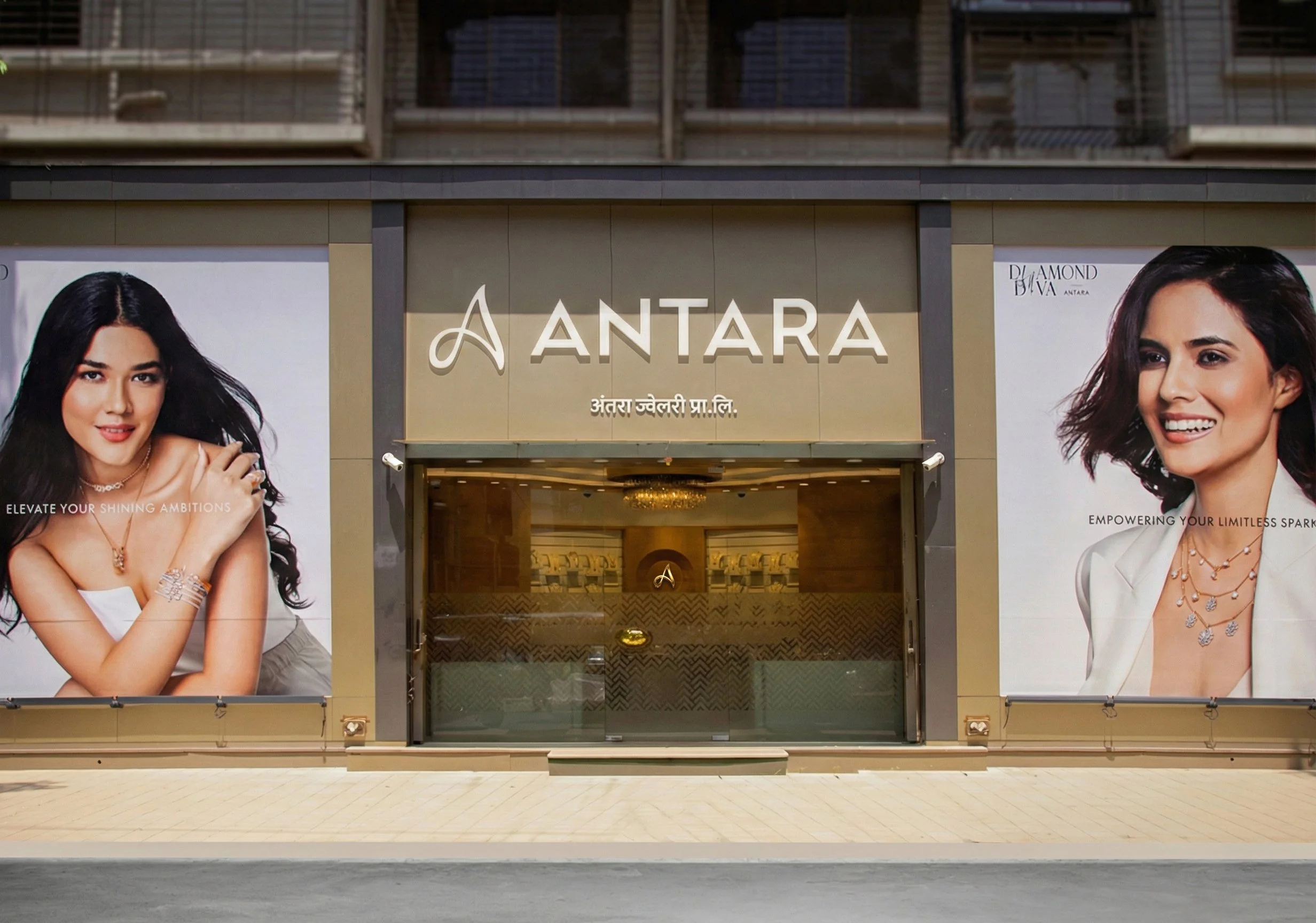

It is embossed into jewellery boxes and the jewellery itself, where the mark says everything the brand believes about restraint, about craft, about the moment before something precious is revealed.
What we built
A visual identity that closes the gap between what Antara has earned over four decades and what the world sees when they encounter the brand. A symbol that carries meaning without category cliches. An identity system that gives a growing jewellery brand the visual infrastructure to expand with coherence, confidence, and craft.
Antara did not need a new name. They did not need a new story. They needed a cohesive visual language as refined as the jewellery they make.
Now they have one.

Client Testimonial
“Working with Yellow Fishes on the ANTARA JEWELLERY logo and brand guidelines was a fantastic experience from start to finish. They quickly grasped our vision and translated it into a clean, cohesive brand identity that perfectly captured our essence. Their collaborative approach made the process smooth and enjoyable.
The final deliverables, including versatile logo, color palettes, and comprehensive guidelines, were polished and ready to scale across all our touchpoints. We’ve received tons of compliments already.
Highly recommend Yellow Fishes for anyone seeking top-tier design expertise!”
Ankit Gala, MD, Antara Jewellery Pvt. Ltd.